User Interface Design Gallery

A gallery of user interfaces that I've collected over the years.

Pattern Tap Guided Tour

Pattern Tap positions some instructional copy at the top of their site for first time visitors. It displays information about what is on the page and how to use it. A right arrow navigation button allows the user to take a guided tour of the site. The user may dismiss the messages when they're done with the tour.

http://patterntap.com/

Amazon.com TV Show Episode Details

Amazon's Unbox service displays episodes of a TV show's season in a table listing. Each episode name is listed by title and air date, with a synopsis teaser, pricing information and a checkbox. On the left of each row is a plus (+) icon so the user can view the episode details. The row expands to show an image and the complete synopsis.

1. Episode listing table.
2. Single episode expanded to show details.

http://www.amazon.com/gp/product/B000V22QJ0

RYZ Rating and Favoriting

RYZ is a sneaker manufacturer that crowdsources the design of their product and shares the revenue with winners. Users download a template to create design and upload to their profile. Participants vote on the designs by giving ratings and winners receive $1000 and $1 for every pair sold. The site provides simple interfaces for both favoriting and rating entries.

1. The voting page.
2. Clicking the star badge in the corner of the image adds to favorites.
3. Clicking a checkmark below the image adds your vote.
4. Clicking PASS adds your "not interested" vote. Not sure what value this is given.
5. Favorites appear on your profile.

http://www.ryzwear.com/

System One Rich Text Editor

System One is an enterprise content management platform that combines functionality of a wiki and CMS in a rich internet application environment. The article editor provides some interesting features and AJAX functionality, including a block/paragraph-level editor, drag and drop moving within an article, and related internal/external content suggestions.

1. The journal's multi-entry view.
2. Clicking the link to create a new page displays an input to provide the page name, and shows suggestions for pages that are similarly named. Clicking one of the suggestions allows the user to edit that page instead.
3. Editing the page. User enters text in the paragraph editor.
4. Selecting text to create a link.
5. Page is published with forward link. User may click link to edit.
6. User is now editing the new page from the forward link, and has clicked "Files" to add files to the page.
7. Clicking the lock icon allows user to set access control for a paragraph/block level element.
8. Images are added to the page.
9. Clicking the arrows on a block allows the user to drag and drop to move the block to another location in the page.

http://www.systemone.at/

AideRSS Table Row Expansion

AideRSS is a service that scores and filters RSS feeds so that users can view the most active posts for a web site. Activity is based on number of comments, and posts to digg or del.icio.us. The feeds are displayed in a table, with hot or most active entries indicated by a higher rank and warmer color in the postrank column. A "+ more" icon allows the user to expand entry information within a row.

1. Feed table.
2. Clicking "+More" expands entry info in a row.

http://www.aiderss.com/

Last.fm Tabs

In Last.fm's redesign, the site started combining vertical tabs along the left hand side of the content area, and horizontal tabs in the main content area for sub-navigation.

This is not something I would recommend. There is something rather unnatural feeling to me when vertical tabs along a Y axis are laid out with text in the West-East orientation. I think for the metaphor to make sense, the South-North orientation has to be respected, as though you were stacking real manila folders. The combination of the vertical and horizontal makes this navigation choice even weaker in my opinion. Stacked horizontals would have been a clearer choice, or just getting rid of the tab metaphor in the left sidebar entirely would clear things up.

http://www.last.fm/home/recs

Google Calendar

Where Google Search gave us syntax for doing all kinds of advanced searching, Google Calendar goes a more natural route. When Calendar was released, it introduced a lot of people to the idea of the natural language command line for the web via the "Quick Add" feature. Via a simple form input, you enter basic event info, e.g. "Lunch with Judy on Thusday at 1pm." The event is quickly added, and you click the event title in the calendar to edit the details.

1. Clicking the QuickAdd link displays input. Enter basic event details in natural language.
2. Google inserts the event in the date/time you mentioned.
3. Clicking the event title shows the event info.
4. You can adjust the time. The change in event duration shown in parenthesis is a nice touch.
5. Click to edit other fields and submit.

http://www.google.com/calendar/render

goosh.org Cmmand Line Interface

Goosh, which dubs itself "the unofficial google shell" interprets the idea of presenting a command line interface via a web site literally. The site uses AJAX to present a terminal shell interface to Google. For simple searches, just enter keywords and click Enter. Type h for help with other commands. It even provides history functionality using keyboard up/down arrows.

1. The default screen is literally a command line interface.
2. Help shows available commands.
3. Doing a simple keyword search.
4. A News search.
5. An Image search.
6. A Wikipedia search.
7. Changing settings.
8. A Place search with the new map size settings I modified.

http://www.goosh.org/

Presdo Calendaring

Presdo is a calendaring service that uses a simple form input as the command line for entering natural language commands for events. To use, enter event statements as with Google Calendar. It is always assumed that you are the subject—the WHO. You just have to fill in the rest of the WHAT, WITH WHOM, and WHERE parts of the statement, e.g. "Have lunch with Judy on Thursday at 1pm."

Once you've submitted the basic event info, you're presented with a more complete UI for entering event details, and this is where the service far surpasses Google's. You may invite multiple guests via email, get suggestions for locations (if you're having coffe with someone it suggests cafes, if watching a movie it suggests theaters), and add the event to your local calendar (Outlook, iCal, Yahoo or Google).

1. Enter your natural language event command
2. The event UI
3. Enter guests' email addresses to send invitation
4. Pick a location
5. Location is filled in
6. Add to your local calendar
7. Event info sent to Google Calendar

http://www.presdo.com/

Twitter Search

With Twitter's acquisition of Summize, the social messaging service now provides a very nice, and simple to use interface to see what people are twitting about. Enter a topic or keyword and click search. The options in the sidebar of the results screen are substantial too: Feeds, translations, trends, interesting queries, e.g. hashtags. Advanced search and using search operators adds a powerful, Google-like experience to your search.

1. Simple search screen.
2. Search Results. In the sidebar: Feeds, translations, trends, interesting queries, e.g. hashtags.
3. Search operators.
4. Advanced search.

http://search.twitter.com/

Blogger Rich Text Editor

The new Blogger Draft text editor shares some of the behaviors of the rich text editor in Gmail, and as commenter points out, uses the same icons used in Google Pages. Blogger and Pages use beveled buttons rather than using the more minimalist style of the borderless icons in Gmail. One might argue that these controls are actually more usable because the states of toggles and the affordances supplied by buttons and dropped down menus should be obvious. The interface controls are simple and easy to use.

1. Font face selection is triggered via a drop down menu.
2. Font size is shown as relative values.
3. Font color selection.
4. Link creation dialog.
5. Selected text shown as link. When links are selected controls are displayed in the editor to modify the link.
6. Inserting an image via upload.
7. Inserting an image via URL.
8. Inserted image is shown with controls to modify the image.
9. Bulleted list format. Control is shown toggled on.
10. Tagging and post options.
11. Previewing content.
12. Text editor in context of the page.

http://blogger.com

Gmail Rich Text Editor

Google have been doing some work getting some of their interfaces to be consistent with each other. GMail and Blogger now provide similar interface behaviors and controls, with slight differences. Other applications like Google Sites and Docs continue to have different controls.

Gmail and Blogger are among the simplest of these text editor interfaces, for good reason. In blogs and email, rich text formatting should be bare bones and out of the way as much as possible. Google is successful in understanding the differentiation in these use cases from text editing in wiki/site and word processing. The controls are intuitive and usable.

1. Font face selection is triggered via an icon rather than displaying all font faces. Default font face is indicated as "Normal."
2. Relative font sizes are used rather than numerical.
3. Color selection control for font color and background/highlight color.
4. Link creation dialog.
5. Selected text shown as link. When links are selected controls are displayed in the editor to modify the link.
6. List controls are displayed, toggled on when active.
7. Running spell check highlights misspelled words.
8. Composition form displayed in context of page.

http://gmail.com

Yahoo! Mail Rich Text Editor

Yahoo! Mail's rich text editor in the composition form is clean and provides the core set of formatting options you'd need. The implementation is simple and intuitive. A few things they do differently include: rolling some commonly visible controls into drop down menus, e.g. text alignment and list style blocks.

1. Font face selection and font size are in HTML form selects.
2. Font color selection. Highlight or background color uses the same color selection control. There seems to be a bug here, where Italics is shown toggled on when the selected text is not italicized.
3. I guess Yahoo! users like emoticons. :)
4. Link creation is handled via a JavaScript dialog.
5. Text alignment is rolled into a single drop down.
6. List style in a single drop down.
7. The message composition form in the context of the full page.

http://mail.yahoo.com

Performancing Metrics Data Filtering

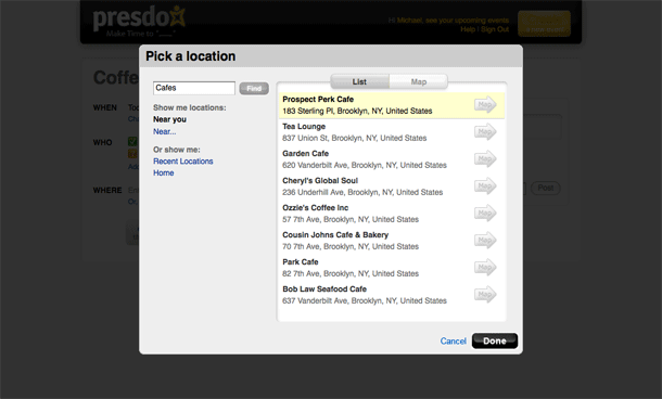
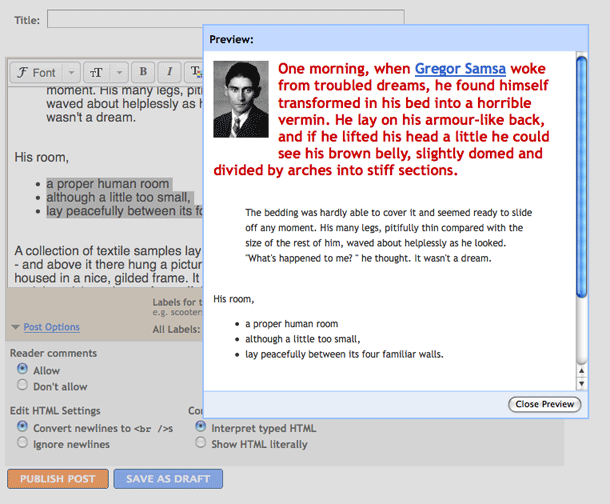
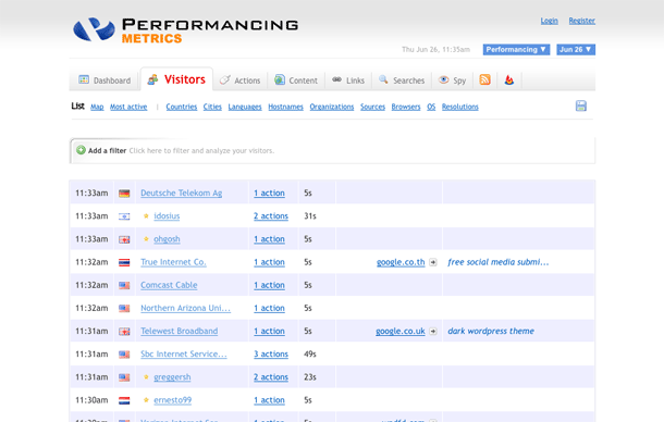
Performancing Metrics is a web analytics product that is focussed on Blog Systems. Their reporting views provide an highly scalable solution for data filtering that takes up very little screen real estate, yet provides a powerful mechanism for adding criteria to do granular reports. This example shows an ad-hoc filtering of the Visitors data on their demo server.

This solution, showing an inline set of filter criteria on a single row contrasts with several typical filtering techniques that can be used. From best to worst I've seen the following: search results filtering with faceted navigation, table-based filtering of data in column as is done in spreadsheets, rules-based with complex rule-generation forms. The alternative used here for filter selection is a take on filtering that I view as efficient when dealing with too many facets or columns/fields of a table than can be displayed. The removal of filters is a little more familiar, using a design pattern that is common on search results.

1. Default view.
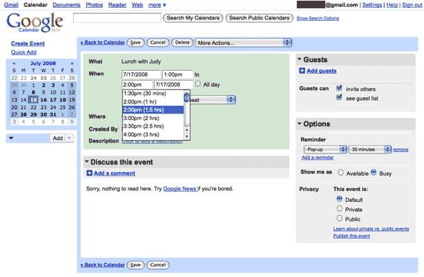
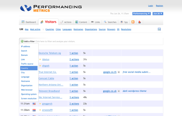
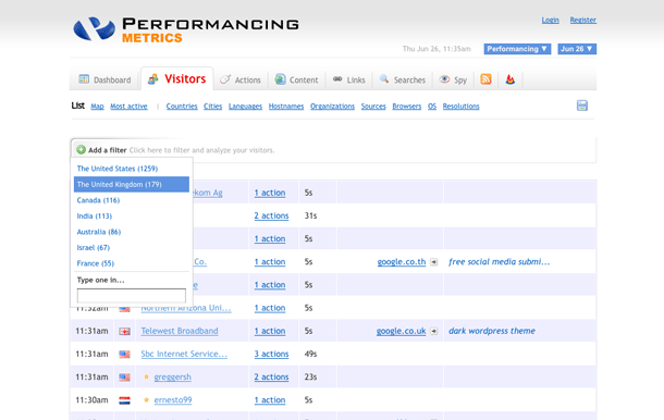
2. Clicking "Add a Filter" control. Selecting filter type, "Country."
3. After selecting type, the possible values for Country are shown. "United Kingdom" is selected. There is also an input to enter a value, but this doesn't offer auto-completion, so correct exact values must be entered.
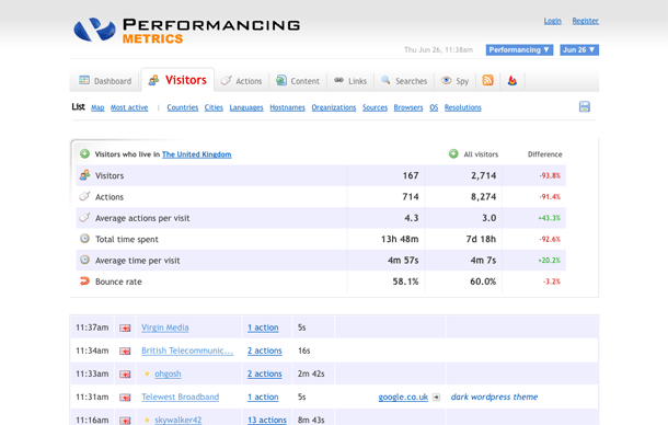
4. FIlter has been added.
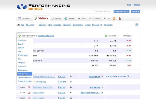
5. Adding a second filter, now selecting "Browser."
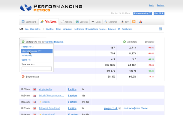
6. Values for Browser are show. "Internet Explorer" is selected.
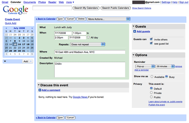
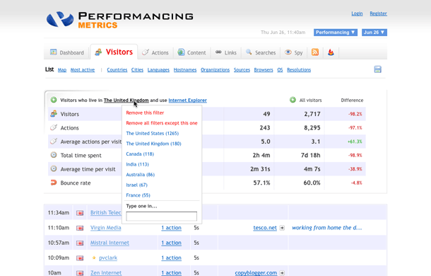
7. Now filter shows "United KIngdom" and "Internet Explorer." User is now viewing options for modifying the "United Kingdom" filter.
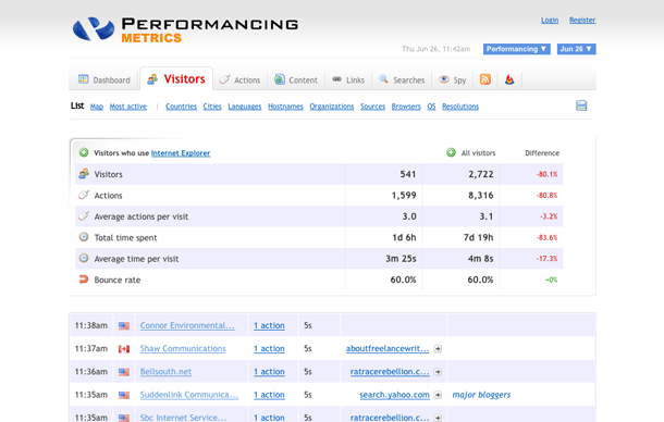
8. User removed the "United Kingdom" filter.

http://pmetrics.performancing.com/stats/visitors?site_id=1

The Filter Embedding Media in Comments

The Wall feature of user profiles in The Filter allows users to create entries with recommendations as embedded content. Users enter their comment and search for anything from an artist to a track to find content to recommend. The selected content is embedded in the comment to be played in the media player.

The interface is similar to those provided in the MTV recommendations app on Facebook and the Video embedding control in Gawker Media comments.

1. Creating a "Wall" message. Searching for media to recommend.
2. Auto-complete suggestions under "Music > Artists."
3. Inserting the recommendation embedded into the comment form.
4. The entry is posted to the wall with the embedded link to the song being recommended.

http://thefilter.com/

The Filter Rating

The rating controls in The Filter provide a slider control with a 10 point scale. Each rating is accompanied by an English language equivalent, e.g. 0% on the negative side is "Never show me this again!" and 100% on the positive side is "A new kind of awesome." Middling ratings are "Not for me", "Average", and "This is good."

1. Ratings slider control.
2. The Ratings module in the video player. More related items in carousel below.
3. Ratings module in user's music ratings page.

http://thefilter.com/

Last.fm Feedback

The feedback and bug reporting interface that Last.fm is using during its beta for the redesigned site provides a simple way to report problems and tell the company what you like. During the beta, a temporary, persistent yellow navigation bar is placed at the top of the page with links to info about the beta program, notices for known issues, and an option to leave feedback. Clicking leave feedback expands the yellow bar to show feedback options.

1. The beta program navigation bar.
2. Clicking "Leave Feedback" link expands bar to show positive and negative feedback or bug reporting options.
3. Clicking "I Like This Page" allows users to enter a positive comment with their message.
4. Clicking "I Don't Like This Page" allows users to enter a negative comment with their message.
5. Clicking "Bug/Other Feedback" allows users to descibe bug or leave other feedback.

http://beta.last.fm/home

Last.fm Top Content Charts Module

Last.fm's top artists and top songs content module appears on user profiles. The module shows a list of top content, with options in tabs to change time slice. The content module also provides options to modify settings and embed the content on an external blog or social network site.

1. Default tab, showing last 7 days of top artists with Last.fm's signature bar chart for number of plays.
2. Last 6 months tab.
3. Clicking the gear icon in the upper right shows drop down menu to modify settings or embed content widget.
4. Modifying chart settings.
5. Embedding.
6. Embed settings page.

http://www.last.fm/dashboard/

OfficeMax A-Z Index

OfficeMax displays an a-z index of the store directory in the global navigation. When users hover over any of the letters, a page-wide flyout menu appears to display entries. Clicking on one of the letters, displays the same listing of entries in full page view.

1. A-Z index displayed in global navigation. Hovering over letter shows wide flyout menu of directory entries.
2. Directory display for B's.

http://www.officemax.com/

OfficeMax Faceted Search Results

OfficeMax search provides faceted filtering of results using controls in a left sidebar. Facets such as category, brand, and price show 5 terms per facet, allow the user to expand to see more terms if any, add and remove facet selections in any order. A breadcrumb trail is also provided to show the selections made, and can be used to clear all selections at once by clicking on the first term in the trail.

1. Search results for term "pencils."
2. Adding term "Mechanical Pencils" under Category Facet.
3. Adding "0.7mm" under Point Size Facet.

http://www.officemax.com/

YouTube Media Annotation

YouTube have added media annotation controls that allow users to add comment bubbles, note boxes, and links (within YouTube only) to their own videos.

YouTube is not the first to add media annotations or commenting features like this, but the addition of this feature may mean we'll see more if it on video portals. The feature is similar to the video annotation that Bubbleply does. Viewers are not allowed to add annotations to other users' media as is done on Flickr and iminlikewithyou.

1. Click "Edit Annotations" button for a video in My Account page.
2. Entering a comment box in the editing form. A small yellow area is shown below the timeline to indicate the start and endpoints for the comment.
3. Entering a comment bubble. Bubble may be resized and moved by manipulating the handles.
4. Entering a comment area.

https://youtube.com/

Conservation International Global Navigation

The Conservation International site provides an interesting take on the flyout or drop down global navigation bar. The site uses single, short action words set in very large type to indicate what you can do and name the sections of the site: Discover, Learn, Explore, Act, Give. These are nice pathfinder-type labels. When the user hovers over a links, the label expands to provide a phrase. For example, Learn becomes "Learn about the issues," and Explore becomes "Explore critical places." This is a nice implementation that keeps the design simple and bold, yet usable. It provides better scent to the links when the user decides to dig deeper into the site.

http://www.conservation.org/Pages/default.aspx

Flickr Sharing

Flickr have added a sharing interface for their photos and videos. Presumably this is because of the introduction of videos into the ecosystem. The interface is provided via an unobtrusive link that uses AJAX to display contextual menus when clicked.

Prior to the introduction of this interface, users had to go to click the "All Sizes" link to find URLs for the item.

1. "Share This" button appears to the right of photo or video title.
2. Clicking "Share This" displays sharing options, showing email sharing by default. Entering text provides auto-completion suggestions using user names.
3. Copying the item link.
4. Copying the embed code.
5. Posting to a blog. User must have blogs configured to see this option.
6. Posting to blog displays the "Blog this..." page.

http://flickr.com/

SugarSync Creating and Moving Items

SugarSync's web-based document management application allows users to manage files that are kept on their computers. The interactions for creating and moving folders use an identical design pattern for placing items in a directory on the file system. This is similar to the Save As behavior in operating systems such as the Mac Finder and Windows Explorer, which will let users navigate to a disk drive, and then drill down deeply into a directory location.

1. Creating a new folder and saving to a location.
2. Moving a folder to a location.

http://www.sugarsync.com/

SugarSync Uploading Files

SugarSync's upload file behavior uses a customized interface that is not typical. Instead of using the browser behavior for handling file uploads using <input type="file">, which typically provides an input and browse button in Firefox and Internet Explorer, SugarSync uses a single button to invoke the file browsing window, and then displays the file's name in HTML.

To be fair, Safari provides a slicker interface for file uploads, which doesn't display an input, but only a button, and then shows the file name next to the button when a file is found. Safari users can actually also drag file names into the browse button from the finder.

1. The file manager.
2. Clicking "Upload File" from the menu displays dialog to upload via web-based application or via desktop application.
3. Clicking web-based uploader displays web browser's File Upload window.
4. When the file has been selected, the window displays the found file name. User has the option to remove the file, upload it, or cancel.

http://www.sugarsync.com/

Nivea Download Wizard

The Nivea brand advertising site features a very wizard for determining the type of logo file you should download depending on how the logo will be used. The visitor will answer questions about the purpose, application, and size needed. At the end of the process, a file is given to download. The questions are very easy to answer, and stepping the user through this process eliminates having to sift through a longer list of file types to determine the logo that would best suit the user's application.

1. User indicates the purpose for using the logo.
2. User indicates how the logo will be used&38212;in which type of application.
3. User indicates size of the logo.
4. System provides appropriate logo.

http://essentials.beiersdorf.com/essentials/executional-guidelines/nivea-umbrella/download-finder/

Tork Revolution Navigation

The Tork Revolution site features a Flash global/local navigation system that appears conventional on the surface, but positions the navigation elements in unconventional places on the page, using size, position, and color to indicate hierarchy.

1. The home page.
2. Clicking, Foodservice, one of the main entry points in the global nav pulls that word out of the nav and re-positions it at the top of the page.
3. Following a link to a sub-page, we are now viewing "Foodservice & Kitchen." The siblings of Kitchen are displayed above the heading in smaller text.
4. We clicked a sub-page under Kitchen&#8212;we are now 3 levels deep. Kitchen appears in smaller, yellow type above the heading alongside second-level siblings.

http://www.torkrevolution.com/