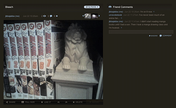
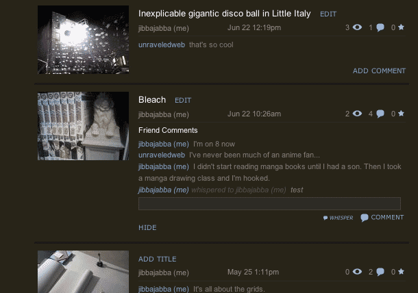
Radar's comment feature allows users to post a public comment on a person's photo, or post a special comment called a whisper that only the owner will see. The owner may click the small X icons next to the comments to delete. The whisper feature is a nice idea, and the execution is dead simple. Allowing comments when viewing a set of photos in list view is very thoughtful and feels right, since these are small-sized cell phone pictures. It may not be necessary to view the full photos at all. The idea here seems more like microblogging the thumbnail sized cell phone snapshots, and micro commenting feels very appropriate.
User Interface Design Gallery
A gallery of user interfaces that I've collected over the years.
Vote Chooser Wizard
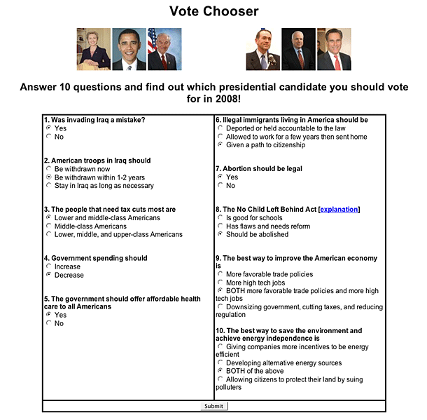
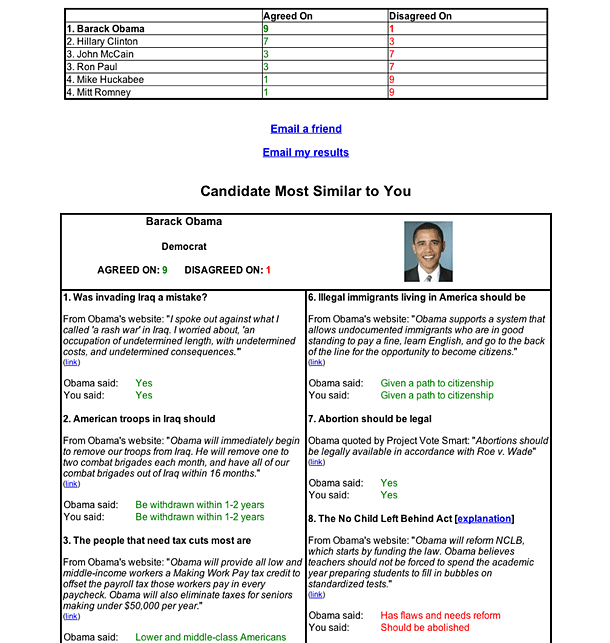
A friend sent me the link to VoteChooser to remind people before the primary to vote. The site consists of a single page wizard that asks you 10 questions about where you stand on political issues. The results page shows how your position aligns with those of presidential candidates in an attempt to help the undecided discover who might be the best person to vote for.
I hesitated at posting this with my results, because I don't want to make a political statement, but its useful to see how this simple questionnaire is very effective at helping to do a simple research task like figuring out what candidates stand for. The comparison and rank order is really quite an effective tool, and putting up something as simple as this combined with a voter registration form in kiosks at post offices, libraries, and shopping malls would be a pretty effective tool to help apathetic and uncertain voters. Individuals could take the poll and print out their results to take home with them.
The next thing the producers of this site might display to make a kiosk of this sort interesting are some statistics and a visualization for how the rest of the country answered these questions.
AOL Music Desktop Video Widget
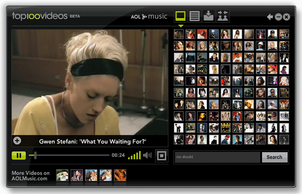
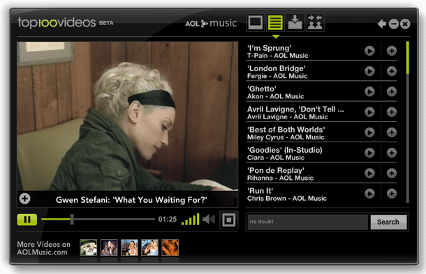
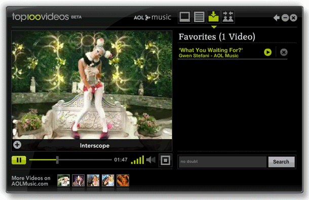
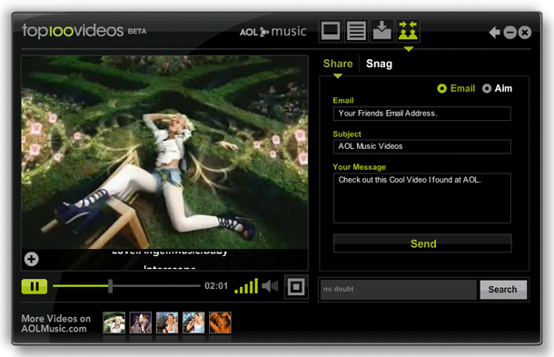
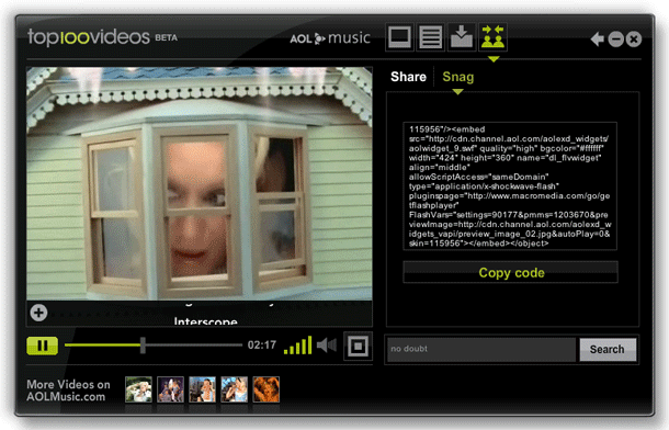
AOL's Desktop Widget is standalone video player (Adobe AIR application) that runs on the user's computer. The video player allows users to browse and watch the top 100 AOL Music Videos without having to access their web site. The player provides typical functions including playlisting, favoriting, sending to friend, embedding.
Oranges Contact Form
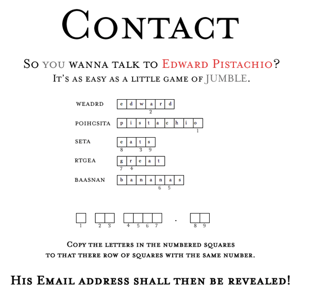
Edward Pistachio is a writer pulping fine short stories. Consistent with the lighthearted tone of this site, he provides a contact form that is also all about words. Getting his email address requires solving a few jumbles, and then decoding the address from letters found in the jumbles. Sure it may be frustrating if you can't figure out the jumbles, and is one of the cleverest ways I've ever seen to gain access to a bit of info. And you can always Google jumble solver if you're lazy like me. One thing that might make this even better is a validation check on each of the jumbles. Otherwise a very fun idea.
Kayak Filtering
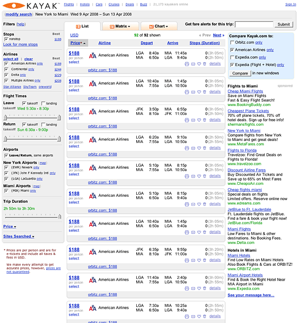
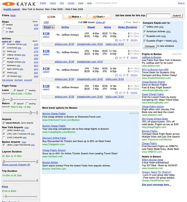
Kayak provided one of the earliest examples of using AJAX to provide data filtering controls and live refinement or filtering of results. Their slider controls remain one of the best examples of how AJAX can be used to make filtering visual and intuitive. Sliders allow users to narrow down search criteria including flight duration, takeoff/landing time, and price.
Roost Filtering
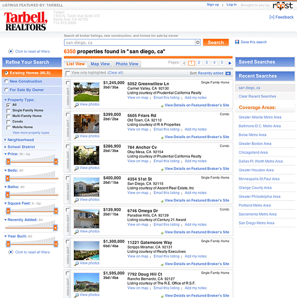
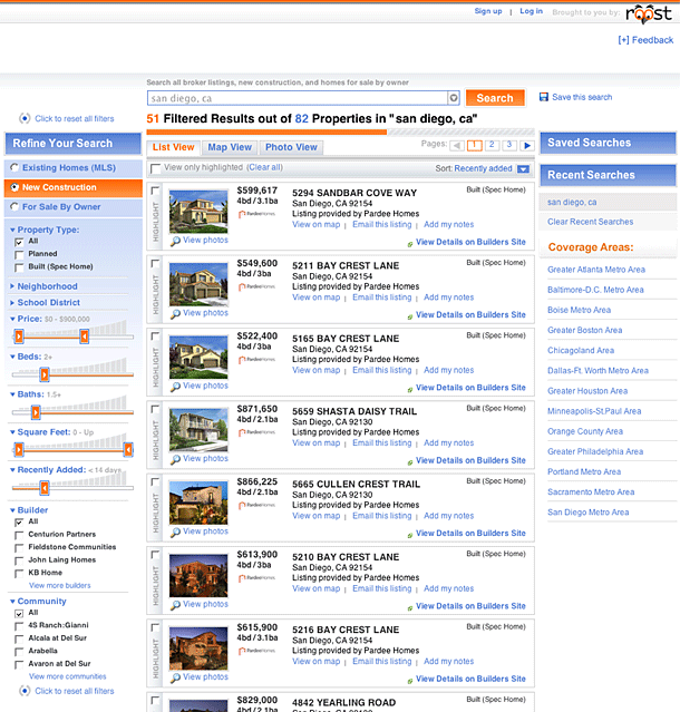
Roost is a real estate search engine that provides full MLS listings. Their AJAX search refining filters are very similar to those provided by Kayak's travel search. The slider controls provide a visual method for narrowing down search criteria and results are updated immediately.
Moody Tags
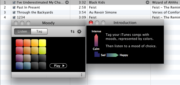
Moody provides a visual tagging interface for music played on iTunes. A 4 x 4 grid of colored squares provides the clickable UI for describing the mood of music tracks along the vertical axis as calm to intense, and along the horizontal axis as sad to happy. Great concept and quite easy to get after a few tries. With tracks tagged by mood, you can later play them back by selecting clicking the listen tab, and selecting as few or many moods as you would like, and finally click play. Moody works by simply adding tags to the tracks' comments field and creates playlists when you select a new set of moods to play.
Nike Faceted Navigation
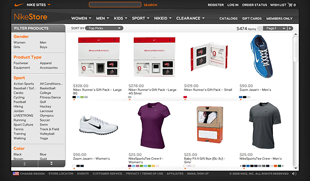
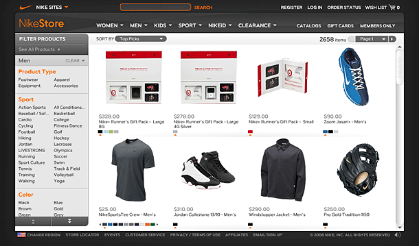
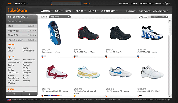
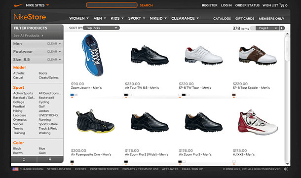
The Nike Store provides an excellent faceted navigation for narrowing product listings by sensible facets including gender, product type, sport, color, and price. The site skins the faceted classification tool provided by Endeca, which allows the user to select a product attribute of interest under any facet, and continually provides feedback about the attributes in other facets that can be used to narrow your choice of products down. Nike's Flash-based implementation is appropriate and useful, and ranks among the best examples of faceted navigation you will find on either commercial or academic databases.
http://www.nike.com/index.jhtml#l=nikestore,home&re=US&co=US&la=EN
Kaltura Video Editor
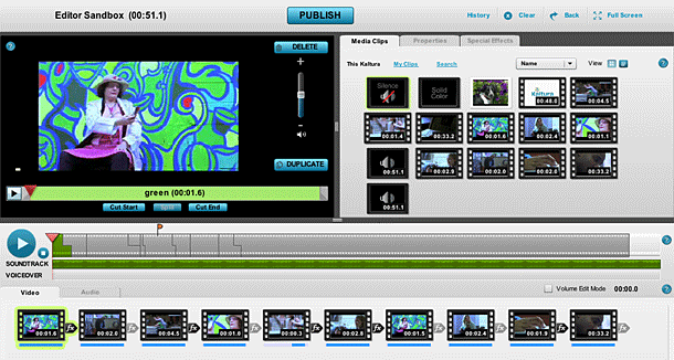
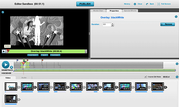
Kaltura's Flash / Flex video editor mimicks a full-featured video editor like iMovie. The company's product allows its users to add video to a collaboratively created work. The editor features nearly all of the features you would expect from a video editor, but delivers the entire interface via the web. Features include organizing clips from a media library, adding titles, transitions, and special effects, and adding and controlling soundtrack and volume.
Fancast Rating (Hulu Player)
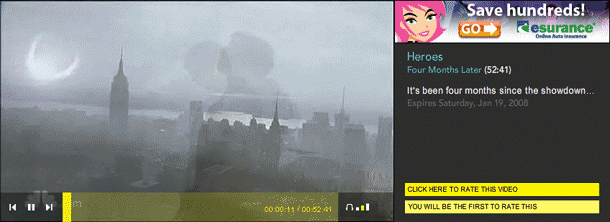
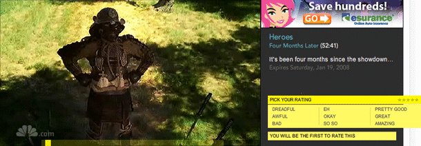
The Fancast experience for the Hulu video player provides a customized rating widget that differs from the straight-forward star rating on Hulu. Users select a text value that gets converted to stars.
TED Ratings
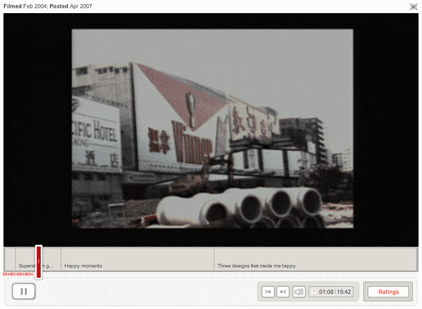
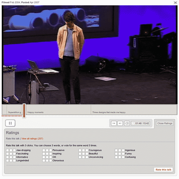
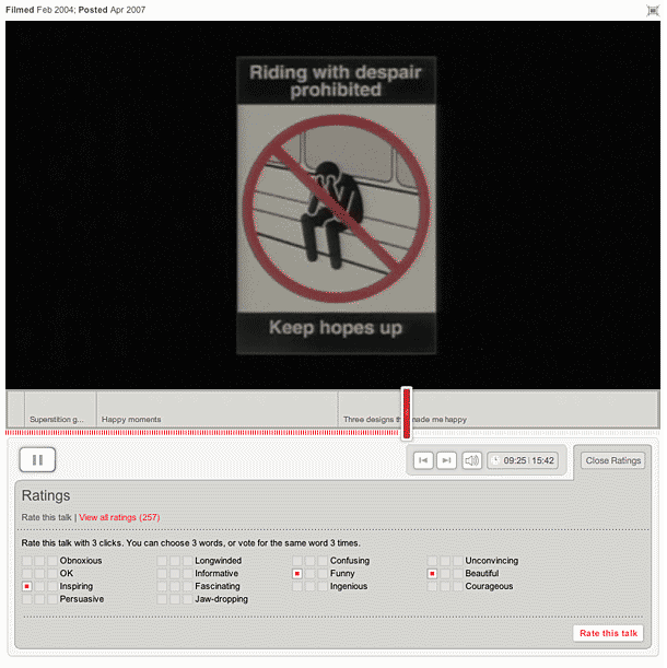
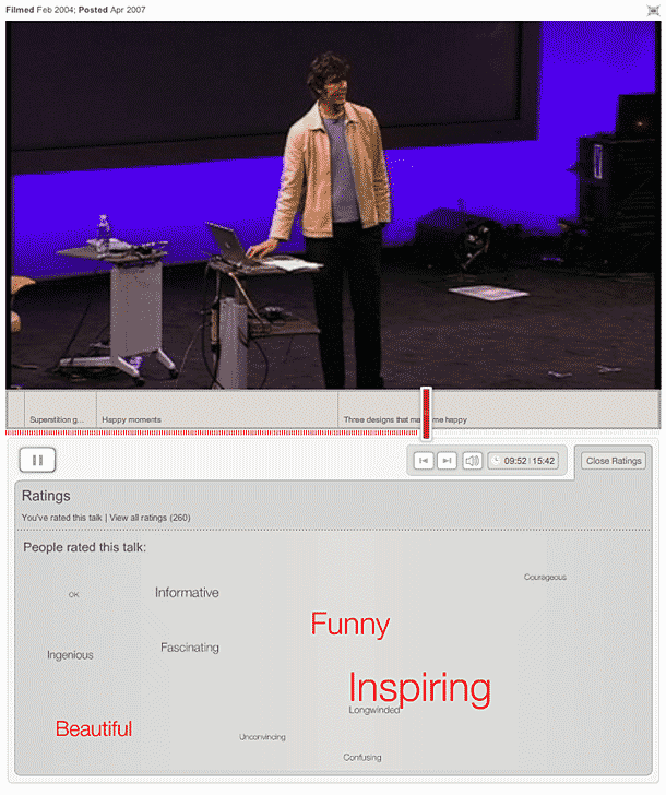
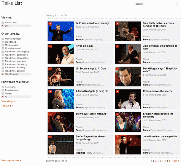
I was a bit confused the first time I saw this rating interface, and have to admit that I ignored it for months. The thing that threw me was the multiple checkboxes offered for each value. But I came back and realized that what this was doing was giving you a pre-defined set of tags which it was then using to create a filtering mechanism for the site. I appreciate that. I think it could be streamlined a bit by implementing those checkboxes differently.
Tubetorial Form Labels
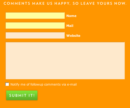
By flipping the convention of labels on top or to the left of the inputs, Tubetorial provides a nicely aligned solution. We're accustomed to reading top to bottom and left to right, so it's a bit strange to have the label and input reversed this way. This works mainly because there are few inputs in a compressed area, but this might not be as efficient on large forms.
WEB2RSS Form Labels
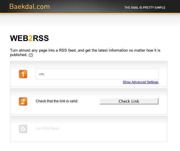
It's interesting placing the label inside the input. The form fields align nicely, but I imagine the alignment of the actual text you enter wouldn't work as well with multiple inputs. Since there is only one text input here, this works to some degree.
YouTube Explore Related Videos
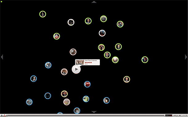
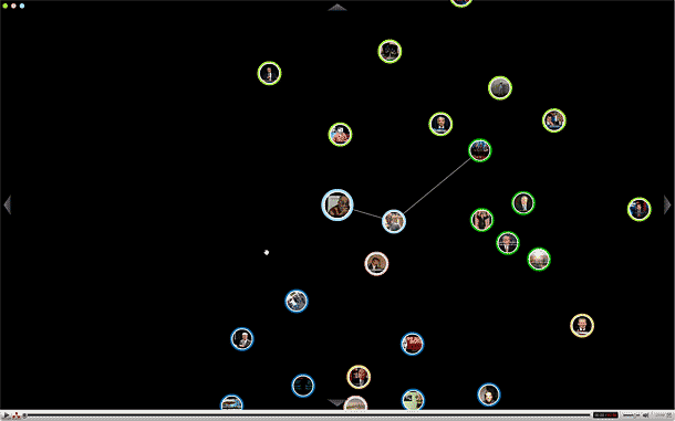
YouTube's exploring functionality in the full-screen video player allows users to directed exploration of related videos.
1) Clicking the explore button in the lower left brings up related videos visualization, which is sort of like a digraph that looks like a constellation of stars.
2) Circles in the center are videos. Hover over one circle expands to show you other videos related to that one, forming a cluster. Click a circle to watch a video.
3) Circles in the upper left corner indicate the clusters you've explored. Clicking on a circle returns you to the related constellation, focused on the cluster you click. Constellation shows the path back to the original video--what relates the video you're now watching to the video that started your exploration.
iStockPhoto Tags
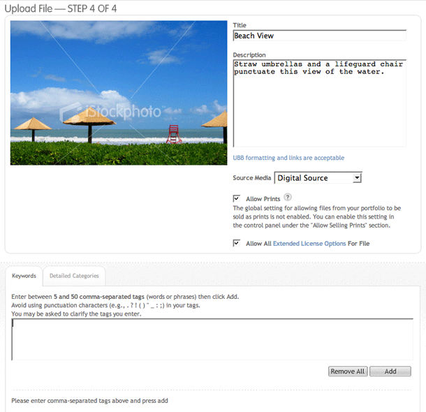
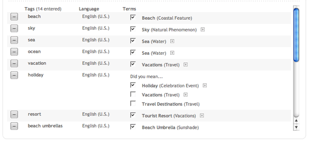
iStockPhoto provides an interesting way of mapping keywords or tags to the controlled vocabulary the site uses. This makes a lot of sense in a site that wants people to be able to browse for concepts, themes, and subject matter with a high degree of relevancy. Curiously, they refer to the keywords as tags on the review screen when the term "tag" isn't used on the site as of this writing.
Hulu Faceted Navigation
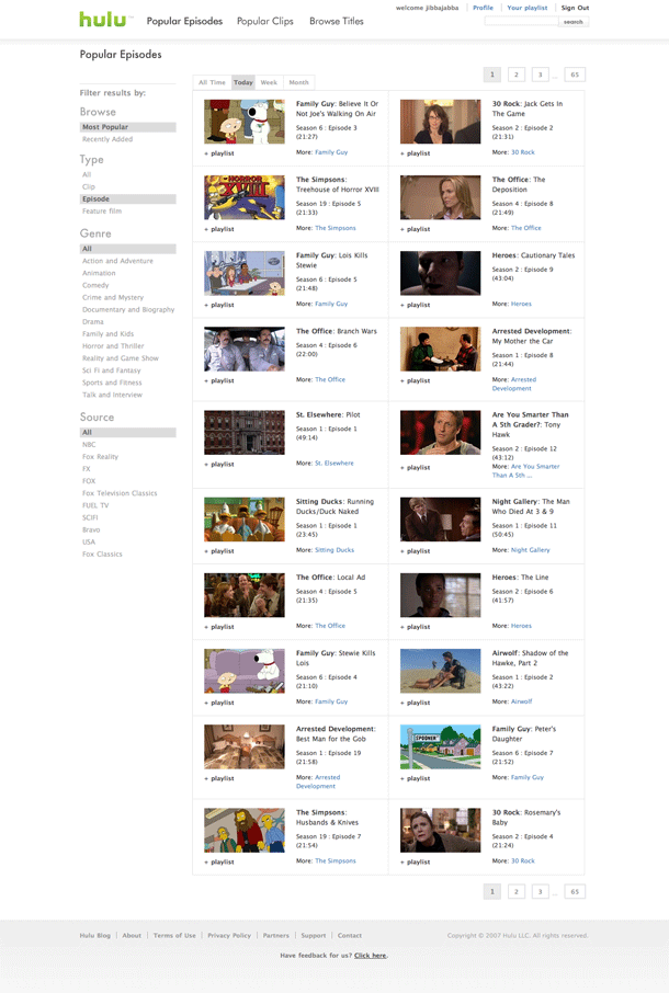
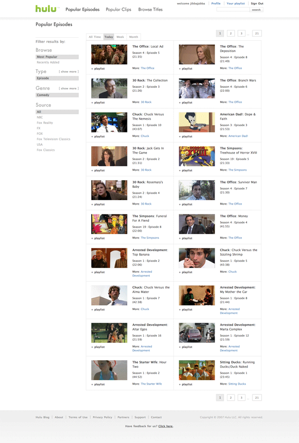
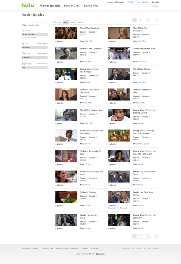
Hulu provides a nice faceted approach for browsing clips and episodes.
http://hulu.com/videos/views/thumbs/all/clip/all/all/today/1
4 Hour Work Week Login Screen
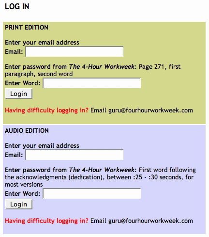
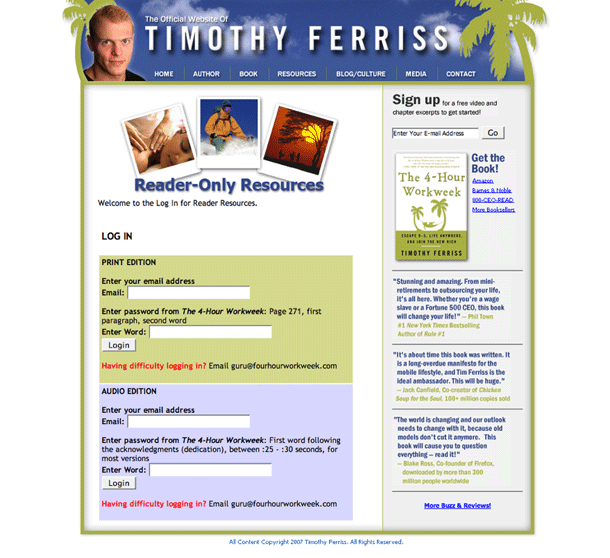
The clever login screen for Tim Ferris' book site uses words from the book or audiobook as the password for entering restricted areas of its resources section.
Amazon Registration and Login
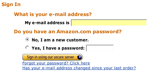
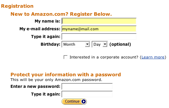
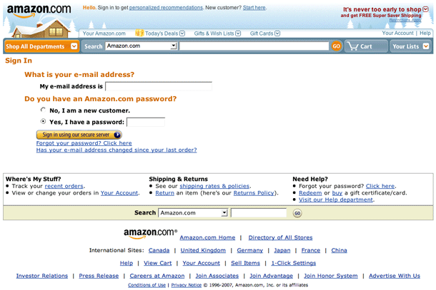
Amazon's login and registration screen is the standard by which other login screens are measured. The simple flow consists of: 1) entering your email address, and 2) entering your password. If you are a new customer, simply select the new customer radio and the follow up screens provide the registration flow.
Basecamp Registration
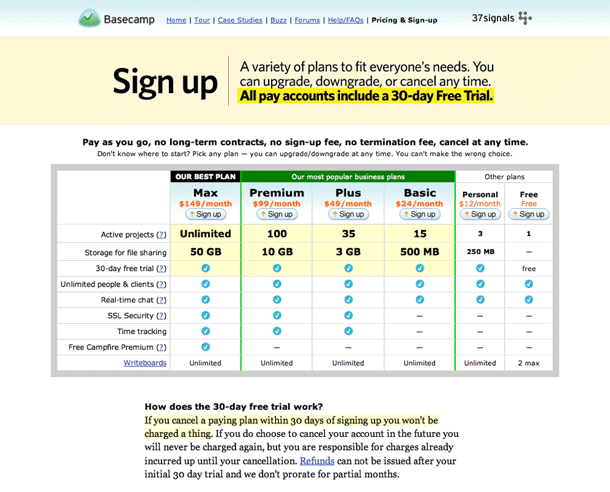
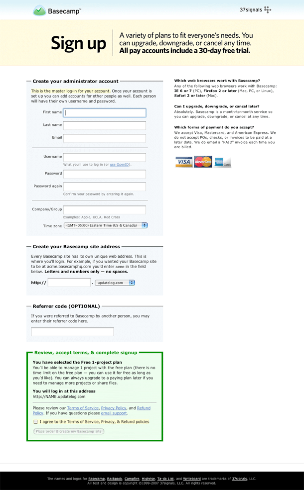
Starting off from Basecamp's sign up page, you pick your plan option, then fill out their form.
The form is clean and simple. Inputs and labels are aligned well and there is a logical chunking of sections of the form. I like the simple hairlines between chunks in the top area.
One of the nicest things about this entire experience is the starting point where you select your plan. The user may return to this page at any point to upgrade, downgrade or cancel their plan. Their options are always available and clearly defined without any difficult obstacles to making changes.
Digg Captcha
Digg's captcha input has nice conversational labels. Sadly they've redesigned the registration form so that the nicely chunked form areas all flow into one block.
Google Registration
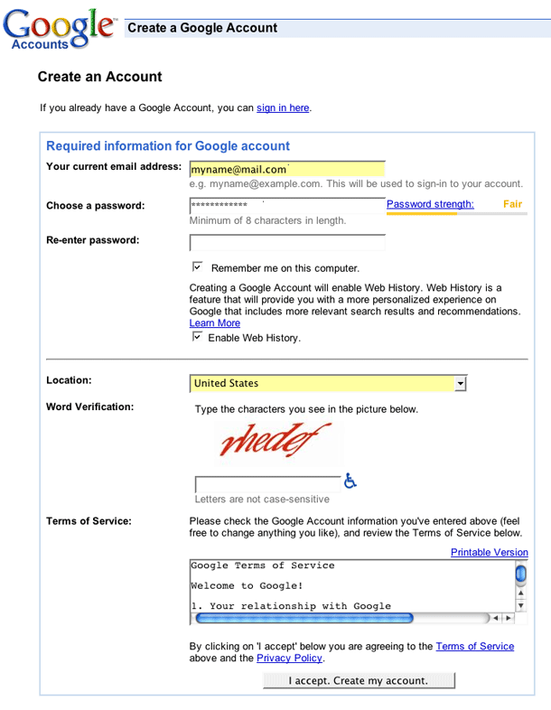
A quick and simple registration form that's compressed into a small area. The labels could be right-aligned for better readability in that 2 column format and the submit button could be aligned left with the inputs to really clean this up.
Hulu Registration
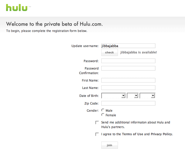
Simple registration form. No captcha in this form, although that could change when they get out of private beta. Having to click the check button seems unnecessary. A javascript check on blur would be better. This form might benefit from a little chunking, e.g. simple hairlines between some fields.
Netflix Registration
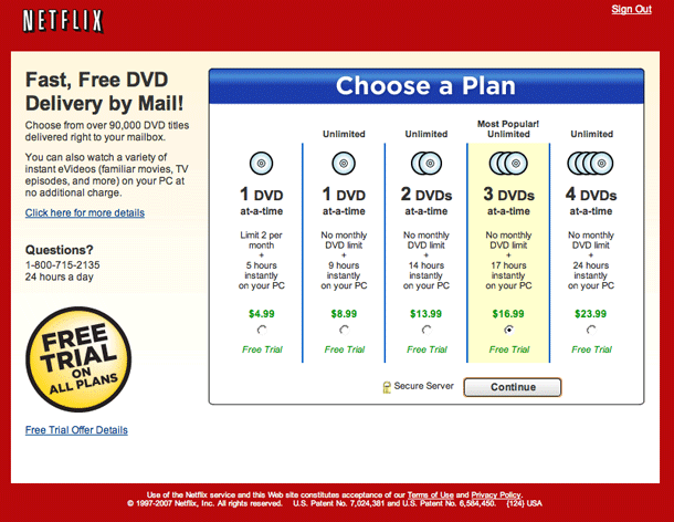
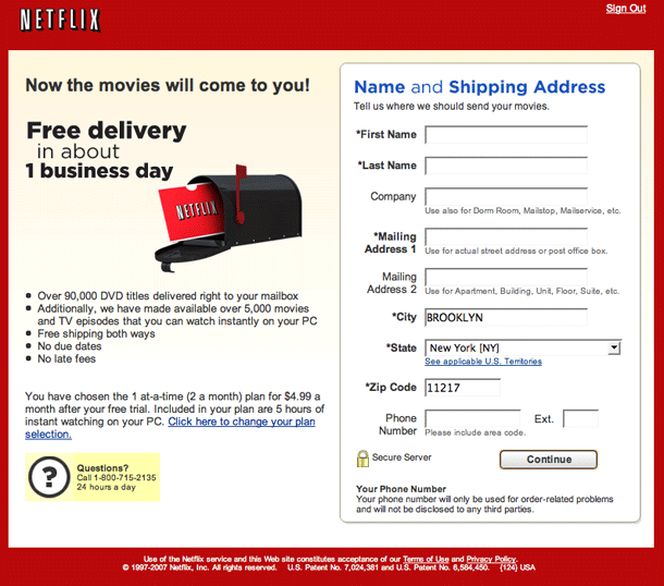
Registration at Netflix is a multi-page funnel. Form fields are laid out very well, and the flow is pretty simple considering the huge amount of text that surrounds the form. After entering your info, you can begin entering your genre preferences or search for videos to start adding to your queue.
Photobucket Registration
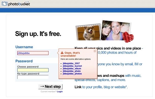
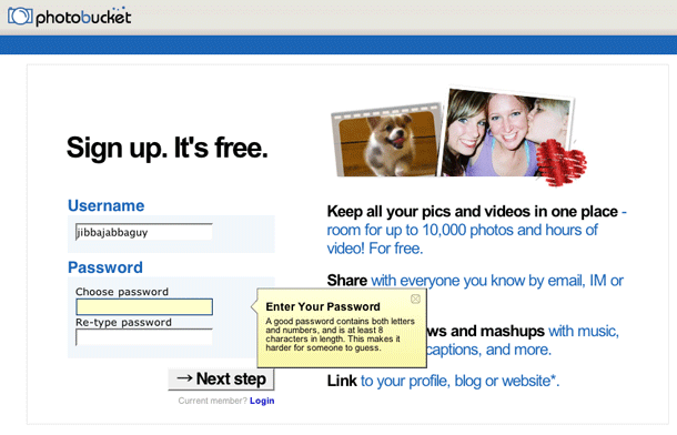
Registration couldn't be simpler. 3 fields: enter a username and password twice and you're done. No captchas. Oops, is that screenname unavailable, well let's get alerted right away before you go on. Nice.
Sidebar Creative Contact Form
The contact page for this design agency features a clever use of an AJAX slider to allow potential clients to for entering their budget in the range of 10K to 500K. Interesting that the slider increments in 25K's up to 100K, then increments in 100K's. Once you get them on the phone, I suppose you can give them your real budget. Maybe that helps eliminate small jobs?
Yahoo! Registration
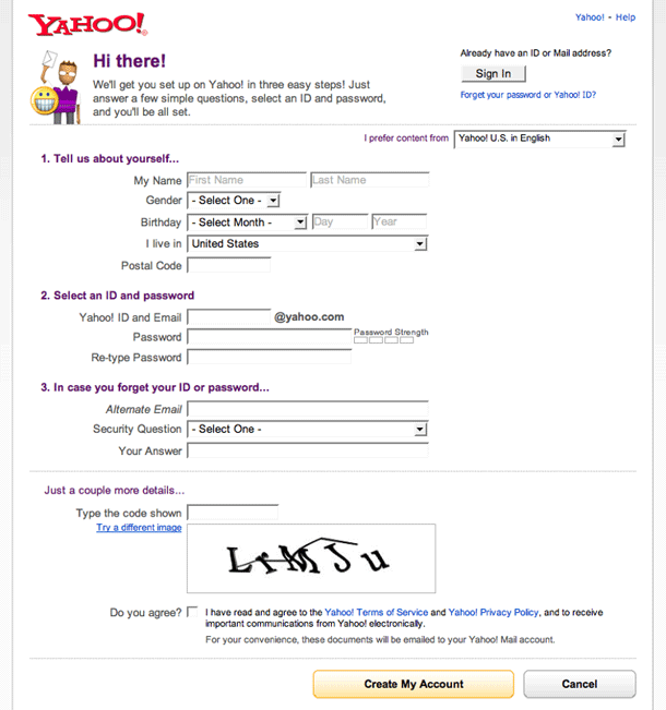
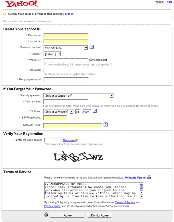
We happened to catch the Yahoo! registration pages when they were being redesigned in 2007. The first version was captured in November 2007 and the second is the prior version. The redesigned version is subtle, but really improves the user's flow through the form. It compresses the vertical height of the form and uses more conversational labels.
