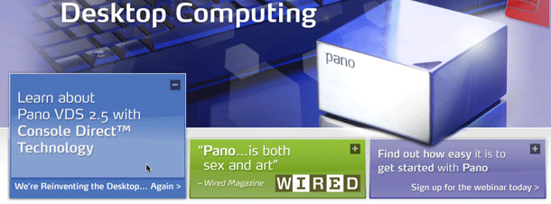
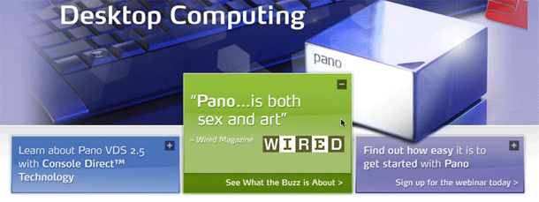
Pano Logic sells a simple network PC. Their product site features a large graphic of the product, and 3 simple informational modules at the bottom to find out more about the product, read reviews and press, and watch a demo webinar. The modules expand when the user hovers over each box. There isn't much information added, except for a call to action that tells the user a little more about what they'll see if they click the link.
Very simple expand/collapse transition that can be used to highlight a call to action and display more below the surface.


