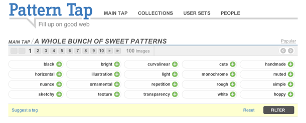
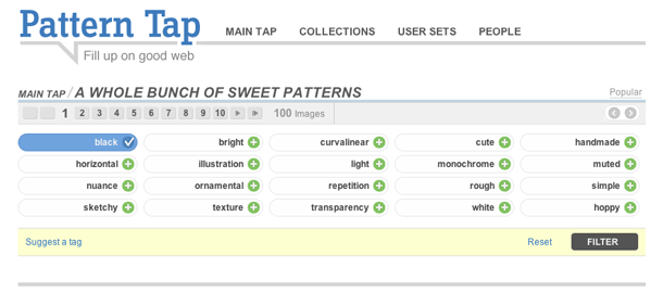
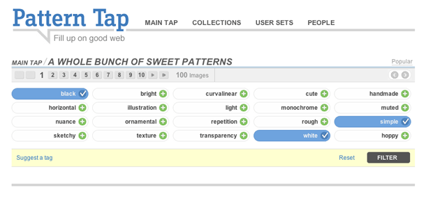
Pattern Tap, an interface and visual design gallery, provides a UI for filtering using tags. Best case scenario would get rid of the filter button and also updates the set of available tags to indicate those that can be combined with the current selection (e.g. dim or hide tags that can't be combined with my selection "black AND white" AND simiple." Often times in interfaces that provide filtering based on all available tags or index terms, if the filtering UI doesn't update to reflect those terms that may successfully combined, the user is led down a path to an empty set. del.icio.us is one example I can point to that prevents this error. I really like the execution of this interface on Pattern Tap, but would love it if that added logic were there.
3. Several more tags added. Clicking a selected tag removes it. A filter button submits the selections.


