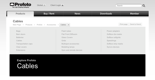
Profoto's take on the breadcrumb combines expanded menus for each branch to provide a drill-down method for navigating siblings, aunts, great-aunts, etc. It basically exposes the hierarchy of siblings at each level, and it's really most useful when you've navigated deep into a hierarchy.
It can get a little weird when you use these, because you have to remember that you're viewing siblings in the branch you're exposing. If you look at the last screenshot for the "Products" siblings, you see that Products is listed there along with the other top-level categories and miscellaneous stuff. But in the second screenshot under the "Profoto" product, I see what I think are children of Profoto, rather than it's siblings. Possibly because Profoto is the only product? I don't know.
I like the implementation of this hybrid breadcrumb/navigation menu, but I think I got lost because of the information architecture. Things need to be exceedingly simple for me to make sense of a site's content and what threw me off was my own IA perspective. If you're going to feature IA as part of a hierarchical navigation control, the IA should really be well organized to reflect hierarchy. Otherwise, forgo hierarchy and find a better way to point users through contextual links in the body, or perhaps treat the final node differently and break it out of the breadcrumb. Or maybe I'm just confusing myself because of my purist ideas about these kinds of things.


