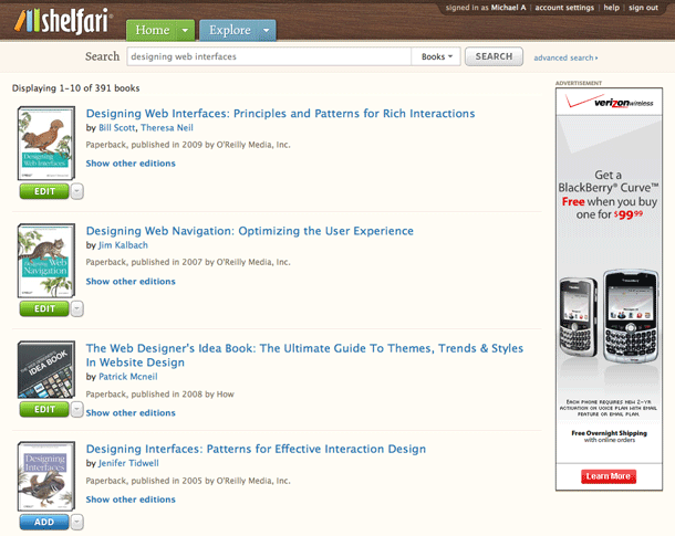
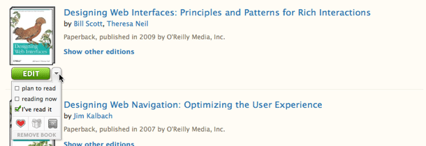
We covered Shelfari's hybrid button in their list views of bookshelf items. That example showed a single push button with an attached icon for drop down menu. The single button allowed for the use of a default behavior, while the drop down arrow allowed for the display of other options for the item. The drop down menu allowed users to make multiple selections, i.e. using checkbox behaviors, rather than just select one value in the drop down list.
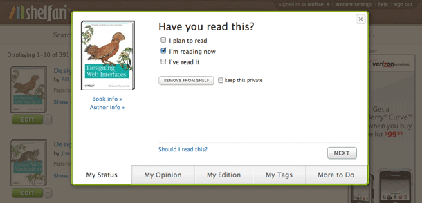
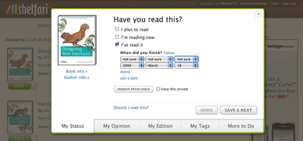
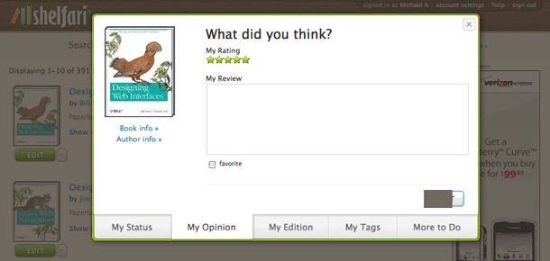
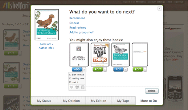
Timothy Gray reported that they did some usability testing on the feature and made some improvements to try to help users with what was perceived to be "overloaded." To this end, they've separated the default button, which now shows an "Add" or "Edit" state, depending on whether the item is in your shelf. Clicking Add toggles the button to Edit. Clicking Edit now displays options in a dialog with pagination and tabs to step through the options.
The old drop down feature of the hybrid button is now placed in a separate drop down button. I'm still not sure why there's a need for checkboxes here. Radios for single selection might be even simpler. Am guessing they're trying to address an edge case where someone has read and is now re-reading? I wonder if they can simplify that. I do like the little chicklet button bar at the bottom.