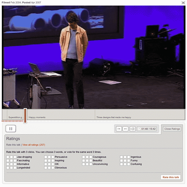
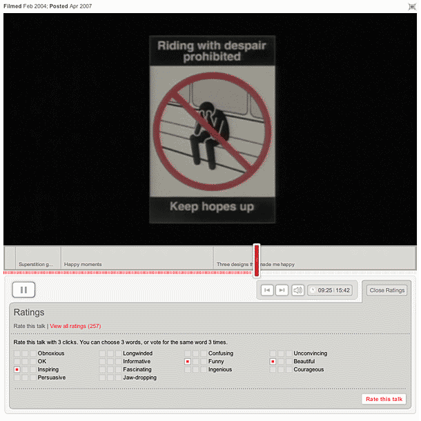
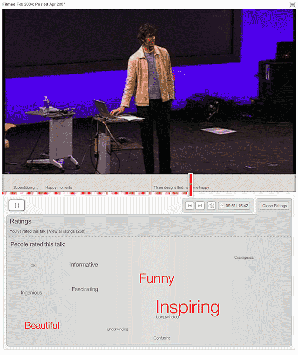
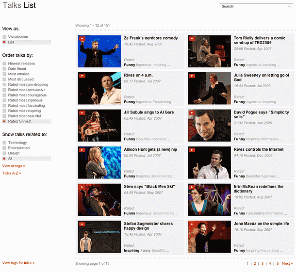
I was a bit confused the first time I saw this rating interface, and have to admit that I ignored it for months. The thing that threw me was the multiple checkboxes offered for each value. But I came back and realized that what this was doing was giving you a pre-defined set of tags which it was then using to create a filtering mechanism for the site. I appreciate that. I think it could be streamlined a bit by implementing those checkboxes differently.
Published on Thursday, Jan 17, 2008 in interfaces
