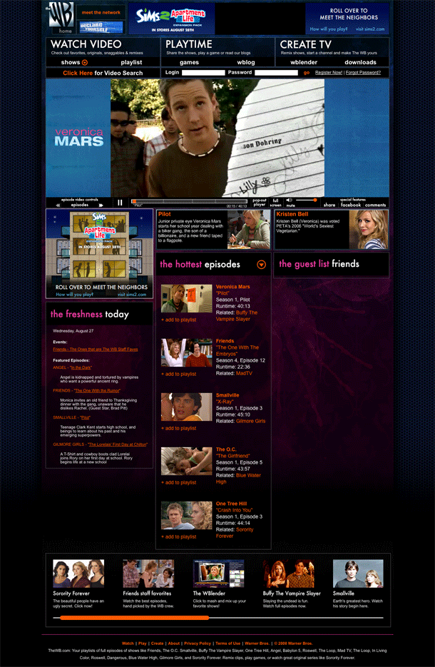
The WB brings its video site to the masses of OC and Friends fans and adds another network portal into the mix with Hulu. In terms of visual appearances and the high level navigation (IA), TheWB.com feels like the polar opposite in sensibility to Hulu's pared down appearances and very usable directory structure and show pages. On Hulu, once you arrive at a show page, everything you can watch whether it be a full episode or clip, is neatly organized and presented on the page. TheWB, while lusciously designed gives you a harder navigation experience.
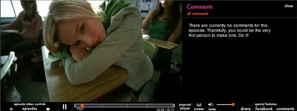
The video player, on the other hand, is quite nice and easy to use. The sharing and commenting tools slide out a right-side drawer and push the player to the right of the stage area. The transition is slick. They also offer video clipping like Hulu. Unlike Hulu, TheWB's clipping controls move the screen with the playhead. We expect that Hulu will fix that one day. No one seems to have perfected this interface yet, but it's a nice option for users who like to embed and share.


