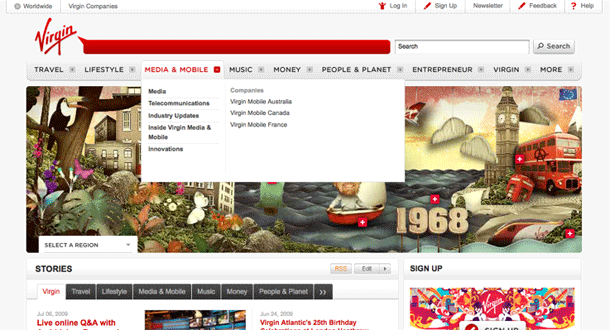
The Virgin.com redesign sports a header that provides a boatload of functionality using mega fly out menus: locale selection, micro-site navigation, registration, login, and newsletter signup. I like that they make these options readily available wherever you are on the site. The longer drop downs like the registration form, for example, seem a little long for users on smaller screens, e.g. netbooks.
1. The global navigation bar provides mega drop downs with sub-nodes and links to their subsidiary companies that provide products and services under each category.
2. The login form is a simple drop down, with a link to register on a separate page.

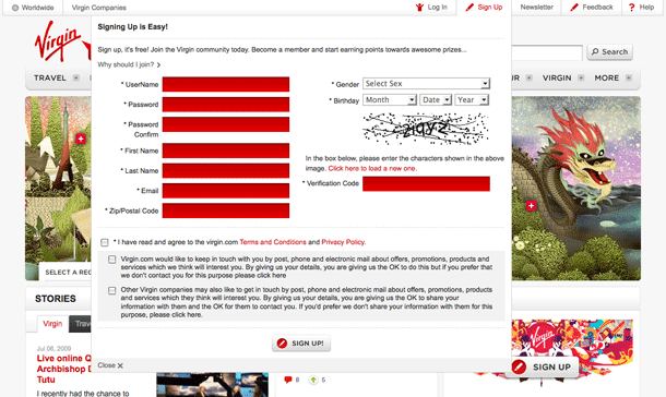
3. The Sign Up drop down provides the full registration form in a big drop down.
4. Clicking Worldwide provides options to view the site for your geographic region. This option is also provided in the Flash hero below the navigation.

5. The Virgin Companies link provides navigation to micro-sites, and remains consistent as you navigate from site to site.