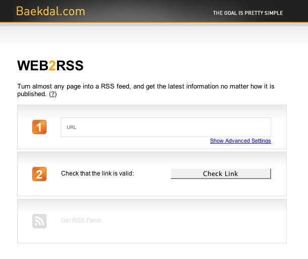
It's interesting placing the label inside the input. The form fields align nicely, but I imagine the alignment of the actual text you enter wouldn't work as well with multiple inputs. Since there is only one text input here, this works to some degree.
Published on Thursday, Jan 3, 2008 in interfaces
