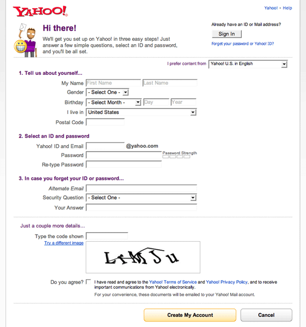
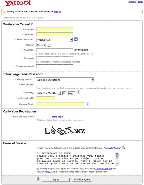
We happened to catch the Yahoo! registration pages when they were being redesigned in 2007. The first version was captured in November 2007 and the second is the prior version. The redesigned version is subtle, but really improves the user's flow through the form. It compresses the vertical height of the form and uses more conversational labels.
Published on Tuesday, Nov 27, 2007 in interfaces

