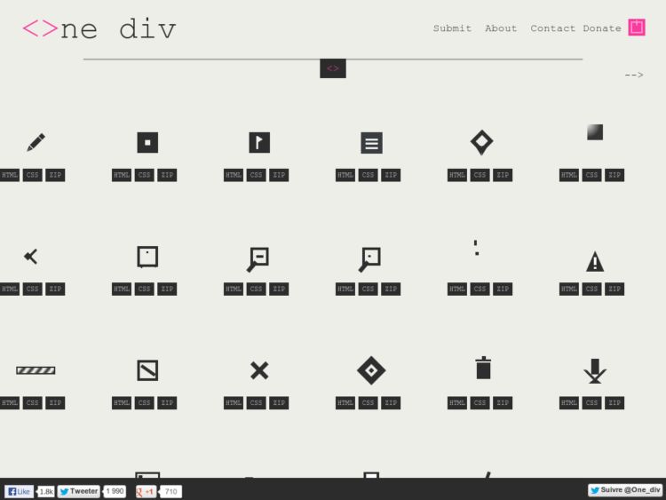
One Div is a library of icons that are realised in pure css with only one html div as an alternative to SVG. Icons allow precise borders even when resized—same as one would expect with vector icons.
Links
Rabbit holes for procrastivity.
Reflector.app: iOS AirPlay mirroring to computer
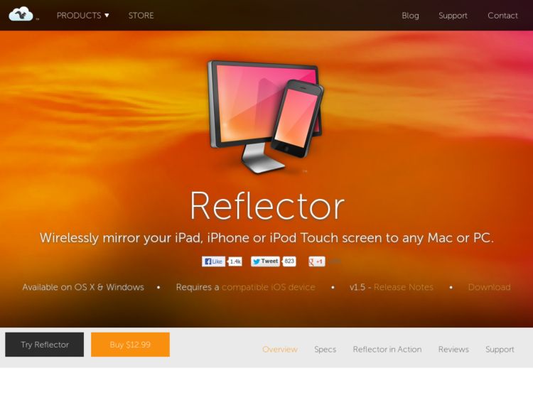
Reflector lets you AirPlay mirror your iPhone 4S, iPad 2 or the new iPad to any Mac or PC, wirelessly, for development, presentation, and testing.
@dakotareese tipped me that some users report problems using apps that hack into Airplay. More info here.
Via 90poe
Call Recorder for Skype
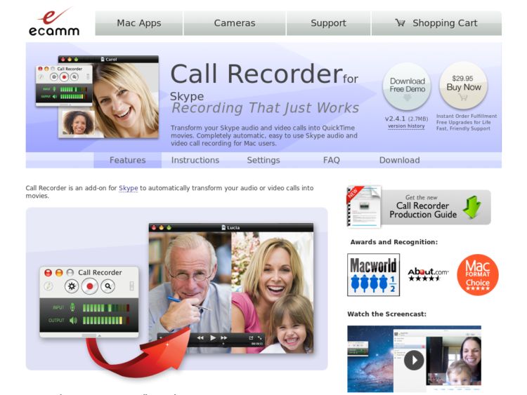
ecamm's Call Recorder for Mac captures audio and video to save Skype calls as QuickTime movies. Useful for user interviews or screensharing sessions.
Thanks to Thomas @vanderwal for the tip
POP: Prototyping on Paper
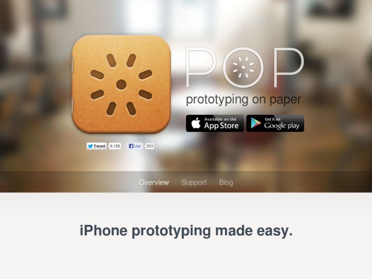
POP is an iPhone app that lets you take pictures of your sketches, and map areas on each screen to create simple click-through prototypes.
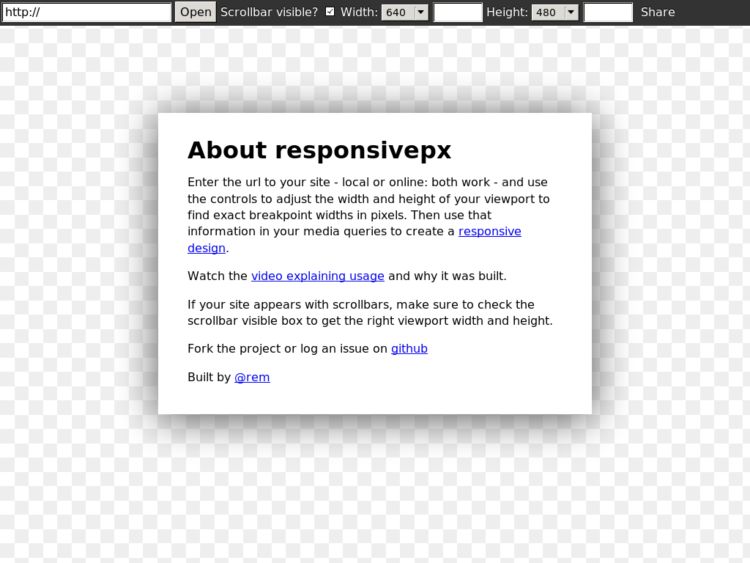
responsivepx
Responsivepx allows you to enter the url to your site (local or online) and use the controls to adjust the width and height of your viewport to find exact breakpoint widths in pixels. Then you can use that information in your media queries to create a responsive design.
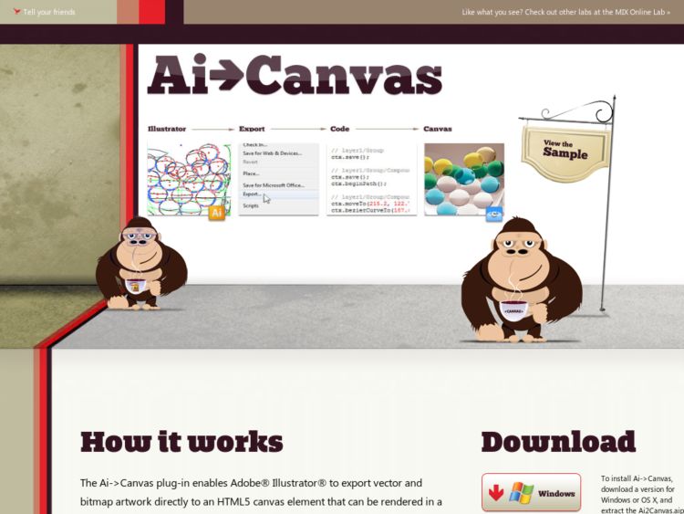
Ai to Canvas Plug-In
The Ai->Canvas plug-in enables Adobe Illustrator to export vector and bitmap artwork directly to an HTML5 canvas element that can be rendered in a canvas-enabled browser. The plug-in provides drawing, animation and coding options such as events so that you can build interactive, well-designed canvas-based web apps.
The Printed Word and The Written Words fonts from LettError
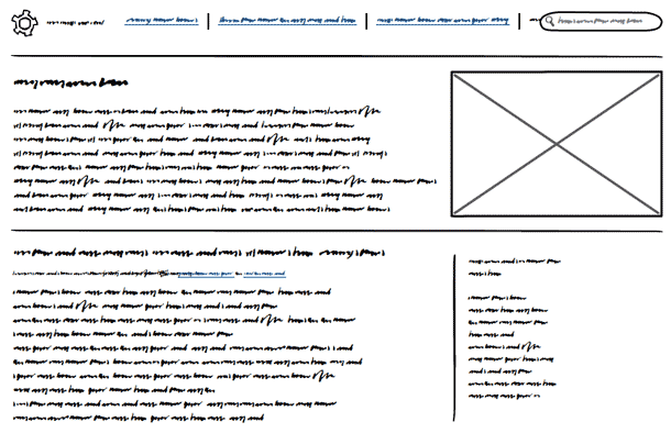
2 different fonts to turn text to obscure your copy in design documents so they don't distract the audience. It's an alternative to using real text or lorem ipsum. Download for free.
Thanks to Ryan Schroeder (@rschroed) for pointing me to this.
IPEVO Ziggi Review
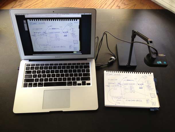
Have you ever done the dance of holding a sketch up to your computer's webcam or taken pictures of them with your iPhone to email to yourself or to colleagues? I've done that sort of thing for all of the years that I've worked remotely on design and development teams, because scanners get tired real fast.
Frustrated with this process, I had largely given up, until a few months ago when I was looking for tools to share work on paper between students and teachers. I stumbled upon the $89 IPEVO Ziggi USB Document Camera and have been evaluating it for a few months now as a tool for design collaboration.
I've been finding it easy to use for both shooting sketches for sharing in other apps, and for capturing and reviewing sketches with remote users using a screen-sharing tool like Skype. I now also believe it could be useful for other tasks including video capture for usability testing on mobile devices, and even presentations like one would do with an old school overhead projector.
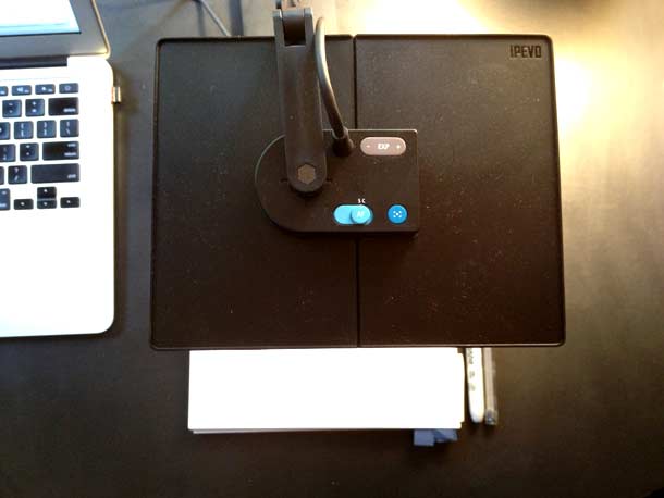
The compact camera folds down and fits in a small bag. It comes with a posable arm to adjust the camera height, a rotatable camera head, an anti-glare shield, and the P2V software is used to display the video on your screen or to a projector when in fullscreen mode.
The camera includes buttons to adjust exposure, a focus button, and a switch to set autofocus on or off. These functions can also be controlled via the software interface. The software additionally provides a focussed mode for capture, a thumbnail view for review, and the fullscreen view.
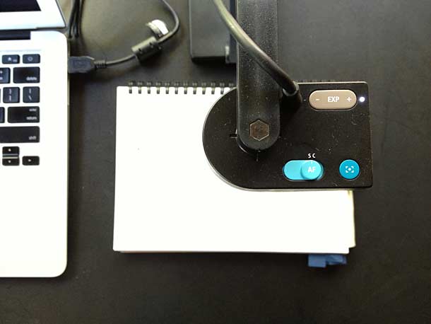
This is a closeup of the camera with the foldable anti-glare shield which can be used when capturing back lit devices like a smartphone or tablet screen. If you were to record an iOS device screen, you would keep this attached.
Here's a low-resolution video I took of me sketching that you may have seen in a presentation I gave. It's pretty low quality because of the movement and video compression since I used it in a presentation.
Sketch Basics from konigi on Vimeo.
The camera itself has a 2.0-megapixel CMOS sensor with auto-focus and is capable of 30 fps live video capture (at 640 x 480). Still shots can be taken up to 12.2" x 9.1" (310 x 230mm) and offer resolutions up to 1600px x 1200px.
You can use the camera as an input for third party software like Skype or Google Talk, although you'll lose some capture capabilities. If you're capturing a test session you're most likely want to screen capture the session with another app like Silverback or Screenflow. I'm also using the new Evernote page capture feature a lot with the Moleskine, but could see this device being a better alternative at a desktop.
Overall, I'm really pleased to have this as one of the few tools in my design arsenal. There are few that stay, but this one is turning out to be as useful as I'd hope it to be with little fuss.
Whitelines Link
Everyone's getting in on on the physical paper capturing game using the iPhone's camera. Whitelines is one of my favorite sketch paper makers. They make great graph paper that reverses the grid using white lines over pale a gray paper. The result is that the grid it more subtle and less distracting
The Whitelines Link product is a free iPhone app that let's you capture sketches made on their new Whitelines Link papers. Position the phone over your paper, the app recognizes and aligns with the squares in the corners, and automatically captures it. You can then save your picture to Dropbox or Evernote or share it via email. If you check a box in the bottom of the sheet, and set a preference on the app, it will send your sketch to your preferred sharing destination automatically. You can even route them to a folder in Dropbox and label in Evernote.
Whitelines sells notebooks with the new sheets, but you can also download sheets for free in A4 and A5 sizes. Find out more here.
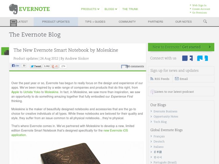
Evernote Smart Notebook by Moleskine
I've tried a lot of tools for transferring sketches from analog sketchbook to digital. I was an early Pen-It user, have used page cutters with a scanner, and have lately just resorted to taking photos with my iPhone. The Evernote/Moleskine Smart Notebook looks like it might provide the right mix I'm looking for.
I've given up on the idea of converting paper sketches to vector drawings. What this seems to offer is the ability to use that dotted sheet tech to correctly line up your photos taken with Evernote app, and combines that with some neat stickers that will automatically route your sketches to tags and/or specific notebooks. I can use the pens I like, and just save my work without worrying about any serious technical communication between an input device besides my phone.
At this point all I'm interested in is capturing the sketches so I can be rid of the piles of paper sketchbooks at some point. I've gone that way with Kindle books, I want to go the full route with my sketchbooks as well. If it goes well enough, I'm ready to cough up the dollars for the yearly no-limit uploading.
Available for order here.
http://blog.evernote.com/2012/08/24/the-new-evernote-smart-notebook-by-moleskine/
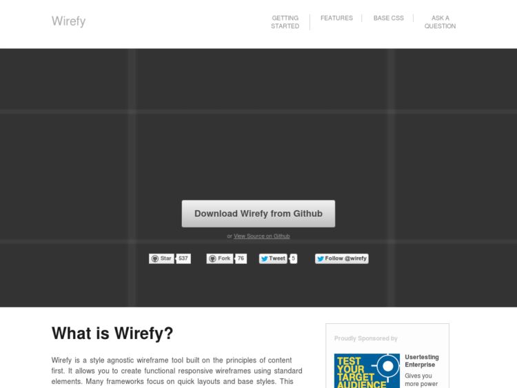
Wirefy: Responsive Wireframe Library
Wirefy is a collection of CSS and JS files for creating responsive HTML wireframes. It builds on tools including the Frameless grid system and Boostrap, and has CSS media queries for adapting to different device resolutions.
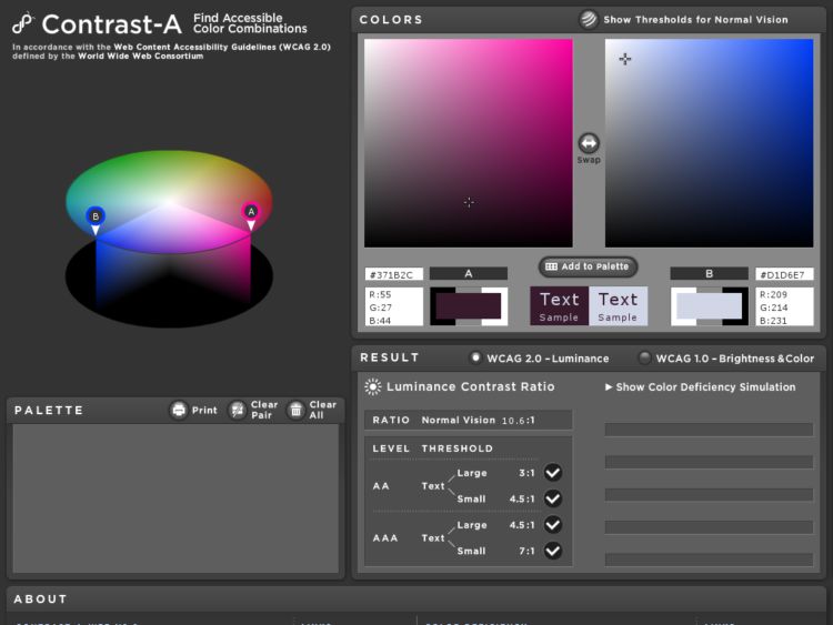
Contrast-A: Find Accessible Color Combinations
Contrast-A allows you to experiment with color combinations, examine them using accessibility guidelines and, create custom color palettes. The app checks color combinations for sufficient contrast and displays the results according to WCAG 2.0 (Luminance Ratio) as well as the results according to older accessibility guidelines, WCAG 1.0 (Difference in Brightness and Color).
Responsive Design Bookmarklet
Victor Coulon's Responsive Design Bookmarklet is a simple browser-based tool for testing your web layout in desktop, tablet and mobile phone dimensions. Save the bookmarklet, go to the page you want to test, then select the bookmarklet. It puts your page in a frame at the dimensions you want to test.
Found via Takashi Sakamoto
Buxton Collection
Bill Buxton has been collecting input and interactive devices whose design struck him as interesting, useful, or important. In the process, he has assembled a great collection spanning over 30 years of the history of pen computing, pointing devices, touch technologies, as well as an illustration of the nature of how new technologies emerge.
The collection can be browsed in HTML or via the PivotViewer Silverlight interface. PivotViewer provides a richer experience with faceted filtering, search, and hypertext links for metadata. Each device includes Buxton's photos, notes, details about the device's release date, retail value, and name of the creator.
View the Buxton Collection.
http://research.microsoft.com/en-us/um/people/bibuxton/buxtoncollection/default.aspx
Adobe Shadow Mobile Device Testing
Adobe Labs' Shadow is an application for Mac and Windows that allows you to preview and inspect your mobile website on iOS and Android devices.
After installing the software on your computer and any number of mobile devices, you can connect and pair them and all devices will be kept in sync with the web site you're previewing on your computer. This should help perform remote inspection and debugging so you can see HTML/CSS/JavaScript changes instantly on your devices.
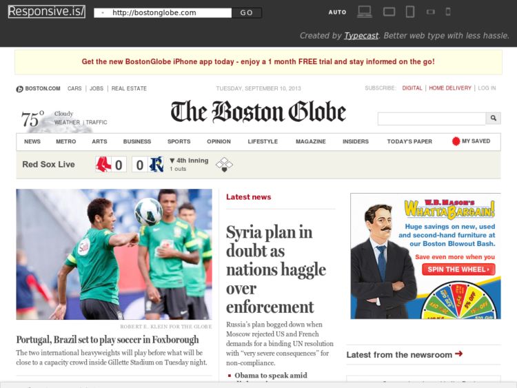
Responsive.is: Display and present responsive web designs
Responsive.is is a clever tool. Enter a URL or append one to http://responsive.is to view how the layout presents itself on the Desktop, and in tablets and mobile phones.
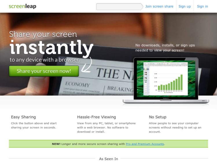
Screenleap Screen Sharing
Screenleap is a free service that lets you share your screen from any device with a browser, including tablets and smartphones. No software downloads, installs, or sign ups are required. May come in handy for people doing customer support or testing sessions where participant software installation could be an issue.
Usabilla Discover
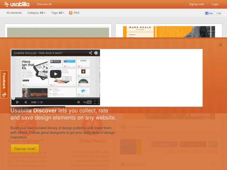
Usabilla Discover is like a mashup of Pinterest and LittleBigDetails, or maybe it's a social LittleSnapper. Whatever the pitch, it's pretty useful to share screenshots of interface and visual designs you like. Now to figure out how to get my over 2,000 screenshots into it.
Note: To get in during the beta, sign up here with code "KONIGI", good for the first 200 who use the code.
Mr. Tappy: Video rig for tablets and mobile devices
Mr Tappy is a kit for filming mobile phones, tablet computers and handheld devices from the user's point of view. Looks like a great alternative to setting up your own DIY rig, and costs $289.
Originally designed by Nick Bowmast as a filming rig for iPad usability testing, Mr Tappy lets you capture or share user interaction with mobile devices during user experience research, product demonstrations or classroom presentations. Attach your webcam and any type of mobile device, set the camera height and angle, and record.
Omnigraffle Stencil for Twitter Bootstrap 2
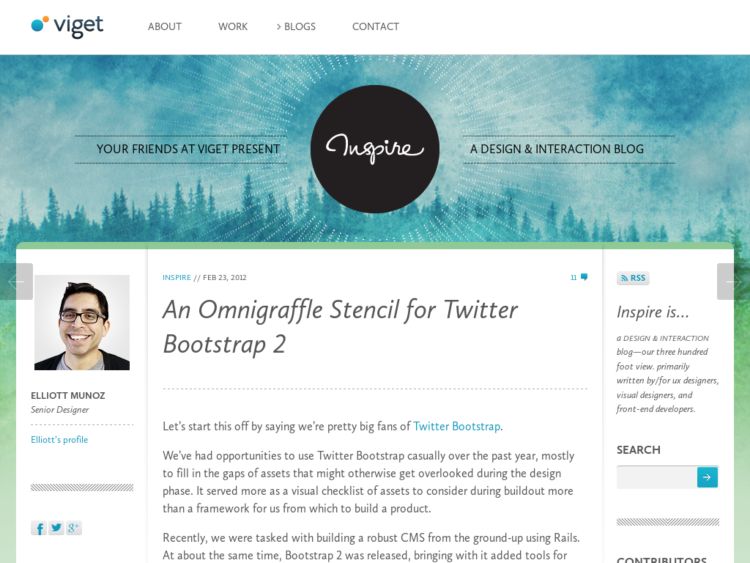
The team at Viget have created a free OmniGraffle stencil for designing interfaces with Twitter Bootstrap.
http://www.viget.com/advance/an-omnigraffle-stencil-for-twitter-bootstrap-2/
Bootstrap Fireworks
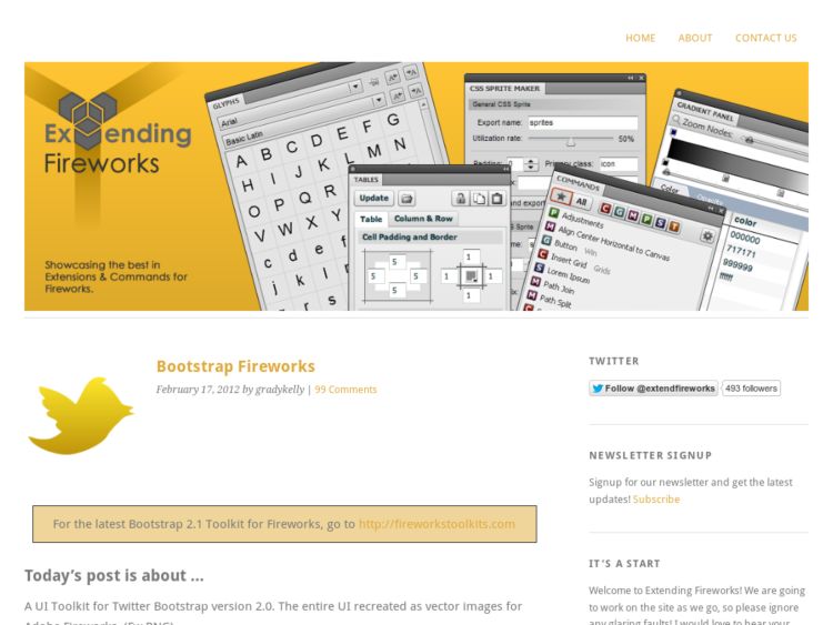
Bootstrap Fireworks a UI Toolkit created Grady Kelly for Twitter Bootstrap, the HTML/CSS/JS framework. The entire UI recreated as vector images for Adobe Fireworks. (Fw PNG)
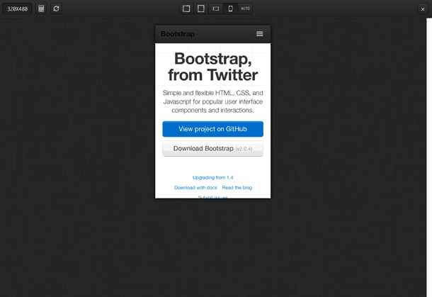
Bootstrap, from Twitter
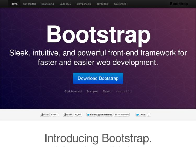
Bootstrap is a free, simple, and flexible HTML, CSS (Less Framework), and Javascript (jQuery) for popular user interface components and interactions created by the devs at Twitter.
InstaCSS: CSS Documentation Search
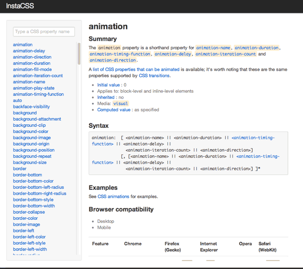
Using InstaCSS is a much easier way to look up CSS docs than Googling. Enter a CSS property in the search box, and the panel below dynamically shows matching properties. Simple. If you're a Mac user, it seems to me like it would be useful tucked into a Fluid menu item like this.
Reframer: Qualitative data analysis system
Reframer is a collaborative web app for collecting and analyzing qualitative data. You start by capturing data into the app—things like customer feedback, free text responses in surveys, emails, interviews, and usability test data. The system then uses the aggregated information and provides a view reframed with quantitative values based on a significance rating that team members apply. These values can also be used to prioritize issues to assess feasibility. The metadata additionally allows you to identify trends and themes, and show relationships in data based on correlated tags.
Looks like a fantastic way to get all of that data out of spreadsheets and into a living tool for both quick capture and simpler analysis. They offer tiered plans from free to $249. Paid plans come with 30 days free. More info here.
Sauce Labs: Cloud-Based Cross-Browser Testing
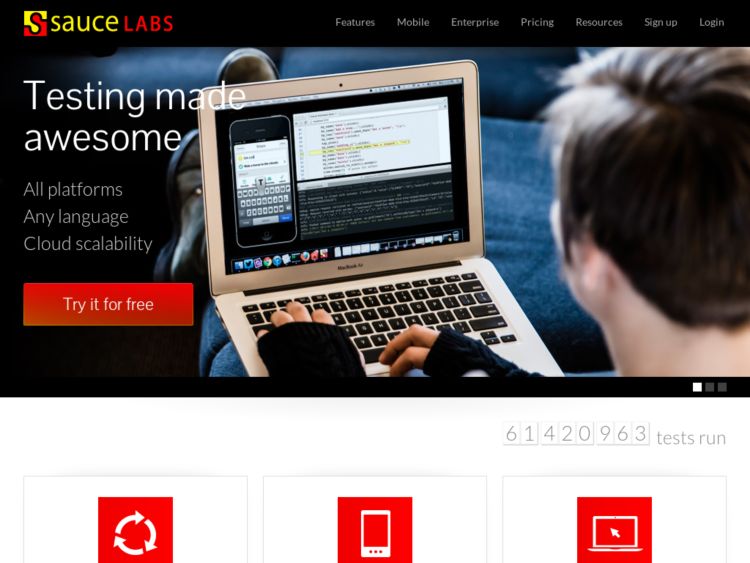
Sauce Labs provides browser testing services for front end development and quality assurance. Their Scout service lets you test your public or private web app in any browser via a VM that's run in the cloud. Enter a URL to test, select an OS and browser, and a virtual machine runs in the web page so you can test in that configuration on demand. Scout can record and save screenshots and video of every session, and they can can be shared, embedded etc. with a dev team, which is nice for bug reporting. JIRA integration means those same videos and screenshots can be attached to JIRA incidents as well. They also let you run automated Selenium tests in the cloud with Sauce OnDemand, for those of you who work with QA automation tools.
I also liked what they describe in this blog entry discussing the security measures they take. Every session gets a fresh VM that’s never been used by anyone else, and at the end of your session, the VM and all its data is completely destroyed. Good for peace of mind if you're paranoid about such things.
Plans are tiered, starting with a free personal plan that gives you 45 minutes of testing per month. You can use it here.
Animate.css: Plug-and-play CSS animation stylesheet
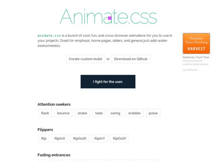
animate.css is a stylesheet created by Dan Eden for doing common, cross-browser css3 animations for things like transitions for emphasis. To use them in your project, simply add add the stylesheet and link, add a class to an element, or call the animation yourself in your CSS file.
Fine Res Tool
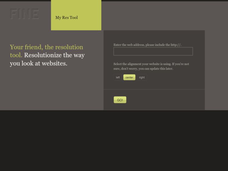
The folks at FINE Design created a browser-based tool for seeing how your web site measures up at different screen resolutions.
To use it, simply enter a full URL of your choosing. Up pops that location superimposed with a draggable set of rulers (x and y axis) configurable in center/left/and right alignment. These rulers allow you to view that site as it would be seen at different resolutions. So you can get a sense for what other eyeballs experience. A small dashboard at the bottom even gives you current stats on what resolutions most people use (hint: 1024 x 768).
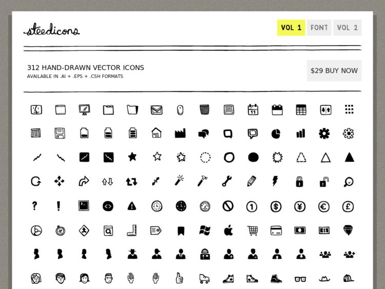
Steedicons
The Steedicons set by Kyle Steed contains 300+ hand drawn icons available as a font or in vector format (.ai, .eps, .csh) for Illustrator, Photoshop, or the wireframing tool of your choice. The bold, sketchy icons would would work perfectly in Balsamiq Mockups or alongside the Konigi Sketch stencils.
Here's a small sample of the icons available in this set.
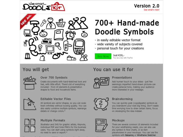
Vector Doodlekit Icons
The Doodlekit Icons set contains 700+ hand-drawn icons for use in sketch-style wireframes. You can buy them in vector format to use in the design tool of your choice, or download the free set of 32 x 32 px PNGs.
Here's a screenshot of the icons in the new custom icon feature that's available in the pre-release version of Mockups.
Form design guidelines crib sheet
These form design crib sheets provide examples for laying out forms to get users through the process efficiently. Created by Joe Leech at cxpartners, and available for OmniGraffle, Photoshop, or in PDF vector format.
Via @theresaneil
http://www.cxpartners.co.uk/cxinsights/form_design_guidelines_crib_sheet_free.htm
