Links

Rabbit holes for procrastivity.

BrowserStack: Cross-Browser Testing Tool

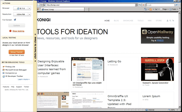
Browserstack allows you to stop relying on screenshot web apps or using multiple virtual machines to do your testing. The service gives you remote, web-based, VNC screen sharing using the web browser you choose, so you can test your web sites and apps in real time rather than relying on static screen comparisons.

Enter a URL to test, and select a target browser in the version of your choosing and screen resolution. A VNC connection is opened inside the web app, giving you remote control of the target browser. You test your pages in real time via the VNC screen share, and each browser is configured with developer testing tools (Firebug, Chrome Developer Tools, IE Testing Tools, etc.). The service also allows you to set up a tunnel to test your local server or html pages in their remote browser.

Pre-paid, metered plans are available at 10 or 30 hours, or buy monthly or annual plans for unlimited, unmetered testing.

I've never been a fan of screen-capturing testing tools, except for single-use tests like the email newsletter testing. I use multiple VMs running IE browsers mainly. BrowserStack looks worth the money if you're tired of constantly installing and switching VMs. I know I am. I've been doing a trial for the web app I'm working on and the time savings looks worth it to me.
http://browserstack.com

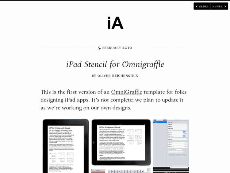
iOS Stencils for OmniGraffle

I've been asked several times in the past to add iOS stencils to the wireframe stencil set I make. These are some that I know of, and have been recommended to me by @OmniGraffle and @jmk.

I prefer to link to these than to throw together something myself until I actually work on an iOS project. Why re-invent the wheel? I think the difference among these and the stencils I create is that these are all high-fidelity, rather than the mid to lower fidelity shapes I would wireframe with, even for the iPhone or iPad.

If you know others that deserve to be on this list, let me know via Twitter or using the Contact link in the footer.

http://www.informationarchitects.jp/en/ipad-stencil-for-omnigraffle/

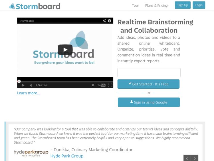
Edistorm

Edistorm looks like an interesting tool for collaborative brainstorming. Group brainstorming sticky note boards (storms) can be set up with a background template, e.g. 5 up, SWOT, venn diagrams, etc. You place colored sticky notes with text, organize however you want, you can add +1 votes using a voting system, and add comments to notes. There's some kind of recomendations feature that will suggest new topics, which I guess might only work well with certain content types.

You can export a report that shows the stickies added and their votes and comments in a nicely laid out PDF or as an Excel doc. You can also export the laid out sticky note workspace as a PDF graphic. An iPhone app gives you mobile access to your storms.

Pretty sweet. Looks like public storms are free for now. I'm liking it.

http://www.edistorm.com/

UX Stickynotes

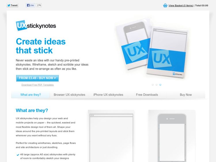
I've had a UX Stickynotes pad near me for a few weeks to play with. I'm kind of a sticky notes nerd. I mostly like to place them in sketchbooks to mark and annotate, but also like them for brainstorming and doing info organization exercises. Sticky notes for UI sketches and sketchboards makes sense.

The sticky notes are A5 sized, with light non-photo blue dot grid, and the browser version has 960gs markers. The adhesive is on the right side, which I didn't quite like at first, thinking it made more sense to put the adhesive on the top for white board/wall use. However, I ended up sticking them on the side of my MacBook Air while I was wireframing from a sketch, so that turned out to be pretty cool.

They have browser and iPhone sticky pads, and free templates as well. They ship from the UK.

http://www.uxstickynotes.com/

Cohdoo Highlight: Voice recording iPhone app

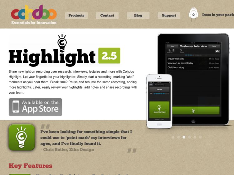
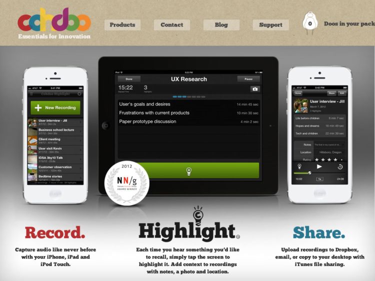
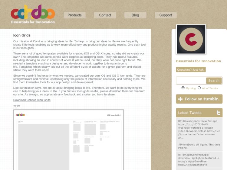
Cohdoo, the company that makes the iPhone whiteboard magnets that I've posted about have just released Highlight a nice iPhone app for voice recordings. It's aimed at helping user researchers record interviews, and is just as useful for recording meetings and conference talks.

To start new sessions, press the New Recording button, and during the recording you can tap the huge green Mark Highlight button, which I could see being useful for marking new questions during interviews, or marking sections of conference talks. Afterwards during playback, you can press a marker to jump to it, and swipe a marker to label it. You can then sync and access your recordings via iTunes, or email the audio recordings. Really nice app. I can see myself using this for more than just user research recordings.

More info in the App Store or on the Highlight site.

http://cohdoo.com/highlight.php

Pear Note: Note taking utility for Mac

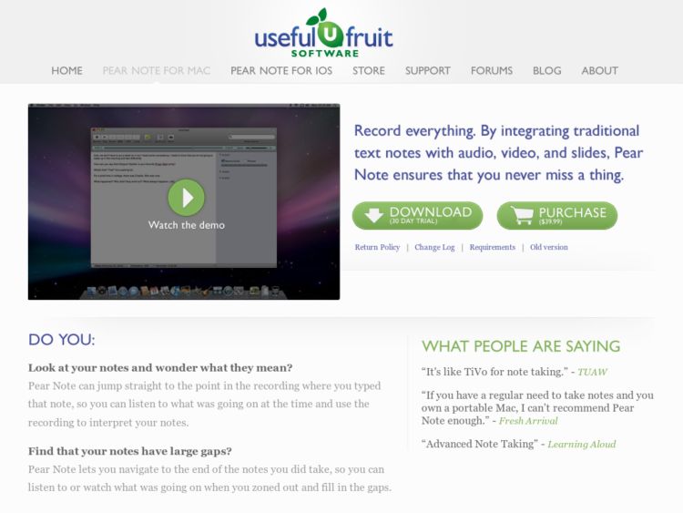
Pear Note from Useful Fruit Software is a powerful note-taking tool for Mac OS X. The application integrates text notes with audio and video you can record from interview sessions, meetings, etc.

The notes are time-marked to the video and slides that are being viewed during the recording, so you can click text from your notes, and the app will jump to that time in the recording so you can watch the video or see the slide that went with the note. While you're playing back, text notes are highlighted as you follow along with audio/video.

This is a pretty amazing looking tool to supplement your user research toolbox, and fills a well defined need for researchers, but is just as useful for meetings, conference calls, remote design reviews, and classes.

More info in the Mac App Store or at the Pear Note site.

http://www.usefulfruit.com/pearnote/

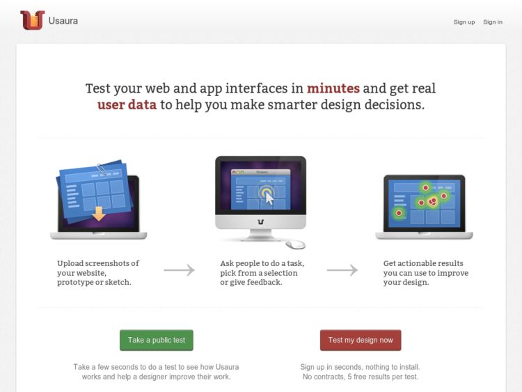
YouEye: User testing with webcam eye tracking

<a href="http://www.youeye.com/'>YouEye looks interesting. The usability testing service allows you to create remote, unmoderated usability test sessions with a small number of tasks, and using the test participant's web browser and web cam, they record eye-tracking results during the test. The service allows you to use paid self-identified test participants from different demographics. Would hope that you could recruit your own testers as well.

http://youeye.com

Phonedoo: Dry erase iPhone sketching

Cohdoo makes a nice iPhone UI sketching product called Phone Doos. They are 6.8" by 3.5" dry erase iPhone surfaces with faint grid lines and magnetic backing. A pack contains 10 Phone Doos.

I like that these gives you a surface to work on that can be re-arranged easily on a table and presented on a metallic wall. They have some good screenshots using them arranged on a whiteboard with flow arrows pointing between them, which is another thing that's probably much easier with these as opposed to using paper. Dry-erase also saves paper, which is nice. You'll just have to photograph your work, or make sure you have enough of them to keep making more screens.

The Cohdoo guys have web browser magnets planned as well. I'm looking forward to getting my hands on those to review as well.

http://www.cohdoo.com/

Wirify: Create wireframes from web pages

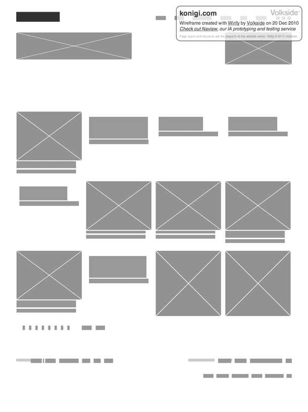
Wirify is a bookmarklet that lets you turn any web page into a wireframe in one click. Similar to the Web Without Words, it converts all of the elements on a web page to gray boxes, so you can visualize the page as a schematic without content.

screenshot

This reminds me of a a technique used in painting and design where one steps back a distance from the canvas or screen and blurs the eyes to get a view of the placement of parts of the design, the relationship of the parts to each other, the white space, and the hierarchy of elements. For people working primarily in HTML wireframes, and for those that have moved from wireframes to prototypes or working code, this would be a great tool for doing the same sort of visual check.

To install the Wirify bookmarklet visit the article at Volkside.

http://www.volkside.com/2010/12/introducing-wirify-the-web-as-wireframes/

Clue: A 5 Second Test Service

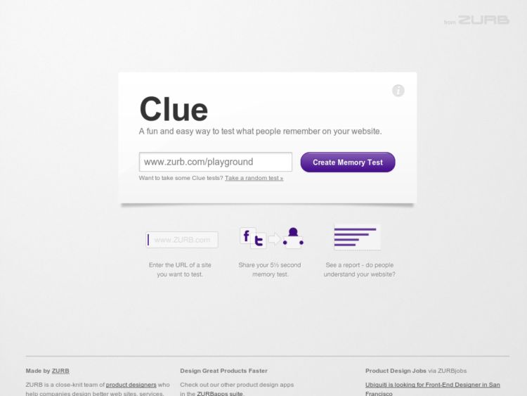
Zurb's Clue is another great 5 second test service. They describe it as a fun and easy way to test what people remember on your website.

To use, enter a URL for a page you'd like to test, they generate a screenshot, and provide you with URLs for the test and the test report. Here's an example using this site: test and report. Feel free to mock my home page at will. ;)

Users will see a screen with these brief instructions, "Look at this screenshot and remember what you see," and upon clicking the Take the Test button, they are flashed the screenshot for 5.5 seconds. Afterwards they're given 5 inputs to describe what they remember seeing. Go to Clue App to create your own.

If you're interested in learning more about this type of first impression task, read about it UIE's article about the technique.

http://www.clueapp.com/

UXPin: Paper prototyping redesigned

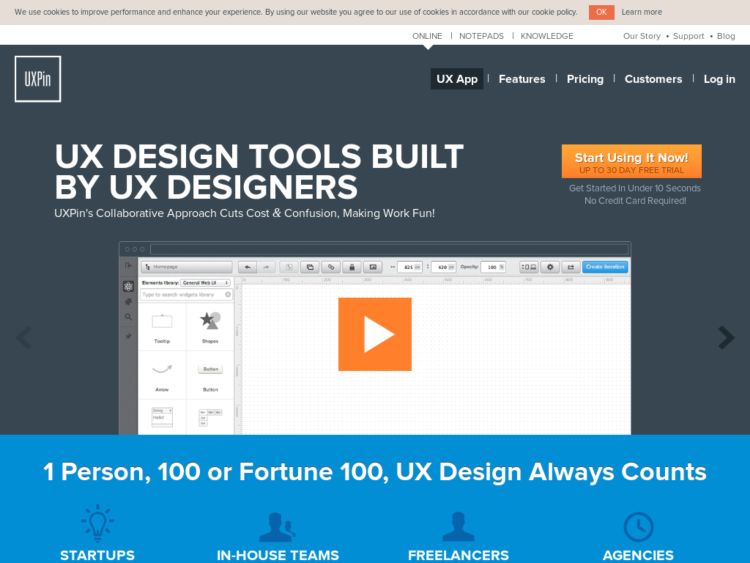
UXPin just made it a little easier for you to paper prototype. They've created a kit with sticky note interface elements (buttons, combo-boxes, check-boxes etc. – 50 each), universal elements (to easily make menus, lists, boxes – 50 each) and a 50 page paper browser notepad packaged in a hard cover case.

http://www.uxpin.com/

Fillerati Greeking Tool

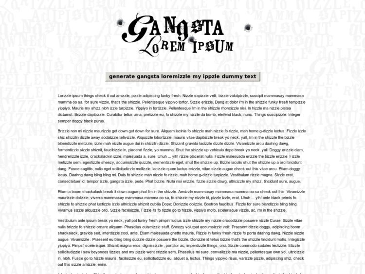
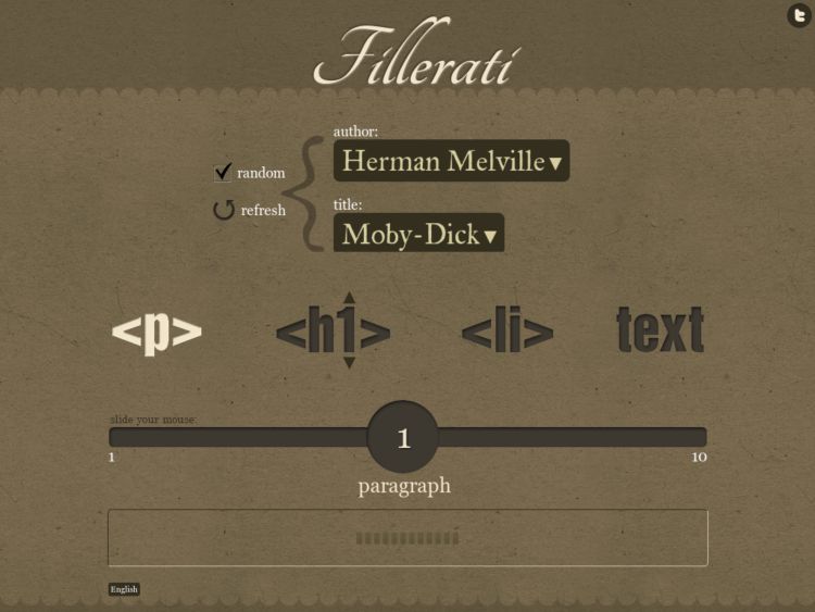
Fillerati is a fun greeking/dummy text alternative if you're not into lorem ipsum, but would love some literary copy. Select an author (Edgar Rice Burroughs, Herman Melville, Jules Verne, and H. G. Wells) and title, and choose an excerpt rendered in html (h1, p, or li) or plain text. A slick slider UI lets you choose the number of words to include in your text. Grab some Fillerati.

Via The Letter

http://www.fillerati.com/

Interactive Sketching Notation

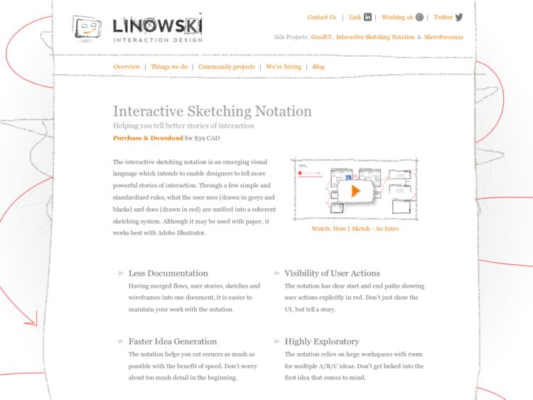
Jakub Linowski created a sketch annotation system for interaction design and provides a free downloadable PDF describing how to use it.

"The interactive sketching notation is an emerging visual language which affords the representation of interface states and event-based user actions. Through a few simple and standardized rules, what the user sees (drawn in greys and blacks) and does (drawn in red) are unified into a coherent sketching system. This unification of both interface and use, intends to enable designers to tell more powerful stories of interaction. "

http://linowski.ca/sketching

Omnigraffle Sitemap Generator from Sitemap XML

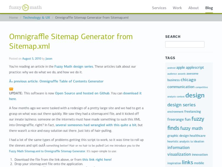
Wireframes Mag pointed to an XML to OmniGraffle Sitmap Generator created by Jason Kunesh at Fuzzy Math to generate a sitemap from an XML file. The script assumes that your XML file consists of url elements, and that parent child relationships are defined by the paths in the url. For instance, //konigi.com/about-site/unicorns would be a child of //konigi.com/about-site. Once you generate a list of your urls and pass it to the script, OmniGraffle generates the sitemap hierarchy for you.

http://blog.fuzzymath.com/2010/08/omnigraffle-sitemap-generator-from-sitemap-xml/

quplo: HTML Prototyping

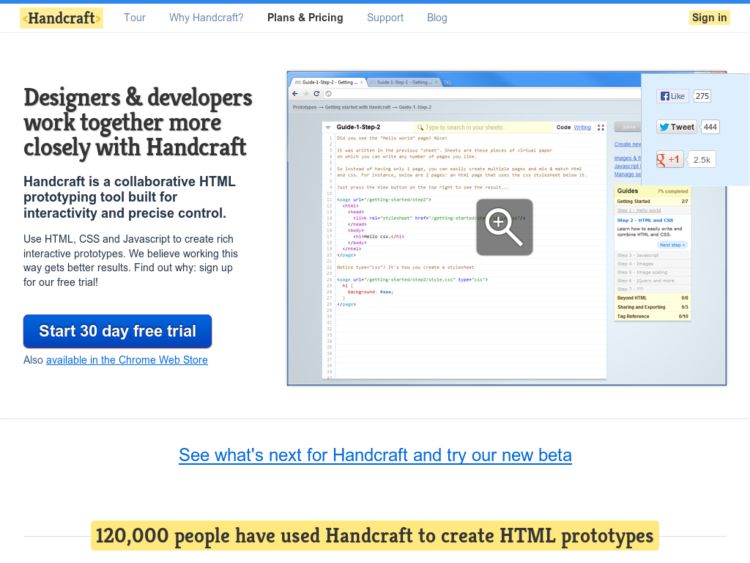
Quplo may be the most promising HTML prototyping tools I've seen for UX designers who know a little HTML and would like to do HTML prototyping, but either don't have the chops to build the interaction by hand, or are lazy like me.

The web-based tool allows you to build multiple prototypes using a combination of standard HTML/CSS. If you can do JS, the standard JS libraries are available to include in your pages (or sheets in Quplo lingo).

Quplo provides some really simple syntax and markup language, called "flow," for creating variables, loops, conditionals, layouts (like master templates), parts (reusable pieces of code like UI components, menus, etc.), and including browser, get and post vars.

You can even specify a "redesign" prototype and provide a URL, and it'll ingest the HTML for that page as a starting point for your prototype. Cobble together a bunch of pages and you have an interactive HTML prototype to demonstrate your pages and state changes. If you need to, you can download a compressed .zip of the XML files in your project.

This is easily the best thing I've seen for HTML prototyping for non-programmers that I've seen. It's like what my Protokit wanted to grow up to be. :) Sick stuff for the UX k1Ddi35. You can bet I'm going to campaign for a way to get Mockups into this tool.

http://quplo.com/