Inspired by the 5 second test, a lot web-based services have cropped up to support remote usability testing. In the past few years, I've been experimenting with some of these to conduct super small, unmoderated remote usability testing sessions. I've used Morae extensively in the past, but for most of my needs, that's like using a sledgehammer on a pushpin.
I'd been successful using fivesecondtest and Usabilla, who decided to sponsor me after I participated in the beta and gave feedback. I then got wind of OpenHallway, which also provides unmoderated testing with the addition of recording the users' screen and voice using. I want to note that having agreed to participate in the beta, Open Hallway is also now a sponsor of Konigi.
I conducted a simple test with one task using Open Hallway. The observations below take you through the application in the current beta, and are based on my experience testing a common task in Balsamiq Mockups, updating your software.
Set up
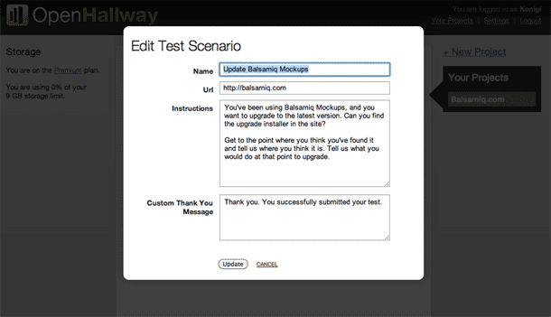
To get started, you create a project and start creating scenarios for your test. The screen below shows the form for defining the scenario or task. I entered the name of my scenario, instructions the user will read, and the URL to use in the session.
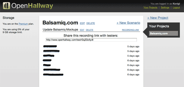
When you're finished defining your scenario, you share a link for the test session with your recipients. The screenshot below shows the share link that displays when you click the "Recording link" text. The sessions that have been completed are also displayed here.
It appears currently that if you plan to have the user attempt multiple tasks, you have to either create each task as a separate scenario, and share the URL for each scenario.
User's experience starting a session
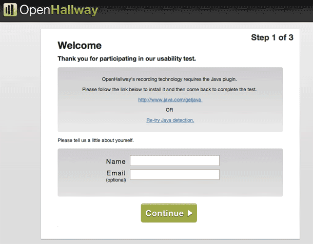
Once you share the test session URL with your users, they're taken to a welcome page that asks for their contact information and diplays browser requirements.
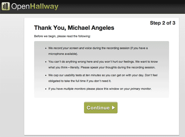
After entering contact information, the next screen shows instructions and describes how the session works. It's a lot of text to read. My first reaction is that this could be a 1-2-3 graphic that's quickly skimmed. The second thing I think might be useful here is some type of consent form or agreement. This would be necessary for most people I would think. Just a quick paragraph in a form textarea and a checkbox to proceed would suffice. This way facilitators can include details about the usage of the recorded video/audio.

It would be useful to somehow show a persistent area in the browser that guides the user through the tasks. I'm thinking of a very unobtrusive box in a fixed position at the top of the page. I wanted to set up my test so that I could do a tasks for 2 different scenarios, but in between I would required a URL change. The fact that the instructions are only given up front once makes it a little hard to expect the user to remember the steps for task #2 without returning to the original screen. That kind of interruption would be a little jarring.
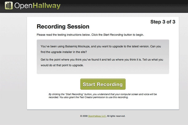
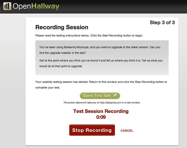
Next we move on to the last pre-test screen which shows the scenario or task to be performed. The test participant reads the task and clicks Start Recording to begin the session, and a new window is opened with the URL specified in the scenario.
After clicking through several pages, I felt like the copy of the task itself could easily be missed if the user clicked the start. My concern is that they would skip the copy and wouldn't know what their task was, and would have to return to the original browser window, looking for the task.
Once the session gets started, everything runs extremely smoothly. If the user performs the task while thinking aloud, their screen movements and audio are captured beautifully.
The only feature request I have regarding the actual session is that I'd love to have multiple tasks be supported in a single session. I like how Usabilla uses a slim iframe at the top of the browser viewport to display the description of the current task and asks the user to indicate when they're done completing the task. It then steps the user to the next task and screen. Something like this would be lovely in OpenHallway so that all tasks are tested in one session.
Viewing the results
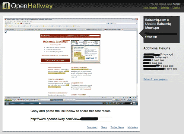
Once your test is complete, you head back to your project window and view your completed sessions. Clicking a session displays the video of the session. Test participant notes are shown below the video, and you can also add notes of your own. There are no tools or adding markers, e.g. to mark when a task starts. I don't know that you would want or need that in this tool. Viewing the session is simple enough as it is in my opinion, without aspiring to be Morae.
Finally, you can download MP4 video or share the URL for the session page with your team.
It's also noteworthy that while OpenHallway's proprietary video format and SSL data transfer are sufficient for most applications, premium plan holders also have the option to turn on OpenHallway's enterprise security features to further secure the storage of your test scenario results. Doing so, however, means you can't share your video URLs.
Conclusions
I found the experience using this tool to be effortless. The details in my review are largely to satisfy more complicated needs. For the most part, I can make do without these features because simpler is better in the end, and doing multiple small sessions more frequently works for me.
Overall, the experience of getting test sessions up and running was extremely smooth. If you're interested, you can also read more about my first test session on the Balsamiq UX Blog. I started by putting a session together at around 7am. I recruited via Twitter, got 5 respondents and waited while they ran their tests. By 10 I was watching their videos and wrote up notes and a plan for changes. I had lunch, and was making the changes by 1pm.
http://www.openhallway.com
