Clixpy is a service that tracks everything your site’s users do, from mouse movement, clicks, and scrolling, to form inputs. The user sessions are as video for you to analyze. Installation requires pasting a few lines of JavaScript into your pages. Check out their excellent demo to see how it works.
Links
Rabbit holes for procrastivity.
Handbook of Usability Testing: Templates and Forms
The Handbook of Usability Testing, by Jeffrey Rubin and Dana Chisnell, describes how to plan, design, and conduct effective tests. The books site includes a downloads page with templates and examples of usability test plans, questionairres, test scripts, and consent forms.
http://www.wiley.com/WileyCDA/WileyTitle/productCd-0470185481,descCd-DOWNLOAD.html
Usability.gov Templates & Examples
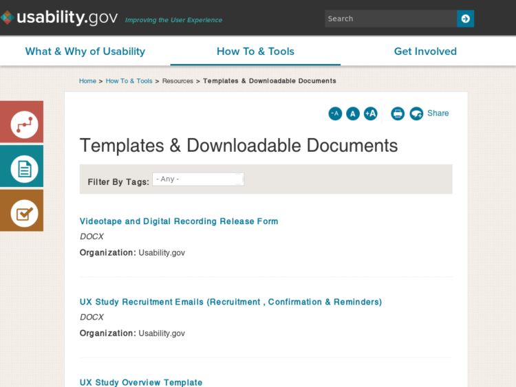
Usability.gov has a very comprehensive set of templates, forms, and examples that are organized by steps in the usability process: Plan, Analyze, Design, Test and Refine. They can be customized for your organization's usability needs. All of these are in the public domain and can be freely downloaded.
Among the most useful of the files you'll find in this collection are commonly used usability test plan templates, waivers and consent forms. I've used these forms many times in the past, and the examples provided can be easily modified to suit your needs.
Yahoo! Grids CSS
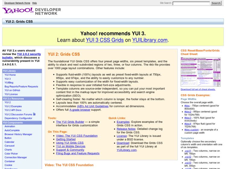
The Yahoo! UI Library's Grids CSS framework might seem hard to grok at first, but I've been using it for the past year on a commercial project and find that it's solid for liquid CSS layouts. The grid builder helps to visualize what's possible and view the rather obscure naming conventions they use in CSS classes.
The framework offers four preset page widths, six preset templates, and the ability to stack and nest subdivided regions of two, three, or four columns.
Boks: Visual Grid Editor
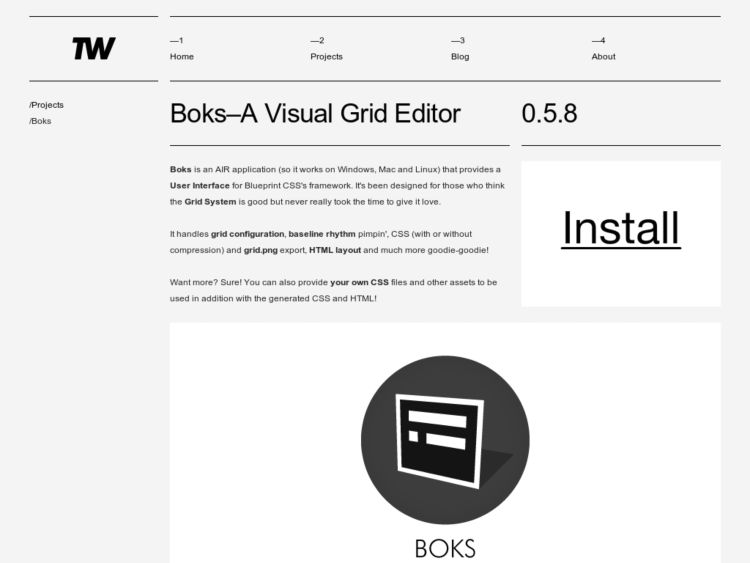
Boks is a cross-platform AIR app for visually creating grids using the Blueprint CSS framework. The app provides an inspector for setting up the page, column and gutter widths, provides typography settings for setting the vertical rhythm of your text, and generates the CSS and grid background image for you to export. Once your grid is set, draw sections in your grid, add lorem ipsum greeking, and the export file will include an HTML template with all of your divs laid out for you. Sweet.
FlairBuilder: Interactive Wireframes and Software Prototypes
FlairBuilder is a cross-platform tool for rapid authoring of interactive wireframes and software prototypes. It focuses purely on wireframing/prototyping, and provides an experience that looks like it's targeted at apps like Axure, but work will cross-platform because it's built on Adobe AIR.
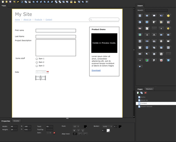
The application provides a page/canvas editor onto which you may drag and drop UI components. Selecting a component provides a properties inspector so that may set dimensions and stylistic properties, text values, and any other available UI options. The event inspector allows you to set events that occur on click, e.g. go to another page, show a window, show card stack, etc. Master canvases are useful for providing any reusable elements across pages. Elements in the master my have events attached to them, and 1 master may be applied per page.

It was easy to drag UI elements into the page and start to add properties and actions to them. The canvas also provides tools for object alignment, ordering, locking, and grouping. I liked the smart guide snapping, but could also use a grid in the canvas. Typography options are limited, but that might be intentional. There were also some minor issues with keyboard use on my Mac, e.g. Delete key didn't appear to work, but it was fully functional otherwise.
Building up interactions seems the strongest part of the app. Aside from simple actions to switch canvases and show dialogues, the app also allows you to show state changes in the page using card stacks. Do you remember Hypercard? Card stacks are like that. A card stack is a collection of frames or cards that you place into a page, which only displays 1 card at a time. You can put any UI elements into a card, and then create actions to move through the stack. With this simple paradigm you can create state changes within the page. For instance, I quickly mocked up a card for a product that showed a "Product added!" confirmation next to an add to cart button. Very nice.
Another nice touch is that media are also rendered in preview/prototype mode, so Google maps, any embedded videos, and even the webcam viewer will display the playable media or video from your camera if attached.
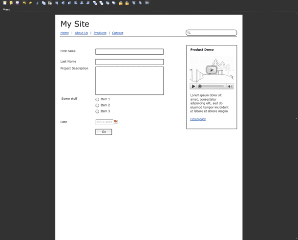
Switching to preview mode hides the UI Component library, page/master browser, and property/events inspectors and renders the pages with actions enabled. You may enter values into form inputs and textareas, interactive elements such as accordions and tabs are interactive, and any events may be triggered on click.
The first release looks very promising. It will be interesting to see if future releases will allow any functionality outside of the desktop client, e.g. export to a Flash for use on a server.
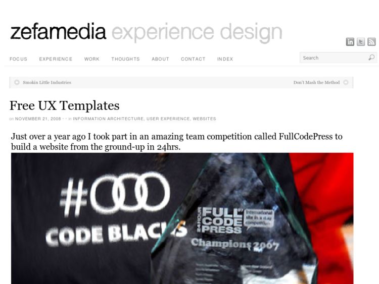
zef[a]media UX Templates
zef[a]media's UX Template package contains sample paper prototypes/wireframes, personas, sitemaps, and user flow diagrams. Requires MS Visio, Word, and Excel.
PolyPage: HTML Prototyping JavaScript Plugin
Polypage is a JQuery plugin that was designed to ease the process of showing multiple page states in html mock-ups. By simply adding class names to a document you can imply state and conditional view logic.
You can view a tutorial for setting up a Polypage project at 24 ways. The latest version is available from the github repository.
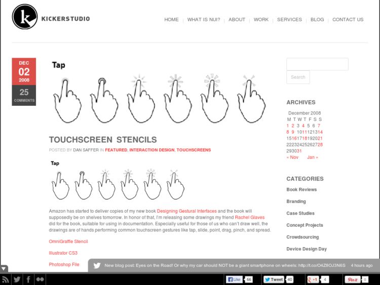
Touchscreen Stencils
Dan Saffer of Kicker Studio provides free touch screen gesture stencils for OmniGraffle, Visio, Illustrator, and Fireworks. The icons are designed by Rachel Glaves for Saffer's book, Designing Gestural Interfaces, and depict hands performing common touchscreen gestures like tap, slide, point, drag, pinch, and spread.
http://www.kickerstudio.com/blog/2008/12/touchscreen-stencils/
Accessibility Checklist
Ben Cano has created an accessibility checklist with priority categorized accesibility checkpoints or criteria that map to 14 accessibility principles. Going through the prioritized checklist, the designer/developer takes a gradual approach from minimal acecessibility towards optimal or most accessible.
(This entry posted on behalf of Ben Cano)
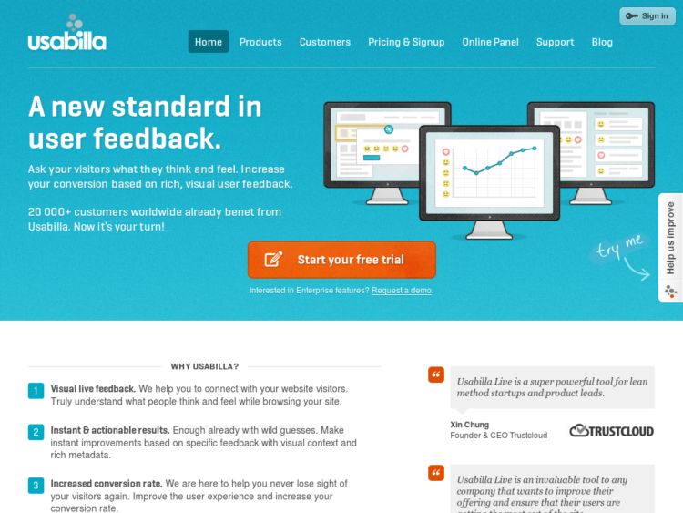
Usabilla
Usabilla is a remote usability testing service that allows you to quickly create short tests that solicit feedback from your users. The service allows you to direct a few questions using screenshots of pages, e.g. you might ask users what do you like/not like about this page, where would you look to find X? Users then click on screenshot to add markers with their notes or answers.
Loop11: Online, Unmoderated User Testing
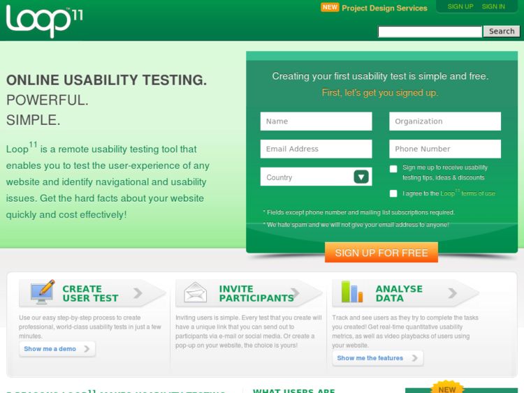
Loop11 is a web-based user-experience testing tool, allowing companies to conduct online, unmoderated user testing.
Loop11 provides the ability to gain detailed insights and understandings of user behaviour. These insights are obtained via a live interactive environment where users are asked to complete a series of tasks and questions on your website or interface. All interactions are captured, processed and made available in real-time reports.
Loop11 is not a survey or web analytics tool, but a user experience tool helping you to understand user behaviour.
Web Browser Templates (Photoshop)
An Adobe Photoshop .PSD template with Internet Explorer, Firefox for Mac, and Firefox for Windows browser chrome. Provides a layered PSD of browser windows at the following resolutions: 800×600 pixels, 1024×768 pixels, and 1280×1024 pixels.
http://www.junglejar.com/2009/02/01/browser-templates-webdesign-webapplications/
OS X Widget Library for Axure RP
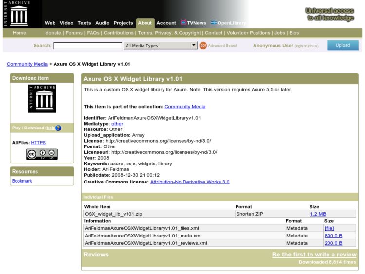
Free library of OS X widgets for Axure users.
http://www.archive.org/details/AriFeldmanAxureOSXWidgetLibraryv1.01
Silverback Usability Testing Software
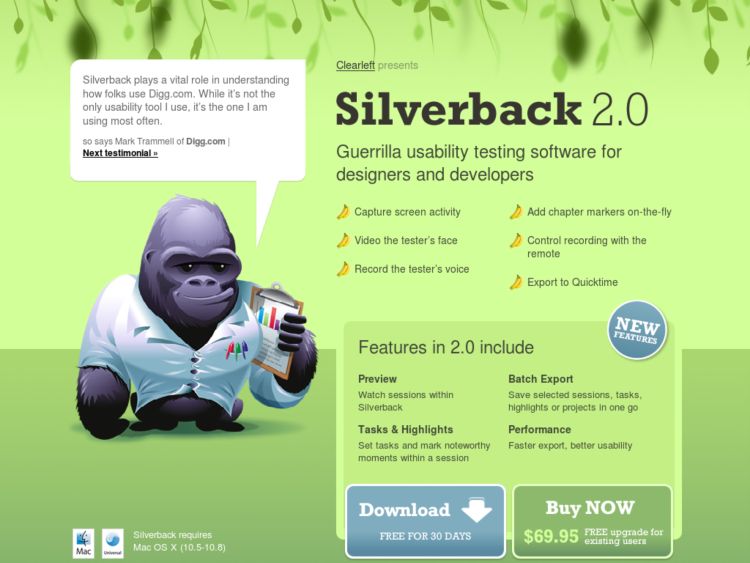
Silverback is a simple to use usability testing application that allows you to capture screen activity, record audio and video of the participant’s voice, add chapter markers on the fly, control recording with the remote, and export to Quicktime.
Lovely Charts Online Diagramming Application
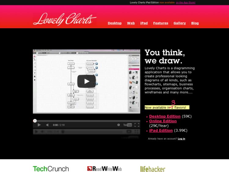
This is a review of Lovely Charts, a free online diagramming tool that provides wire frame, flow chart, and site map stencils. I like the unique, simple method they provide for quickly creating flow charts and site maps. In this screencast I show how to do a few simple flow diagrams and a wireframe, as well as discussing the features that I'd like to see for creating prototypes from this tool. I think what they're providing in this first release is very promising and will be one to watch if you're interested in this kind of thing. The video below gives you a preview of some of the app's capabilities.
As with all of the Flash-based tools, there's not nearly as much control in the output, but it's useful for light needs. Light, quick, and dirty is a good thing.
CSScaffold
Anthony Short produced a video demonstration of CSScaffold, a CSS framework takes the structural principles and architecture of current grid systems like Blueprint and the generation engine of Shaun Inman's CSS Cacheer, and creates a CSS Grid System Builder that lets you define the rules for your layouts using meaningfully named CSS ids and classes, and automatically generates the grid system to those rules.
It's a framework that lets you focus on fitting the CSS to your design, rather than the reverse, and gives you the ability to focus on meaningful abstractions and naming rather than structural ones, so you can easily make changes in the future. This is something I find appealing, so I can name divs and not worry about affecting changes in number of columns throughout my templates, since the change can be made to affect semantically named divs at a higher level through the framework. Nice. Watch the video below for a demonstration.
CSScaffold Introduction from Anthony Short on Vimeo.
I've become a regular user of both Blueprint and YUI for core column layout because it speeds development and makes maintenance and testing effortless. This seems like the right direction to move into if you work with CSS at any level, whether IXD doing prototypes or front end developer.
http://anthonyshort.com.au/blog/comments/video-an-introduction-to-csscaffold/
userfly: Instant web-based usability testing service
userfly.com from Chris Estreich on Vimeo.
Userfly is a new web-based usability testing service that looks pretty exciting. When you set up a new test on the service, you're given JavaScript to enter into your site template. Userfly captures sessions including link clicks and time spent on the page, and records screen events including mouse movement and keystrokes.
This looks like a pretty nice service for certain types of observation. There doesn't appear to be any options for interacting with users, e.g. video/audio capture, task marking. I suppose on a siloed test server you could drive test session tasks and do an additional recording via other software. But at that point, you might as well go a more traditional route using web-based methods. But this should definitely be useful for some testing needs. Would love to hear more about people's experiences with this.
Design Commission Website Stencil Kit
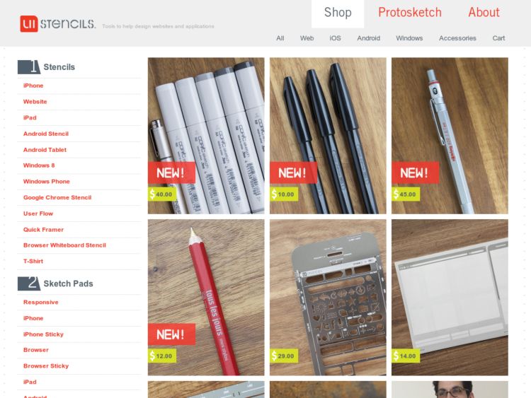
Design Commission have begun selling their web stencil kit! The kit includes:
- Stainless steel stencil with all your favorite user interface iconography
- Heavyweight paper pad with browser chrome on top
- Zebra mechanical pencil
http://www.designcommission.com/shop/dc-website-stencil-kit/
Layers App Creates Layered PSDs from Screen Captures
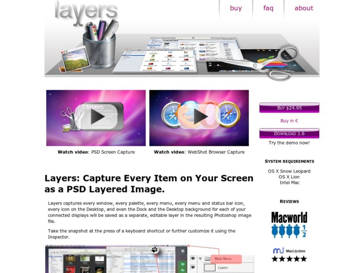
Just when you thought there couldn't be a way to improve the screencapture app space, Layers hits the net. Layers for the Mac, captures your displays as a Photoshop layered image. Press the capture hotkey or customize your capture in the inspector and you'll obtain a full fledged PSD file with one layer per window, including menu and desktop icons, dock and menubar. Sweetness.
Via @davidkaneda
Mockups To Go: UI Components for Balsamiq
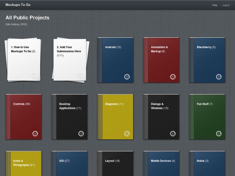
Mockups To Go is a very cool blog featuring a user-contributed collection of ready-to-use UI components and design patterns built using Balsamiq Mockups. Share your mockups by sending an email of your docs. See the site sidebar for details.
Uni-Form
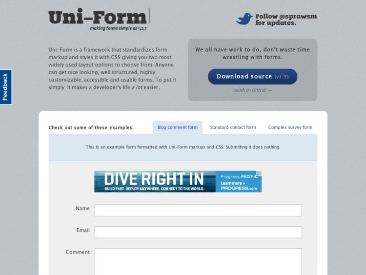
Uni-Form is a cool tool from Dragan Babić of Superawesome. The CSS library standardizes form markup (xhtml) and css, and "modularizes" it so even people with only basic knowledge of these technologies can get nice looking, well structured, highly customizable, semantic, accessible and usable forms. Download the plug and play XHTML and CSS and you're ready to go.
Todd Warfel's Persona Templates
Todd Warfel has posted templates for his data-driven personas. The main file is an InDesign (INDD) file and the visual chart is in Illustrator file. Both are made with CS4.
Mocklinkr Prototyping and Review Tool
Mocklinkr is another new design mockup review service to hit the web. This one adds a little twist, however, that might be pretty useful. After you upload images of your designs or wireframes, Mocklinkr let's you create clickable sections on the image linking to another image. This let's you do very simple click-through prototypes to change state and navigate between pages. In a way, this seems a bit like the Berkeley GUIR Denim tool, which is sadly no longer available at the GUIR site.
The video above shows how it works. Jump to 0:30 for the demo. The prototyping is not as sophisticated as using standalone wireframing software or something like Balsamiq, but the approach should be very simple and friendly for people who don't want to bother with software. It allows you to use your own images and adds the online annotation and review features. It's nice to have so many different service options these days.
Design Commission Web Stencil Kit
This is the excellent web stencil kit from Design Commission, which you will apparently be able to order soon! Comes with sketchpad, complete with browser chrome and grid, custom etched metal stencils, and a Zebra mechanical pencil. Hot stuff. Drop them a line if you want one when they run another job.
http://www.designcommission.com/blog/web-stencil-kit-hot-off-the-press/
STC Usability Toolkit
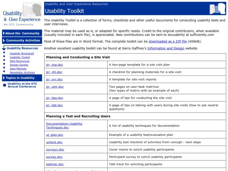
The STC Usability Toolkit is a resource I've borrowed from over the years and continue to find myself back at fro time to time. The toolkit is a collection of forms, checklists and other useful documents for conducting usability tests and user interviews.
http://www.stcsig.org/usability/resources/toolkit/toolkit.html
Smashing Magazine iPhone PSD Vector Kit
Smashing Magazine releases their own iPhone design kit, designed by Renee Rist.
http://www.smashingmagazine.com/2008/11/26/iphone-psd-vector-kit/
ecommr: e-commerce interface and design elements
Tom Sullivan has launched ecommr, a collection of screen captures of e-commerce design and interface elements. From product listing pages to e-mail newsletters, ecommr is a resource to view all of the individual pieces that make up the e-commerce puzzle. More info from his personal blog:
Working in the e-commerce field, I often find myself looking at other retailers to gather ideas on how to best present various elements of e-commerce sites. From design to information architecture, I find it fascinating to see how different retailers tackle the same problems in different ways. I’m often looking at different retailers and constantly looking for changes, no matter how small, and trends in e-commerce design.
I always wanted to see a site that broke down e-commerce stores into their different elements. I wanted a resource that would allow me to see the various ways retailers display their products or style their “Add to Cart” buttons. There are sites that break down general web elements (see: Elements of Design) and sites that highlight e-commerce design (see: Carted Up), but still no resource that broke down the individual elements.
Protonotes: HTML prototyping collaboration tool
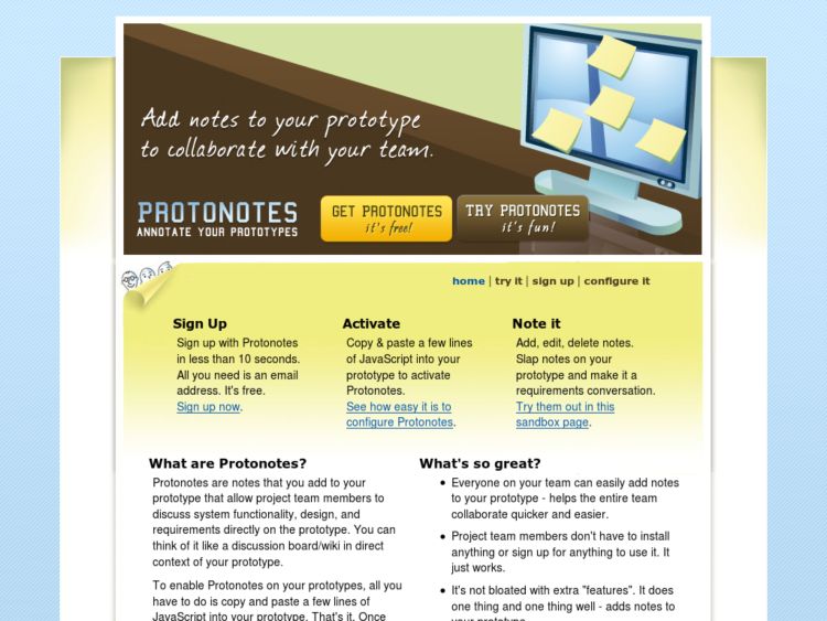
Protonotes provides a service to allow teams to add notes directly onto html prototypes. Check out the video below for a demo. After you register the confirmation email provides a few snippets of javascript to put into your html prototypes to insert a menubar over the top of your site. The menubar provides controls for creating notes and can be configured to be unobtrusive.
PolyPage HTML Prototyping Javascript Library
Polypage is a JQuery-based HTML prototyping javascript library that was designed to ease the process of showing multiple page states in html mock-ups. By adding simply adding class names to a document you can imply state and conditional view logic. Brilliant.
