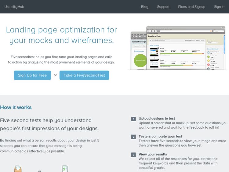
The five second test is a simple usability test that helps you measure the effectiveness of your user interfaces by getting users to look at a screen for 5 seconds, and then asking them to recall what they saw. This is something I typically do at the start of a usability test to see what users understand at a high level. Show them a screen, take it away, have them talk, ask them questions. There's more about this method at UIE. This site provides a service so you can easily do this kind of thing with users by generating a test and providing a link you can share with participants to take it. The service then emails you the results.
Links
Rabbit holes for procrastivity.
Interactive Gestures Pattern Library
The Interactive Gestures Pattern Library is a promising looking wiki that collects gestural interface information and patterns, such as found on such devices as the iPhone and Wii.
Cockburn's Basic Use Case Template
Just discovering that Dr. Alistair Cockburn, whose Writing Effective Use Cases book got me through many a project, has a wiki. On the wiki he offers some great resources like the basic use case templates. If you don't have the book, this is a pretty good substitute for understanding use case writing.
http://alistair.cockburn.us/index.php/Basic_use_case_template
Axure Design Pattern Library
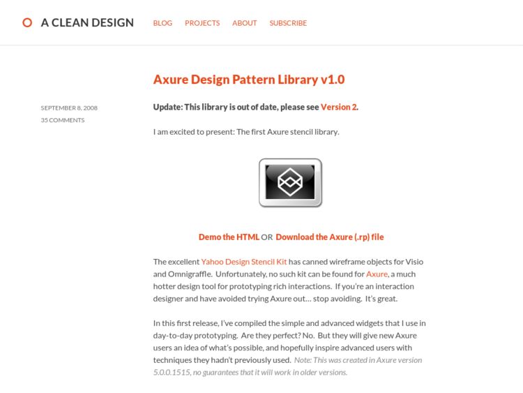
Loren Baxter has created an excellent looking set of design patterns for Axure users. The kit provides droppable interface elements for demonstrating rich interactions like editing in place, lightbox effects, video embedding, and a bunch more.
When I worked in a Windows only company, we used Axure and I loved how easy it made wireframing and prototyping simple interactions by just dragging and dropping. This tool kit will definitely make the job even easier. Axure users, this is not to be missed.
http://www.acleandesign.com/2008/09/axure-design-library-v1/
Photoshop Custom Comping Elements
Bad Assembly provides a layered Photoshop file with common user interface elements for design comping. It's like the PSD analog to a wireframing UI stencil.
ProofHQ
ProofHQ is a collaborative tool for reviewing creative projects such as photography and graphic design. The tool allows you to upload anything from a PDFs, PSDs, and JPGs to Word and PowerPoint files up to 75 MB. The functionality is a bit like a mashup of Flickr and Skitch. It allows users to annotate, mark up, and comment on the work. The art can be embedded into a web site with the provided embed code.
iPhone GUI PSD
The iPhone GUI PSD by teehan+lax is an editable layered Photoshop file with graphic elements including the iPhone, buttons and controls, form inputs, and application chrome.
Thanks to Designnotes for the tip.
Backboard
Backboard is a very simple collaboration service that allows teams to upload images (e.g. schematics, design comps, and screenshots) to a web page and elicit feedback from team members.
Usability Test Data Logger for Excel
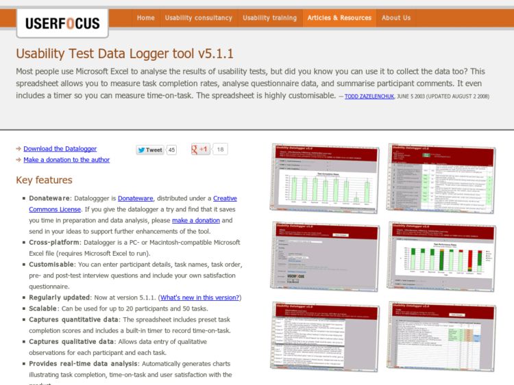
User Focus' Todd Zazelenchuk provides an excellent Microsoft Excel tool with macros that turn the document into an application for collecting usability test data.
"This spreadsheet allows you to measure task completion rates, analyse questionnaire data, and summarise participant comments. It even includes a timer so you can measure time-on-task. The spreadsheet is highly customisable."
Download the Excel document and documentation for free.
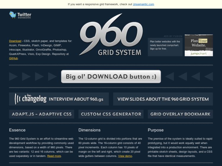
960 Grid System
The 960 Grid System is a CSS Framework based on 960px width and can be used with 12 or 16 column grid. 12 column grid uses 60 px wide columns and 16 column grid is used with 40 px columns. Each has 10px gutters on either side or 20px combined between columns.
960 px was chosen as a base number because it is divisible by 2, 3, 4, 5, 6, 8, 10, 12, 15, 16, 20, 24, 30, 32, 40, 48, 60, 64, 80, 96, 120, 160, 192, 240, 320 and 480. Seems like fairly flexible system, although I find the classes in use on Blueprint, particularly when nesting, to be a little simpler.
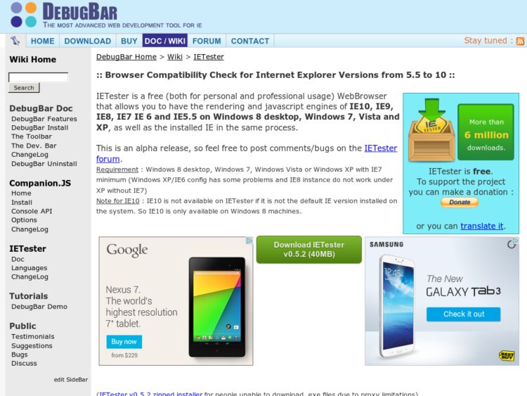
IETester: Testing Multiple IE Versions
IETester is a free WebBrowser that allows you to have the rendering and javascript engines of IE8 beta 1, IE7 IE 6 and IE5.5 on Vista and XP, as well as the installed IE in the same process.
Thanks to Chad for the tip.
Balsamiq Mockups: Prototyping Software
Balsamiq Mockups is an incredible application for creating user interface mockups. The application allows you layout interface sketches using the 50 interface controls included. Controls are added to the canvas or notebook by dragging and dropping or by using an insert input with auto-completion suggestions. As with Visio, many controls may be easily customized by editing values in the properties panel, and may be modified to show state, e.g. selected, disabled, etc.
This looks like a very interesting application for sharing wireframes and mockups via one of the CMSes that provide support for it. It does not have typical drawing tools, so you cannot customize the stencils at this point, but this should serve very well for many people's needs around communicating interface ideas.
The application is built on Flex and is available as a client plugin for systems including Confluence and Twiki, and may also be run as a standalone Adobe AIR application. It allows export to XML for importing into new mockups, or to PNG.
Grid Calculator
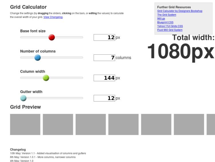
Matthew Pennel's Grid Calculator is a tool to calcuate a grid based on easy to use slider controls and forms.
[A]llows you to choose the font size you are going to use, and then select the number of columns, column width, and gutter width based on that base font size. As you fiddle with the dimensions, the total width is dynamically updated, so you can check that you haven’t gone over that magic 1024px!
If you’re not bothered about the column and gutter widths having an exact proportional relationship to the font size, you can edit the values directly (they are plain text input boxes). The total width will reflect changes as you type.
GridMaker Script for PhotoShop
Andrew Ingram's GridMaker is a brilliant script for Photoshop that can be used to automatically generate guides in your PSD.
The script allows you to enter the series of columns that should be laid out both horizontally and vertically. Then you set the maximum dimensions for the canvas. To generate a Blueprint grid, for instance, you'd enter "30,10" to create a PSD with a series of repeating columns of alternating 30 pixel units and 10 pixel gutters. You can set any number of columns in the series.
The script is saved into your Photoshop "Preset / Scripts" directory and is summoned by selecting "File $gt; Scripts."
Pencil Project: Open Source Drawing and Prototyping Software
Duong Thanh An has begun work on Pencil, an open source diagramming tool to free users from commercial products such as Visio and OmniGraffle. Pencil is an application that runs on the Mozilla Gecko engine and can be run as a Firefox 3 tool, or in standalone mode (Windows and Linux only for now).
The first version looks very promising and provides the basic functionalities needed to create diagrams and page schematics. What looks most impressive to me presently are the features of the Windows UI stencils that I've missed since moving away from Visio. UI objects in the Windows XP Widgets stencil provide properties for changing the state of a control, e.g. right click a form checkbox to select disabled or selected, and the control takes on that new state. Right click a combo box and select disabled or focussed. This is one of the functionalities in Visio that just never made it into OmniGraffle.
Pencil also provides canvas masters using the background page model Visio introduced, which I find to be pretty well implemented. There are still a lot of features that need to be implemented for me to consider using Pencil as a replacement tool, however. Basic shape and line drawing tools are absent, for instance. And while PNG exporting is good, I would need support for better export options. PDF or even SWF of entire documents would be ideal. For a first release, this looks very promising.
Sketch paper for the mobile designer
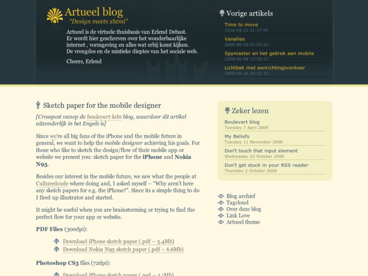
Erlend posted on the Artueel blog about a great idea they had for mobile designers—a sketchpaper document you can print out (PDF and PSD formats available) so you can get your ideas on paper. They've created sketchpaper for the iPhone and the Nokia N95.
Since we‘re all big fans of the iPhone and the mobile future in general, we want to help the mobile designer achieving his goals. For those who like to sketch the design/flow of their mobile app or website we present you: sketch paper for the iPhone and Nokia N95.
Each document includes an image of the mobile device, space for a title, and a lined area for notes. Looks a lot like shells for wireframes and storyboards. There are pages to show the iPhone, for instance, in both landscape or portrait mode, with browser chrome, or stripped down for application designs. Several formats are included to show 1, 2, or 3 devices per page. Brilliant.
http://blog.artueel.be/sketch-paper-for-the-mobile-designer/
Yahoo! Design Pattern Library Stencils
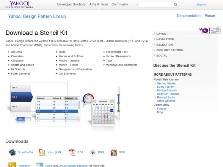
The Yahoo! Design Pattern Library have released stencils for design patterns in OmniGraffle, Visio, PDF, PNG, and SVG format. I had planned to do the same for OmniGraffle users, but they beat me to the punch. :) This has easily become the best resource out there for design pattern examples. Congrats to Christian Crumlish and his team.
Color Deficit Simulators
There are several applications and web services that help you determine if the colors used in your designs will be accessible to users that cannot view all colors. My personal favorite is the Sim Daltonism app for the Mac (pictured above).
- Sim Daltonism is a color blindness simulator for Mac OS X. It filters in real-time the area around the mouse pointer and displays the result — as seen by a color blind person — in a floating palette.
- Vischeck's color deficit simulator plugins for Photoshop allow you to simulate how color blind users see your screens.
- etre's color blindness simulator is a web-based service that allows you to upload a screenshot and view the screen with color blind simulation.
- Wickline Colorblind Web Page Filter is a web-based service that allows you to specify an URL to test, and provides an interactive control to toggle between color blindness simulations.
GridFox - The Grid Layout Firefox Extension
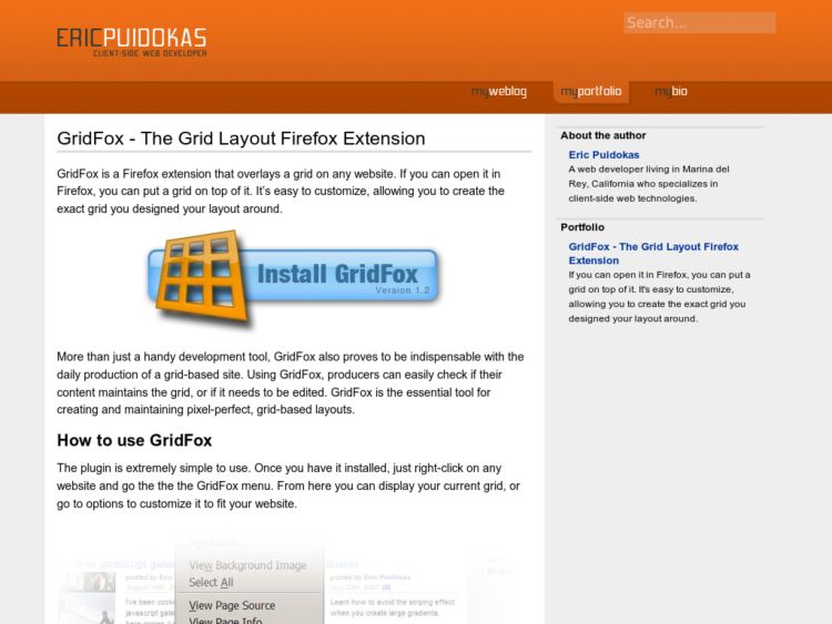
GridFox is a Firefox extension that overlays a grid on any website. If you can open it in Firefox, you can put a grid on top of it. It’s easy to customize, allowing you to create the exact grid you designed your layout around.
Via DigitalWeb
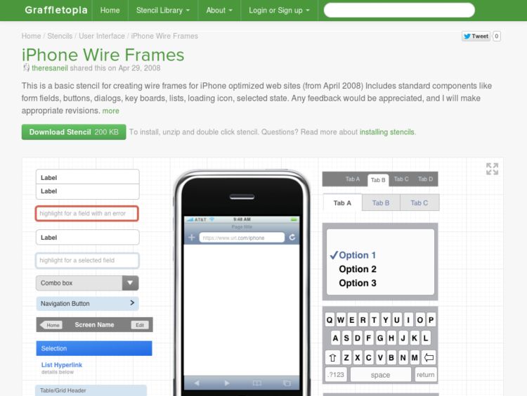
iPhone Wireframes Stencil for OmniGraffle
A wireframe stencil for designing iPhone interfaces.
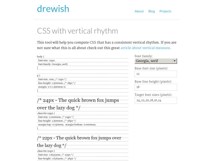
CSS with Vertical Rhythm
drewish.com provides a nice script that takes a base font and line height and generates a scale of font classes with font sizes, line height, and margins calculated as ems. It's an odd selection of scale however with fonts sized at 12, 14, 16, 18, 20, 22, and 24 px. You can easily set this to a more familiar 12, 14, 16, 18, 21, 24, 36px. Or following Mark Boulton's lead, you can set to 11, 13, 16, 18, 24px.
One very nice thing about using the classes this generates is not only that they are scalable via the browser because they are set as ems, but that you can do tricks like line up text on a ruled background with predictability, as in the example below.
This is text set at 36px.
This is text set at 12px (the base font size). Lorem ipsum dolor sit amet, consectetuer adipiscing elit. Nullam hendrerit, augue ac egestas bibendum, nunc nulla aliquam ipsum, ultricies luctus nibh nunc interdum magna. Vivamus aliquet tincidunt dui. Donec iaculis ornare ipsum. Sed dapibus erat nec purus. Donec elementum rutrum est. Mauris iaculis.
This is text set at 14px. Lorem ipsum dolor sit amet, consectetuer adipiscing elit. Nullam hendrerit, augue ac egestas bibendum, nunc nulla aliquam ipsum, ultricies luctus nibh nunc interdum magna. Vivamus aliquet tincidunt dui. Donec iaculis ornare ipsum. Sed dapibus erat nec purus. Donec elementum rutrum est. Mauris iaculis.
This is text set at 18px. Lorem ipsum dolor sit amet, consectetuer adipiscing elit. Nullam hendrerit, augue ac egestas bibendum, nunc nulla aliquam ipsum, ultricies luctus nibh nunc interdum magna. Vivamus aliquet tincidunt dui. Donec iaculis ornare ipsum. Sed dapibus erat nec purus. Donec elementum rutrum est. Mauris iaculis.
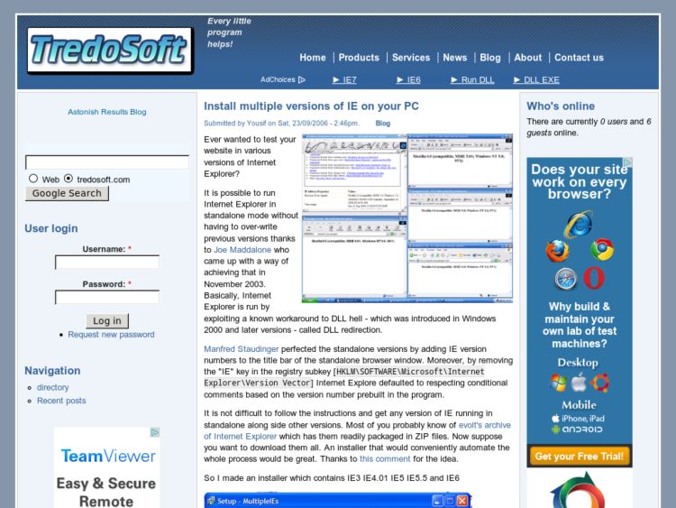
Install multiple versions of IE on your PC
The Multiple IE Installer is a must have resource for front end developers. I had to configure a new computer for myself because of a recent job change, so that meant installing all of my design/development tools again. On my new MacBook Pro, I run VMWare and just ran Tredosoft's Multiple IE Installer for Windows XP. On an XP machine with IE7 (you must upgrade to IE7 before running this), the application will allow you to select versions of IE 3, 4, 5, and 6 to install. I've had it working on my last 3 Macs running Windows on both Parallels and VMWare without any problems.
Litmus: Test your email and website designs
Litmus provides testing of web sites and email messages across all browser and email platforms for a fee.
Textism Word HTML Cleaner
In my old days working on a corporate portal, I occasionally had to take someone's HTML, which was generated by Microsoft Word, and drop it into an entry on a CMS. But before I could just cut and paste, I had to run a series of regular expression replacements in vi or Allaire HomeSite to strip out any of the god awful HTML that Word generated. To pay homage to the past, fate recently dropped a Word HTML file in my lap. I was surprised to see how much cleaner the HTML was, but it was still pretty awful and full of excessive markup cruft.
Doing a search today for Word HTML cleanup turns up Textism's excellent Word Cleaner service, which allows you to upload a Word HTML file, and then spits out cleaned HTML ready for you to use in your blog or CMS. It worked out perfectly for me. I only wish this were around 10 years ago!
Mac OS Hex Color Picker
The free Hex Color Picker from Waffle Software lets you get and edit hexadecimal HTML color codes in the standard Mac color panel. Requires Mac OS X Tiger.
Mondrianum, A Kuler Color Plugin for the Mac
Lithoglyph’s Mondrianum is a plug-in that enables Mac applications use color palettes created by the kuler community. Mondrianum acts like a built-in, system-wide color picker, available in any application that supports this feature, including iWork, iLife, OmniGraffle Photoshop, Illustrator, Coda.
Thanks to Andrew for the tip!
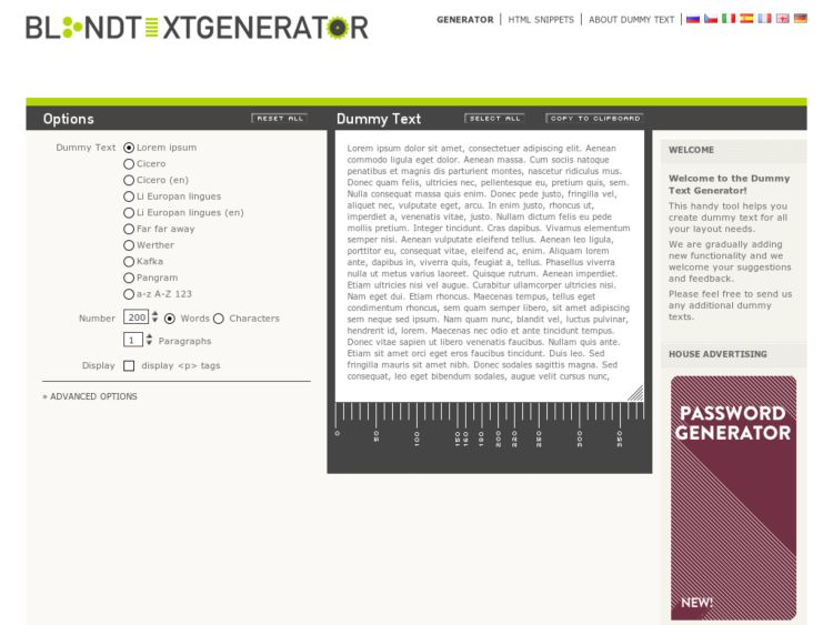
Blind Text Generator
I prefer not to use dummy text, because creating wireframes and comps that reflect how they will really look and function is what people pay me for, and is a sign of a lazy IA/IXD. Plus it can be really enjoyable to write real fake copy. Having said that, I have to admit to being the lazy IA from time to timeand have gone to gone to lipsum.com to generate dummy text.
Another thing I do is go to silly blogs and copy the text there. Dwight Schrute's Schrute Space has been a great resource for that lately, since I'm working on a TV-related site with user generated content. This at least makes my copy look semi-real.
But if I have to resort to dummy text, I think I'll be going to the Blind Text Generator rather than lipsum.com. This dummy text offers you a few options, from Cicero's standby Lorem Ipsum greeking to a passage from Kafka's Metamorphosis. You'll never have to deliver boring copy again--in your wireframes at least.
