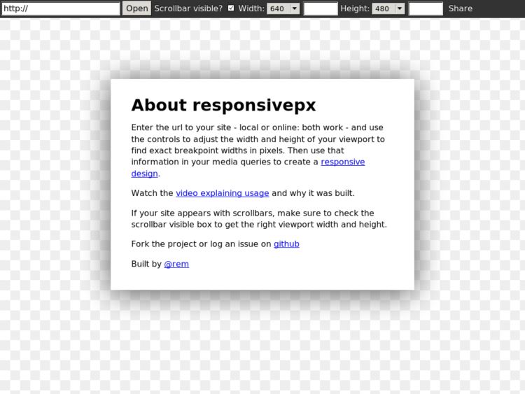
Responsivepx allows you to enter the url to your site (local or online) and use the controls to adjust the width and height of your viewport to find exact breakpoint widths in pixels. Then you can use that information in your media queries to create a responsive design.