Blog

Designing Enjoyable User Interfaces: Lessons learned from computer games

· Michael Angeles

I find inspiration in the literature that examines games and play as factors in creating delightful and engaging experiences. I like to think of how this applies to products outside of the video gaming industry. I've had Thomas Malone's 1981 paper, "Heuristics for Designing Enjoyable Interfaces: Lessons from computer games" on my desk for a while. I finally got around to reading it and found some interesting ideas that resonated with me.

The paper asks why users find games captivating and proposes guidelines for designing enjoyable systems. What I found relevant for interface design are Malone's observations about the experience with toys versus tools, and how to incorporate elements of game play to make tools more enjoyable.

One of the distinctions he makes is that when using tools, their interfaces tend to become virtually invisible, to allow the user to focus attention on tasks that satisfy their external needs and goals.

I don't think all tools become invisible, but well-designed, efficient interfaces for business software tend to feel this way. I also think of it this way—I don't go to the library to experience the library, I go to satisfy a need external to that physical place. The collection of the building, its contents, and it's staff are the tool, and more importantly they are simply a means to an end. The same is true of research databases or search engines. Most business software is focussed on fulfilling needs and goals, and the ones that I've used that feel efficient tend to have interfaces that fall away so I can focus on tasks.

We're using tools during large portions of our work day, and to some extent, for power users, their utility sometimes makes them boring, and we seek out ways to find challenges using them. I found this passage particularly relevant to me.

In a sense, a good game is intentionally made difficult to play, but a tool should be made as easy as possible to use. This distinction helps explain why some users of complex system may enjoy mastering tools that are extremely difficult to use. To the extent that these users are treating the systems as toys rather than tools, the difficulty increases the challenge and therefore the pleasure of using the systems.

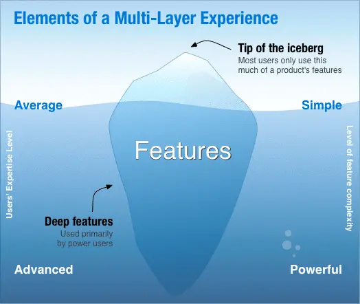
Interesting idea, although the conflict of simple versus complex presents a challenge. With tools, simple features are great for satisfying that 80% of users that need efficiency, but the 20% of power users can probably stand to go beyond that simpler experience. For them, the challenge is to find ways to unlock the hidden features beneath the iceberg.

I thought of it as an iceberg representing features (excuse the cliche metaphor). The tip represents defaults and simple features for the majority of average users, and the larger mass below the surface represents power users and the often hidden, advanced features they use.
The conflict really has to do with power users. They want to push the tool to do more, they want to do advanced things. What Malone proposes in this case is to build in a progression of increasingly complex levels, and the analog in the business tools world would be access to advanced features, whether they be built into the interface itself, or require expert-level expertise to access those features. Have you ever looked at the insanity of an MS Excel spreadsheet loaded with macros? That's the kind of analog we're talking about. Or in a SaaS environment, it's an API that gives access to data.

There are simpler examples from our world. Some IAs use these kinds of expert-level skills to get access to data from websites to come up with information graphics that help us visualize that information when wrestling with server log analysis or content inventories. I did a lot of this with tools like Graphviz in the past. In traditional design tools, it could mean pushing an advanced feature in graphics software to do things beyond what they were intended for. I'm thinking of things like using JavaScript and Scriptographer in Illustrator, in this case.

Malone talks about building multi-layered systems in games in order to push advanced users to become more engaged and sustain their use with the game.

[A] multi-layered system could not only help resolve the trade-off between simplicity and power. It could also enhance the challenge of using the system. Users could derive self-esteem and pleasure from successively mastering more and more advanced layers of the system, and this kind of pleasure might be more frequent if the layers are made an explicit part of the system.

What he's talking about is common in games—providing an ecosystem that supports leveling up with the purpose of providing incentive and reward via building up expertise and engagement.

This reminds me of what Kathy Sierra talks about in her talks on creating awesome users. Experiences that progressively introduce and teach users about advanced features have a better chance of sustaining engagement with them. This is something we all want in our products.

I love the idea behind this. It becomes our responsibility as interface designers to know how to identify the tip of the iceberg to provide the simple defaults, but simplicity isn't all. We might keep the majority of our users working with the obvious features, but we want to provide the conditions that will let them become expert, and over time keep them feeling continually challenged and satisfied. Our challenge comes in knowing how to push the iceberg up, or teach the user how to swim deeper below the surface.
http://dl.acm.org/citation.cfm?id=800049.801756

10 Omnigraffle tips you might not know

· Michael Angeles

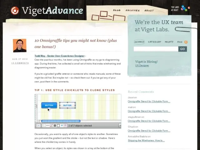
All the OmniGraffle users out there will want to check out Todd Moy's list of tips and tricks that all OG power users need to know. The character replacement one in particular will save you time. Although I tend to just clone an entire object's style the style brush with W and OPT+W, you should definitely learn about cloning discrete styles with chicklets. You'll wonder you never did.

Check them all out on Viget Advance and level up your OG skills.

http://www.viget.com/advance/omnigraffle-tips-and-tricks/

Letting Go

· Michael Angeles

Two great slides from Yiibu's presentation, Letting Go, a talk about design in an time of increasing disruption.

"Issuing your customers with something that is rough, incomplete, and possibly even substandard seems counterintuitive but there is growing evidence that people don't necessarily want the perfect product. They prefer to deal with something ragged around the edges that they can adapt or improve."
— Martin Thomas in "Loose: The Future of Business is Letting Go"

"The best designs will set the stage, but stop short of fully defining the experience."
— Adam Silver, Frog Design

Awesome presentation deck. Would have loved to see and hear it in person. See the full presentation here.

Photo credits: 1, 2

http://www.slideshare.net/yiibu/letting-go-9109114

Konigi Graph Paper 2011 Update

· Michael Angeles

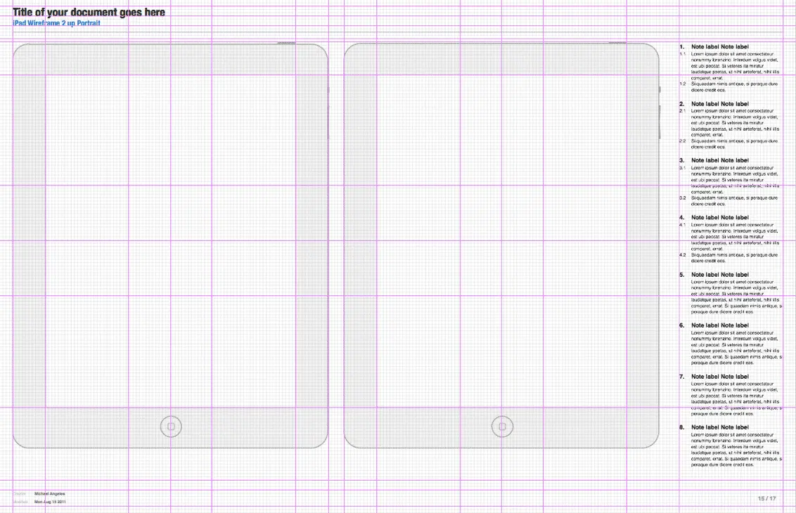
It's been about 3 years since I updated the printable graph paper PDFs I provide for user interface design sketching. You can download the printable PDFs from here. (Yes, I use the word "Here" in links.)

In the last year I've gotten a lot of requests to replenish the inventory of wireframe and storyboard graphpaper notepads that I fulfilled via Amazon.com, and the wirebound sketch books. I feel bummed every time I tell people that I decided to get out of that little business. It seems enough people still like to use them. I've even been told via Amazon comments that the storyboard notepads were being used by animators and filmmakers, which is a lovely full-circle I think.

In any case, I updated the graph paper page to provide PDFs of the very Illustrator files my offset printer used to create the final run of wireframe and storyboard notepads that were sold on Amazon. I also now provide an 8-up page. In an upcoming article I'm going to show you how you can print and bind your own notebooks from these. I think it's more satisfying anyway to do it yourself and have only enough paper on hand for what you need.

Enjoy. More to come. Get the updated graph paper.

//konigi.com/tools/graph-paper#update201108

OmniGraffle UX Template 2.5: Updated with iPad Pages

· Michael Angeles

@nickf called me out for not having iPad templates in the Konigi OmniGraffle Wireframe Template, so I got off my lazy ass and added some since this thing hasn't been updated in over 2 years! Added iPad Portrait 1 up, iPad Portrait 2 up, iPad Landscape 1 up. They have guides for 2x2 or 3x3 grid.

Note, this is for OmniGraffle Pro ONLY. You will not be able to edit shared layers to modify the headers and other templates. Get yours.

//konigi.com/tools/omnigraffle-ux-template

Seth Godin on the Importance of Domain Knowledge

· Michael Angeles

Seth Godin's blog often talks about where successful ideas come from, and in this post talks about bypassing the need to make huge leaps in innovation by synthesizing what we know and have learned from history, using Palm as the cautionary tale.

It's not enough to be aware of the domain you're working in, you need to understand it. Noticing things and being curious about how they work is the single most common trait I see in creative people. Once you can break the components down, you can put them back together into something brand new.

This is why we are constantly doing competitive monitoring and analysis of the products in the industries we work in. At times I feel kind of crazed signing up for betas out there, because the speed at which they appear now is overwhelming. I just have to remind myself that it's ok to spend the time if there's some research value, and then quit.

Whether we're just looking at the landscape from a high level, or deeply investigating and deconstructing how things work, continually expanding or improving domain knowledge is always going to be an important activity for us as designers.

http://sethgodin.typepad.com/seths_blog/2011/08/bypassing-the-leap.html?utm_source=feedburner&utm_medium=feed&utm_campaign=Feed%3A+typepad%2Fsethsmainblog+%28Seth%27s+Blog%29

Can you guess what this is?

· Michael Angeles

So I'm working on this hand drawn font and looking at characters with diacritics is having a weird effect on me. While working on it, the ö character reminded me of something from my childhood and I had to remake it in type.

So if you can guess what this is by @ing me on Twitter or in G+ if we follow each other there, I'll give you a floppy disk notebook from my stash, and a few sketch pads. Game on. Happy Friday.

Update:

@dakotareese came closest within minutes, then @emenel and @sjaa guessed it.

The inspiration was the Martians, aka Yip Yips, from Sesame Street:

I don't know how he got so close with just nothing but those 3 letters to go by, but @dakotaresse wins the prize if he wants it. And if you're curious, it's Futura in the middle flanked by Gill Sans.

Articulating Your Preferred Use Case

· Michael Angeles

I like how Seth Godin states everything so clearly. Usually it's a pithy piece of advice about how to do the right thing, do right by your product, and thereby do right for the market by serving the right users with the product they want, and forgetting about trying to serve everyone else.

Here's one thought about really knowing your use case and putting it out front for the market to see, and letting it guide your conversation.

Many organizations will take any customer, any time, and bend and writhe to accomodate money in whatever form it arrives. Other, happier organizations understand the benefit of optimizing for a certain kind of interaction, and they have the guts to decline the part of the market that doesn't want to use their tool/organization the way it was intended.

And what to do if your use case becomes irrelevant (ouch!):

You'll often be wrong about what the market is and what it wants. When that happens, time to either shift your use case (and the way you're organized around it) or stick it out but be prepared for a long, tough slog.

Hear, hear. More over here.

http://sethgodin.typepad.com/seths_blog/2011/07/articulating-your-preferred-use-case.html

Persona Email Client Prototype

· Michael Angeles

Persona is a concept for a theoretical email client prototyped by Ali Seçkin Karayol, Marco Triverio, and Harsha Vardhan at the Copenhagen Institute of Interaction Design. The prototype focusses email on people or conversations rather than presenting the typical data-dense tabular view of messages. The attachment view also offers a nice way of viewing all attached files in a gallery presentation.

There are some compelling ideas for re-imagining the focus of email consumption here. The group plans to do some sessions with real users, and I would be interested in seeing if users ask some of the hard questions. Certainly pivoting the entry point to focus on people can help. Another hard problem with email is bubbling up importance, and dealing with volume. So far, I don't see anything beating the processing of filtering email manually and visually, with regard to that problem.

http://www.personamail.info/