Blog

Experiments in Password Masking

· Michael Angeles

Jakob Nielsen recently called for an end to password masking, and a few people have come up with interesting approaches that try to find a middle ground between the typical prractice of masking passwords with asterisks.

arc90 are experimenting with a half-masking technique. The method partially obscures the password by placing a few blurred characters in the background so that the characters are not easily read by someone looking over the user's shoulder. This seems like an interesting idea. The problem for me is that I can't say that the characters are easily read by me either. Can you make out the password in the screenshot above? It's hard to, I would argue. But, I'm one of those people who has trouble with the more twisted captchas or those with too much background noise. My eyesight is not bad, mind you, I just interpret some of the characters more creatively I guess.

Another interesting idea uses a behavior that is typical in mobile phones, which masks the typed character after it is displayed briefly in the input for a specified time, or after the user enters a subsequent character. This is a terrific behavior in phones because the character is completely visible to the user. I guess it could argued that it could still be read over the user's shoulder, however. You can try that solution in the iPhone-like passwords using jquery post on the Decaf blog.

Both are interesting solutions to a problem that might be a minor nuisance to some users (although I would argue that captcha is a much bigger one to me). But my opinion is that simply having a toggle to hide/show the password clearly might be an even simpler approach. For users in public places, the input might be masked, but when they're alone they can keep it in the clear.

UPDATE: Chris Dary also pointed to his HashMask experiment at arc90, which we discuss below.
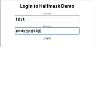
http://lab.arc90.com/2009/07/halfmask.php

Content Templates to the Rescue

· Michael Angeles

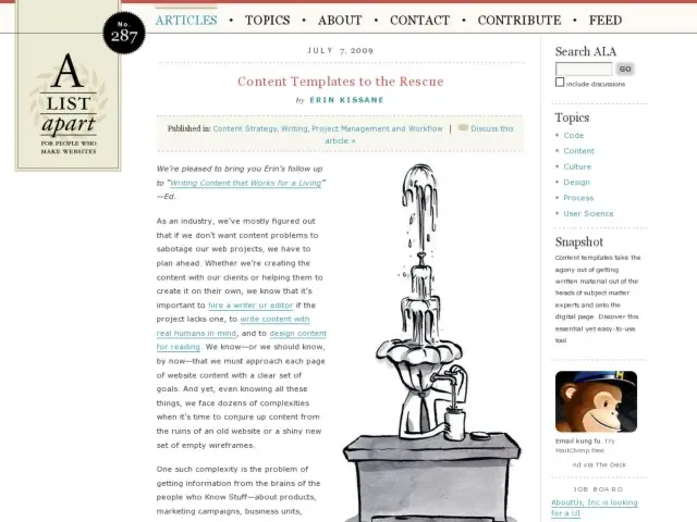
Erin Kissane writes about using content templates "... to help speed up the information-collection process, improve consistency across the website, and make the editing process easier and more orderly" in A List Apart.

The ideal situation is to have a content strategist, perhaps a technical writer, who can provide the guidance for auditing and organizing information, and add some rigor to the writing process. The absence of a content strategist on a project necessitates at least dedicating one person to this task. Kissane's article shows how to use content templates to provide the framework for preparing each page of content so they may communicate the essential information effectively and consistently. If you have an IA on the project, this can follow from wireframes on new work.

http://www.alistapart.com/articles/content-templates-to-the-rescue/

Redub Designs a Better Online Magazine

· Michael Angeles

I came across Redub's "Don't Make Me Scroll" presentation embedded above, which looks at the current offering of magazine readers which are modeled after print layouts, are difficult to read, SEO-unfriendly, and which rarely use the full capabilities provided by web browsers, e.g. multi-media. Or they're modeled largely after blogs with articles are long and scrolling, are limited by the possibilities of HTML/CSS, and have layouts that aren't differentiated from blogs and which pale in comparison to the layout in the printed version of the original magazine article.

Redub is working on a magazine reader, built on Flash, with a keyboard-enabled UI (input devices work as well) that scales to any screen size, does not scroll, and provides designer-friendly layout possiblities. You can check out the GOOD magazine demo to experience the reader. There's some really interesting interface design happening there including unobtrusive menus and prev/next paging controls, a pagination bar that is scaled to indicate the amount of content on the page, great examples of interactive media in the content, e.g. interactive charts, and hints at personal options like annotations. It's very well thought-out and works better for reading magazines than any of the readers out there.

It seems like they're trying to do for online magazine reading what the Kindle does for ebooks. Exciting stuff to see the full potential of Flash being utilized to improve the magazine reading experience, rather than just port it over to an digital, PDF-like version that doesn't work as well on screen.

http://redubllc.com/2009/07/dont-make-me-scroll/

Beautiful Minimal Websites

· Michael Angeles

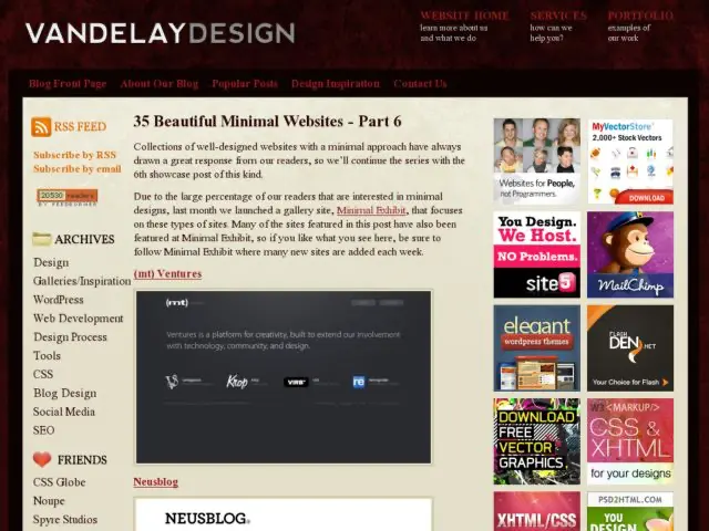
I'm enjoying the 6 part collection of minimalist designs posted by Vandelay Design. Some sites are more minimalist than others. I tend to use that term loosely at times as well. But the predominant theme seems to be type as interface, minimal use of graphics (aside from a logo and the body content), few if any graphic treatments of navigation, and little to no use of texture and graphic effects, and liberal use of white space.

http://vandelaydesign.com/blog/galleries/35-beautiful-minimal-websites/

Writing Microcopy

· Michael Angeles

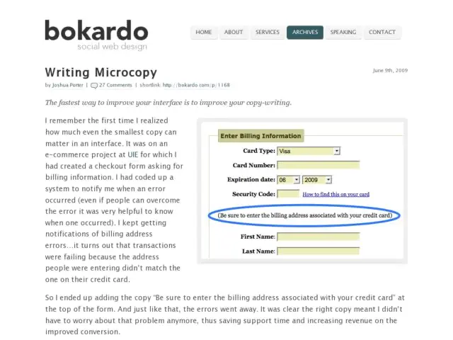
Joshua Porter writes about the use of microcopy to create confidence and alleviate concerns in customers about the actions they take on your site.

Ironically, the smallest bits of copy, microcopy, can have the biggest impact. ... Microcopy is small yet powerful copy. It’s fast, light, and deadly. It’s a short sentence, a phrase, a few words. A single word. It’s the small copy that has the biggest impact. Don’t judge it on its size…judge it on its effectiveness.

Porter provides a few detailed examples showing how microcopy helped users entering ecommerce funnels, in one case reducing errors by qualifying an address form, and in another case adding information to assure customers that they don't need a PayPal account to purchase with PayPal. He provides a few more before/after bits of copy for typical registration and ecommerce scenarios as well.

http://bokardo.com/archives/writing-microcopy/

Ryan Singer Interview on Think Vitamin

· Michael Angeles

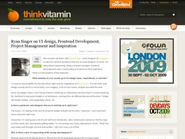
Think Vitamin interviews 37 Signals' Ryan Singer to talk about ui design, frontend development, project management and inspiration. I like that Singer suggests that designers read more about writing copy, but even more so, I like how he suggests that designers should also consider learning more about front end development and programming frameworks. At the very least, it allows designers to be conversant with developers, and ideally it gives a designer a new range of skills they can use for such things as prototyping or doing proof of concept work on their own. Excellent advice for growing the T-Shaped designer.

http://thinkvitamin.com/features/ryan-singer-on-ui-design-frontend-development-project-management-and-inspiration/