Blog

Free Notebook for Konigi Friends at SXSW Wireframe Talk

· Michael Angeles

So I've made some 8.5 in. by 5.25 in. graph paper notebooks because I wanted something a little more functional than what I was using for sketching. They're basically a mini version of the wireframe grid I use, with markers for 1/3s and 1/4s, but without the gutters. I've been working with a prototype of this for a few months now and have a bunch of these ready to put up for sale, but haven't been rushing to do it, mostly because I made them for myself and selling stuff like notebooks isn't profitable until you get into selling large quantities, and unfortunately I haven't the time to market the pads and books.

So I had a great idea for now. I am going to sell these eventually, when other higher priorities get out of the way, but for now, I'm going to start off by giving the first 30 or so away, starting with a little gift for my Konigi readers who happen to be able to make it to SXSW to hear the wireframe panel that Nick Finck, Donna Maurer and I are doing. After the talk, if you're one of the first 30 to come up to me and give me the secret word, which I'll announce on Twitter a few days before the talk, you'll get one of the books. My little thank you for being a reader and making it out to the talk.

Stay tuned.

chrome://speeddial/content/speeddial.xul

The Language We Use

· Michael Angeles

In "The language we use," David Malouf discusses how ideas about user interaction can become so ingrained in what we are familiar with, that our language begins to reflect that familiarity. That can lead to a natural tendency to explain away interaction without thought to what it means to the design of a thing. In this case a student describes the change of context in a sketch presentation by using the word "click" (as in clicks to go to the next screen). The absent minded use of the word "click" brings with it the connotations of a mouse click, and limits the possible set of interactions.

David makes two great observations here. First, that the way we talk about interaction design is as important as the visual elements of the design solutions we produce. The language we use, and in particular the selection of meaningful words that convey behaviors, and the intellectual content and analysis of our design is a closely bound component of what we're providing when we do design work. It is productive, therefore, to write about interactions (e.g. in your spec) and deconstruct what you write.

The second great observation David makes is that there is danger in the use of loaded language when it comes to describing interaction. Words like "click" explicitly point to the use of one type of input behavior, whether it's a mouse input or finger touch, that carry with it the limitations or constraints of that behavior. The same might be true of using certain conventions or design patterns. The use of a specific, familiar interface element, like a tab for instance, might lead to known but perhaps limiting behavior for a given application, that would hold the designer back from considering better alternatives for the interaction.

This discussion also reminds me of the thread started by Josh Kamler on "Designing by Writing." It is extremely valuable to engage in writing and discussion about design through deconstruction. Even in the absence of a studio environment, we can learn to analyze what we design by paying particular attention to how we describe what we've designed when we write specs and re-reading and deconstructing what we've written, and actively engaging in regular critique of our work.

http://davemalouf.com/?p=1560

Milton Glaser on Shepard Fairey and Plagiarism

· Michael Angeles

Print Magazine interviews Milton Glaser to discuss Shepard Fairey and the topic of appropriation and plagiarism. If you're not familiar, Fairey is the graffiti artist responsible for such iconic imagery as the ubiquitous Andre OBEY tag and the Obama Hope image. Glaser had this to say, on the topic of copying other artists' work:

The process of looking back at the past is very accepted in our business—the difference is when you take something without adding anything to the conversation. ... I think unless you’re modifying it and making it your own, you’re on very tenuous ground.

He makes the finer point that copying ideas and appropriating imagery is not patently wrong. To the contrary, it is the basis for a lot of work that is celebrated. The difference comes in appropriating and making one's own. He points out the danger the idea of copying poses to future designers and artists.

It’s a dangerous example for students, if they see that appropriating people’s work is the path to success. Simply reproducing the work of others robs you of your imagination and form-making abilities. You’re not developing the muscularity you need to invent your own ideas. ... But it’s important for students to understand that any idea can be exploited, but not simply reproduced.

I, for one, don't sit in judgement of Shepard Fairey's work because I find the idea of what he does, the mass underground distribution of iconic imagery in the form of an ilegal activity for spreading one's art, to be interesting for that controversial aspect alone. Is it art or is it vandalism? Is it stealing or is it some sort of free speech that should be protected? But, I digress on that issue, only to share what I think is provocative. Getting back to Glaser's point, if in the realm of design we tend to be gray on the issue of copying ideas or actual form without making a thing our own, what do we gain from that experience? Not very much, for not very long.

You might also want to check out the interview with Shepard Fairey on the Fresh Air show at NPR.

http://www.printmag.com/design_articles/MiltonGlaseronShepardFairey/tabid/492/Default.aspx

Prezi: The zooming presentation editor

· Michael Angeles

Prezi is an interesting web app that allows users to create Flash-based Zoomable/Pannable presentations. The interface brings up a presentation editor with a keyboard command, and displays a radial menu for placing media objects, drawing paths for prev/next animation, etc. The finished presentation allows users to step through the "slides" as the canvas zooms and pans. It really might be a nice service for doing things like simple product screencasts, for instance, and hopefully the finished product will allow you to export your work for embedding on your site.

http://prezi.com/

OmniGraffle Sketch Stencils Now Available

· Michael Angeles

Sketches are often better tools for communicating designs than high fidelity illustrations or schematics. The purpose of the sketch style wireframe is to prevent the intended audience from thinking about visual design and focus on the functionality and behavior you are proposing.

I'm happy to announce the release of this set of sketch stencils for OmniGraffle, based on the Wireframe Stencil. This set of user interface sketch stencils is designed for OmniGraffle 5.x. OG4 users are able to use the stencils by changing the .gstencil extensions to .graffle. The sketch kit contains all of the UI elements you'll find in the free Wireframe Stencils we provide at Konigi, plus additional shapes and elements to make it easier for you to adjust to this style of wireframing.

As usual, I'm sticking to the goal of keeping the tools on this site inexpensive or free. Your $10 purchase of this stencil set entitles you to free upgrades forever.


//konigi.com/store/product/omnigraffle-sketch-stencils

Untitled Document Syndrome

· Michael Angeles

John Gruber laments the illogical, yet human, tendency to avoid saving new documents, which occasionally leads users to the loss of data when an "Untitled Document" is left in limbo and a crash leaves them scrambling to figure out what happened to it. The point is that users often can't be bothered with things like figuring out where to put this thing on a file system because we're too busy with the task at hand, e.g. writing the thing that we might not have a name or place for yet.

Good software would save users from their non-saving, human selves. Software needs to offer a way to protect us from our laziness (and I say that as someone who is very lazy about certain things) by providing systematic methods for frictionless data protection and recovery. We're talking about the realm of usability principles that Jef Raskin wrote about, e.g. providing undos rather than dialogs for destructive actions.

Gruber also talks about the "i" apps' implicit handling of things like file system paths in iTunes and iPhoto, which take care of file organization for you, so you can just focus on things that makes sense to you, like albums and playlists, and let the system just do the file management for you in a logical manner. Gruber also writes of the autosave intelligence in apps like Stickies and BBEdit, which auto-save in the background unbeknownst to the user, and upon return from an abandoned session, data is back where she left it, in whatever state they left it in.

These are frictionless applications--those that lets users get to the main task that brought them to the app in the first place, e.g. writing, uploading photos and music, without having to think of things like the file system. This is design for use, and not for micro-managing control. It's getting directly to the point of using the application, and avoiding obstacles like thinking about how to use the application.

I think this is the vision most of us, concerned with ease of use, espouse and want for our apps. I speak out of both sides of my mouth sometimes, opting for micro-managing some things, e.g. I've used a photo management app based on my camera/year/ file organization rather than using iPhoto's file management, but I let iTunes manage all my music and video data. But the point is, most people probably don't want to micromanage that organization.

http://daringfireball.net/2009/02/untitled_document_syndrome

20 Steps to Better Wireframing

· Michael Angeles

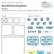
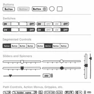
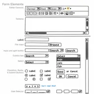
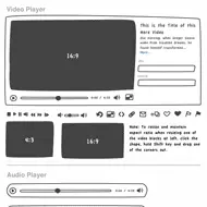
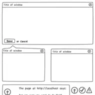
Think Vitamin's Clive Howard says "Wireframing is one of the first steps in your planning process and arguably it’s one of the most important ones." In this article, Howard goes through the wireframing process, discussing who should be involved, which tools to use, and offers sound tips to enable you to make better wireframes.

Among my favorite points are those about ownership and involvement. This is to do with ensuring that someone is driving the process and iterations, and making sure that the interaction design process doesn't happen in a vacuum, but is reviewed, validated, and informed by key team members, e.g. engineers, as you're creating them.

I also like the points about fidelity, and avoiding doing too much design. That said, if you're also the visual designer, or can base the visual language of the wireframe to the visual language of agreed upon visual design specs, then I don't see a problem doing that.

What I don't agree with, is that you want to avoid designing behaviors such as Flash or AJAX. Wireframes, storyboards, and sketches are the precisely place to explore how websites and applications should behave. You needn't be as specific as specifying types of transitions, just generalized behaviors and relationship to system logic. If you don't specify behaviors, decisions will get made without your input. If that's fine with you, leave them out. But you're supposed to be the expert on your users, how they've modeled the site or app, and what they expect to do there.

Lastly, one point that is missing for me is know how to pitch/present the wireframes. These aren't just documents to be chucked over the wall. While they should be able to stand on their own when it comes time to design or develop what you've specified, your job is not done when you've shipped the doc. You have to present and justify, explain details, and answer to questions that will undoubtedly arise about how things behave. For this reason, I rely very heavily on annotating wireframes and storyboarding behaviors. Those questions will need to get answered eventually. If you don't think you deserve to be in that conversation, leave them out, because someone else will make those decisions without you. But if you intend to be involved in the user experience, why not be involved in every aspect of design, and make sure your wireframing process allows others to be inform what you produce.

There's quite a bit of good stuff in Howard's points, so be sure to read the article to find out what each of the bullet points above refer to.

http://thinkvitamin.com/features/20-steps-to-better-wireframing/

Bill Buxton on How to Keep Innovating

· Michael Angeles

In BusinessWeek, Bill Buxton discusses how to keep innovating, with the main idea being that you can continue to cultivate creativity and innovation by finding new things that you have a passion for. He suggests that when you get good enough at a thing, you should find something else to be passionate about, and commit and throw yourself into learning how to do it. You'll be bad at it at first, but the experience of learning something new, no matter how bad you are at it at first, may affect your creativity in positive ways that you won't realize until you experience it. In some cases, they may inform what you are already expert at, and in others lead you in entirely new and surprising directions.

The discussion reminds me of Paula Scher's talk focussing on serious versus solemn design at TED. Scher spoke about the different times in her career where she was able to be most innovative in her craft, and the thing that was common in each case was that she was doing something new--something she didn't know much about when she started that particular project. The fact that one has no reference point or bearing can lead to innovative thinking.

This is the same argument Buxton is making. I think Buxton is saying that the continued pursuit of new endeavors itself, is what can help cultivate one's creativity and create the pre-conditions for innovation. I'm sure a lot of people who take up new hobbies and have the continuing need to learn see the obvious in this. This is one of the reasons I feel at home in a city where it is easy for me to start investigating and learning something new all the time. Being in a city isn't necessary, per se, but being able to get inspired and start doing something new is a hell of a lot easier for me here. This coupled with the fact that my wife and I homeschool our 8 year old son, which has lead me to dive deep on countless topics and project that I would never have held my interest in the past. If you read my personal blog, you know about my forays into toy making, game design, character creation and storytelling.

In any case, the story is not new, but is a reminder for me that being well-rounded and having many interests is a good thing. In fact it's one of the top criteria I've used when participating in the hiring of people.

http://www.businessweek.com/innovate/content/feb2009/id20090218_337947.htm

30 Essential Controls for RIA Design

· Michael Angeles

Theresa Neill, co-author of Designing Web Interfaces lists her 30 essential controls for Rich Interface Application design, and provides a list of frameworks that provide these controls, in the second article in a three part series on patterns and principles for RIA design.

1) Standard Screen Patterns: 12 patterns w/100 examples

2) Essential Controls: 30 controls for RIA design and development

3) Components for Commonly Requested Features: 15 patterns and examples (Forthcoming)

http://theresaneil.wordpress.com/2009/02/04/30-essential-controls/

CompareNetworks jQuery'd Bread Crumb

· Michael Angeles

The JQuery'd Breadcrumb is an odd breadcrumb interface that collapses all nodes in the branch upon page load, and then expands to show each node the user mouses over. Their explanation:

This collapsible breadcrumb was developed to deal with deeply nested, verbosely named pages. Rather than limit the amount of elements shown on the sever side, we decided to go with a client side solution for usability and SEO reasons.

I don't see how this is a usability improvement over an exposed breadcrumb. If they needed/wanted to use breadcrumbs for whatever reason, it would seem more usable to show a larger truncated portion of each string with an elipsis, and expose the string on hover, rather than just show these strange portions of the string. I don't even see the whole first character, so it just looks kind of broken in a way.

I like the attempt to do something about minimizing breadcrumbs in deep paths. But it might even be more useful to use something like the path control we're accustomed to in the Finder and Windows Explorer. You'd have to do a lot to make it look less like a form control to make it unobtrusive, but provide some context. Do it with ULs and CSS, and I think you'd still be ok with regard to SEO, although someone might correct me if I'm wrong. I don't know why you'd allow horrendously long titles as in their example, but clearly you don't need to have the current node in the branch visible if the point is to minimize the weight of this UI element.

http://www.comparenetworks.com/developers/jqueryplugins/jbreadcrumb.html