Blog

OmniGraffle Wireframe Icons

· Michael Angeles

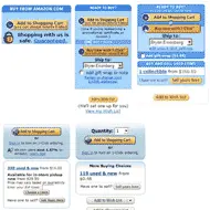
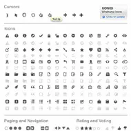
The Konigi OmniGraffle Wireframe Icon Set is a set of grayscale cursors and icons that come in handy when designing wireframes, aka user interface schematics. This product includes a standard set of cursors, and many of the icons you need for the design of web-based user interfaces.

This set of icons is designed to work well with your wireframe stencils. You'll find rich text editor controls, file system actions, social interaction symbols, ratings and voting, and a host of other icons for most of the behaviors you may want to communicate with an icon.

Your purchase of this icon set entitle you to free upgrades forever. If you have suggestions for icons you'd like to see included in this set, please feel free to suggest them.

//konigi.com/store/product/omnigraffle-wireframe-icons

Paula Scher gets serious at TED

· Michael Angeles

Fantastic TED video of Paula Scher looking back at her career for those moments where she was able to devote time and effort to serious play and create wonderful work, and contrasting it with the unfortunate moments when the serious becomes solemn. I love how this retrospective observation of her career brings her to conclude that the best of times for her as a designer is when she comes into a project with no grounding or bearing--those times where lack of history or reference point allows that kind of play to emerge.

http://www.ted.com/index.php/talks/paula_scher_gets_serious.html

OmniGraffle UX Template Updated (Version 2.1)

· Michael Angeles

The OmniGraffle UX Template for interface and interaction designers has been updated to version 2.1. Included in this release are major alignment, grid, and layout changes. Added guides for 24 column grid with vertical and horizontal gutters on wireframes. Added appropriate guides to all templates that necessitated alignment guides. Added small wireframe and iPhone templates. Download it here.

//konigi.com/tools/omnigraffle-ux-template

Pacemaker Mobile MP3 DJ Device Gets a GUI Redesign

· Michael Angeles

Pacemaker, the mobile MP3 DJ device that debuted last year with a 120 GB hard drive, is getting a 2.0 release this spring and offering an additional lower capacity 60 GB hard drive option, and a new user interface.

I was enamored with this device and the way they could incorporate most of the possible mixer and track selection controls for 2 deck track mixing into a single, albeit large, handheld device with their original product UI. The newly redesigned UI looks like it made some usability tweaks and subtle improvements. For instance, there's a new scrolling behavior that highlights your alpha headings. Some filtering options look like they'd be welcome improvements as well. For those that actually DJ, there are a bunch of new effects in there too it seems. The hardware remeains the same.

Now the lower price point and an improved UI, I might actually get one of these. It's still pricey, but over the years my use of 1200s, Trakktor, and Torq have diminished to near nothing. I get by now playing with a DS KORG. I miss DJing, but this may be the toy for me.

http://www.pacemaker.net/default.aspx?documentID=294&entryID=10482

Web Design Trends For 2009

· Michael Angeles

Smashing Mag curates their top web design trends, and gives us the first of a multi-part set with these 10 great examples. It's a well picked, high quality collection of screenshots as is typical of these guys. They never disappoint. Here's a snippet describing the list:

Web design trends for 2009: recent developments, new design elements and new graphic approaches. We also discuss situations in which these trends can be used and present some beautiful examples.

Their second set of trends is forthcoming.

http://www.smashingmagazine.com/2009/01/14/web-design-trends-for-2009/

Distinguishing decorative from meaningful elements in UI design

· Michael Angeles

Ryan Singer posted a article on 37 Signals, deconstructing the design of the global navigation header on Github. In his example he points out the problem with the "Repositories: All | Search" links in the account box in the upper right of the screen, which suggests that those links are scoped to the user shown in the box.

This a great example of how visual grouping and proximity could be more effectively utilized to help users make sense of the available controls. Seems a bit strange to me that the Repositories link is in that area at all. Singer suggests moving the avatar to the right. I might even go further by moving the repository and search links to a different area or better defining the separation of those functions with the user information might be effective in this case. Removing the bounding box certainly helps to alleviate the perception of scoping created by the group, but a better visual structure could be represented here.

http://www.37signals.com/svn/posts/1524-distinguishing-decorative-from-meaningful-elements-in-ui-design