Blog

10 Most Common Misconceptions About User Experience Design

· Michael Angeles

Whitney Hess asked some of the most influential and widely respected practitioners in UX what they consider to be the biggest misperceptions of what we do. The result is not only a terrific list that debunks myths, but an excellent compilation of quotes that better describe what UX is about than a clinical definition can. Those who were quoted described UX as many things, from the reach and touch of customers with products and companies, to the processes we use and the roles we play when we take part in its design.

The Top 10 list of what user experience design is NOT…

1. …user interface design
2. …a step in the process
3. …about technology
4. …just about usability
5. …just about the user
6. …expensive
7. …easy
8. …the role of one person or department
9. …a single discipline
10. …a choice

Of course you're going to have to read the article to get what those points mean. But in essence all of these observations debunk myths that UXD is any one thing among the many parts that might describe it. User experience is both tangible and intangible--it's just exists when people decide to participate in the use of a thing. UX Design is the many parts in a holistic approach to design or enable the use of the thing, and every aspect related to its use.

http://mashable.com/2009/01/09/user-experience-design/

Talking About Sketching About Interacting

· Michael Angeles

This the audio and slides from the presentation Chris Fahey gave at SVA's Interaction Design Program series dot dot dot. In this excellent short short talks (16 minutes), Chris talks about sketching and shows plenty of examples from his notebooks. Great series of events that Liz Danzico and company are putting on. Chris will be on the faculty of the MFA program.

http://www.slideshare.net/askrom/talking-about-sketching-about-interacting-presentation/

Kindle vs. iPhone/iPod Touch: Human/Machine Interaction & User Experience

· Michael Angeles

Tog's comparison and analysis of the human computer interaction versus the user experience with both the Amazon Kindle and the iPhone/iPod Touch is excellent. The separation of HCI/UX in his analysis really drives the point home that good interaction and industrial design can make the experience, and a good experience isn't only about the design.

I don't use a Kindle daily, so I can't comment personally on it, but the industrial design was a showstopper for me and kept me from wanting it. Truth be told, though, the kind of books I read are probably better on dead trees. The thing that impressed me most was the mobile connectivity and the screen. But when I held it in my hand and paged through, the buttons kept me paging through accidentally. I think the lack of back light for darkened rooms would also be a let down.

As for the iPhone, I'm not one of those people that dotes on it. Don't get me wrong. It's without a doubt the single most enjoyable device I use daily, and I wouldn't want to be without it. But many of the elements of the experience have frustrated me, and I still won't be convinced that typing on a touchscreen is a step forward from a physical keyboard. The Sidekick spoiled me.

The best part of this article is that step back that tells the story of why we need to take a holistic approach to the product, from the interaction with the interface to every aspect that radiates from the product.

Companies that pay attention to both the mechanics of the interface and the subtleties of the user experience win. Explore websites like Bed, Bath & Beyond and see how good screen design and carefully-plotted user experience come together. Don’t just examine look and feel; set up a shopping scenario and experience every step from thinking about maybe buying a product to selecting it and checking out. Bed, Bath & Beyond has perfected a superior experience in their real-world stores, and they have translated it beautifully into the cyber world.

There are no trade-offs here. Human/machine interaction is a subset of the user experience. Anything done to improve the mechanics of the interface will, by its very nature, improve the overall experience. Anything done to improve the user experience will amplify the good qualities of the human/machine interaction.

You must, however, research and design each of them separately—and to test each of them separately. They each require a specific frame of mind, and concentrating on just one will lead to the kind of uneven design that both the Kindle and the iPhone/iPod Touch have been offering.

And that last part strikes home most. These are separate activities, but require a holistic approach and frame of mind. Investing in research and design on both of them can be seen as either a luxury or a given depending on how and where you work. But the holistic approach ensures a better experience.

http://www.asktog.com/columns/074KindleVsiPhone.html

OmniGraffle Wireframe Stencils

· Michael Angeles

About

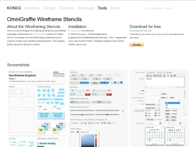
This is a set of shapes for making wireframe in OmniGraffle 5 Pro or OmniGraffle 6 (Mac OS X). It consists of most of the basic elements you'll need to create user interface specifications.

No Installation!

The stencils ship with OmniGraffle! Find them in the Software category. To download them anyway, get the file and open it, when it appears click the Install button.

Download

Download Version 3.3 (6/14/13)
Stencils are free to use, but can't be distributed. If you like them, a donation is appreciated.


UI Components


Ad Units


Browser Chrome


Mobile Devices

Version Information

View version notes.

3.3 (6/14/13)
Added Andrew Blair's Google Nexus device.

3.1-2 (2010)
Ships natively with OmniGraffle

3.02 (4/2/2010)
Fixed dimensions of iPad chrome viewport.

3.01 (2/24/2010)
Added iPad chrome. Replaced graphic icons with vector images.

3 (9/15/2009)
Modified all form and controls elements for color consistency. Added the following: sliders, new form icons, tag clouds and lists, a-z lists, IAB advertising units, iphone chrome, web browser chrome.

2.0.1 (1/6/2009)
Minor bug fixes, clean up of element alignment.

2.0 (1/6/2009)
Major updates to version 1.
Formatted for OmniGraffle 5.x
Includes Base Wireframe Kit; Controls Audio and Video; Controls Basic; Forms; Navigation; Text; Windows, Dialogs and Layers.

1.x (2005-2007)
Original urlgreyhot OmniGraffle Wireframe Palette, formatted for OmniGraffle 4.x (Original is available here).

Kurafire and Smashing Mag on Pagination

· Michael Angeles

Faruk Ateş provides some suggestions for implementing pagination, all of which I would agree with. After the suggestion list, Ateş shows quite a few examples and discusses what's good and bad about them. There's a huge list of examples on Smashing Magazine as well, although some of them are a little fussy.

Oddly enough, while a few of the examples show the method of using an ellipsis plus the last few page numbers as a way to show number of pages, Ateş doesn't count that as a recommended practice.

Here's a screenshot of Flickr using this method. I like Flickr's as an example because it's as straightforward as ou can get with no fuss.

The practice of showing the an ellipsis plus the end pages is one of the pagination conventions I've been using for years and is one I'd add as a more explicit recommendation to the lists above.

http://kurafire.net/log/archive/2007/06/22/pagination-101