75 Insane High Res Photoshop Brushes
· Michael Angeles
Elite By Design has collected links to 75 high resolution Photoshop brushes.
http://elitebydesign.com/75-insane-high-res-photoshop-brushes/
Elite By Design has collected links to 75 high resolution Photoshop brushes.
http://elitebydesign.com/75-insane-high-res-photoshop-brushes/
Gizmodo puts Dieter Rams' designs at Braun next to Jonathan Ives' designs at Apple.
10 principles of design according to Rams:
http://gizmodo.com/343641/1960s-braun-products-hold-the-secrets-to-apples-future
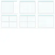
This 8.5 x 11 inch graph paper is made for visual designers, interaction designers, and information architects. You'll find styles for wireframing user interfaces, and story boarding interaction. I've been told that it's also used by animators and filmmakers. Enjoy.
These cyan and gray grid pages are great for sketching, but also work well when producing high fidelity drawings. The boxes and grid lines of the cyan versions are non-photo blue, so you can easily remove them when scanned. The gray works better if you like more prominent grid lines.
Download all of the PDF files.
These templates are free to use and distribute, but may not be sold without permission. If you like it, buy me a coffee or make a donation to keep my server running. ;)

This is a wireframe grid divided into 24 columns with gutters between each column. The grid is especially useful to designers who are working within a CSS framework such as Blueprint, which also divides its grid into 24 units, so setting up common divisions is easy (1/4 + 3/4, 1/3 x 3, 1/3 + 2/3, 1/2 x 2, etc.). 1/4 column divisions are marked along the top of the grid, and 1/3 columns are marked on the bottom. There's also a 1/2 division on the side, which makes it easy to split the grid into 4 quadrants for plotting values on a 2x2 graph. To the right is a ruled column for adding labels and annotations.

The grid in this graph paper is identical to the wireframe paper above, but the notes section is removed to make room for a larger (taller) page schematic. Like the landscape wireframe grid, this one provides 1/4 and 1/3 divisions, but they're all marked at the top of the grid. Title/project and date areas are provided at the bottom.

This is a sheet with 8 grid boxes for doing fast thumbnail sketches or 6-8-5 sketch sheets following Tod Zaki Warfel's method of doing 6-8 sketches in 5 minutes. Each cell provides a simple grid and a rule below for a title or caption.


To make the most of this system, a designer can complete their process by using other templates and tools that utilize the same grid system, such as an OmniGraffle wireframe template.
I spend a lot of time sketching interface ideas on paper. Typically I sketch wireframes and storyboards on graph paper, then redo the final documents in OmniGraffle. But lately, I've been using paper for more than just sketching. Now, after spending time sketching ideas and working out design issues, I start to do higher fidelity drawings on paper, scan them, post them to our system. We discuss and iterate, and the process repeats until we're happy, and I spend less time pushing pixels around.
As a result of this method of working, I've been wanting my graph paper to be more suitable to the way I work and the kinds of drawings I do. So I've come up with the different types of graph paper. You see here. You'll find styles for wireframing user interfaces, story boarding interaction, and plotting values based on simple criteria using a two by two grid. We throw in a basic grid got anything else that might come up.
These pages are great for sketching, but also work well when producing high fidelity drawings. The title bar and grid lines are photo-safe, so they won't show up when you scan them into your computer. The thick black lines for boxes will show in scans and are 2px wide to match the weight of Pentel Sign Pens.
So if you're interested, find out more about Konigi Graph Paper or download these for your self.
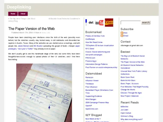
After posting the Konigi Graph Paper, someone pointed me to Deeplinking's collection of photos of paper prototypes and user interface sketches.
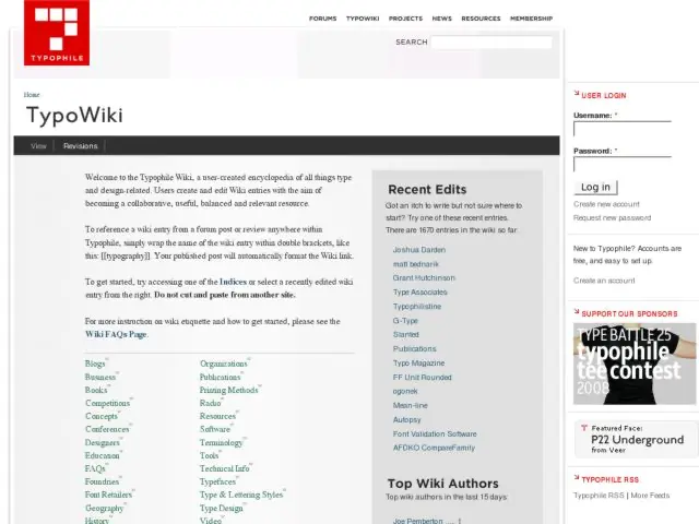
I noticed the TypoWiki on TypoPhile for the first time. The wiki is "a user-created encyclopedia of all things type and design-related. Users create and edit Wiki entries with the aim of becoming a collaborative, useful, balanced and relevant resource."
This is a very simple wiki created on top of Drupal. They've done a nice job of creating a core set of wiki pages ("indices", as they call them) linked off the front so you can edit those pages and create forward links to new resources. This is a nice approach that the keeps the site organized and clean.
There's quite a lot of content in here already, including a pretty large glossary of terms. Wherever you see a little red W icon, the content needs to be written still, so get in there if you're so inclined and contribute.
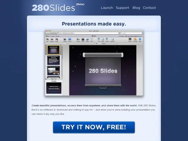
280 Slides is a service that lets you create presentations online in a Keynote-like interface, and then share them, download them to PowerPoint, and present them online.
TechCrunch has some photos of a usability lab used by the Gmail team at Google. Some of the photos include earlier iterations of Google Chat that were being tested in the lab.
I only see shots of the observers' room in the photos, but there's some description of their testing room as well.
It’s a small room with a large flat screen monitor, along with a desk and computer. It also has a number of discrete cameras (and a microphone) that keep an eye on the user herself as well as the screen.
Around the corner is a second room where Google employees can watch people interact with the software real time. The room has a couch and a chair along with two screens and speakers to monitor the lab. See the image to the right.
http://www.techcrunch.com/2008/06/22/a-peak-inside-googles-usability-lab/
Boxes and Arrows has a very detailed tutorial by Alexa Andrzejewski, interaction designer at Adaptive Path, on creating prototypes in Flash.
To tackle the classic “how to prototype rich interactions” problem, I developed a process for translating static screen designs (from wireframes to visual comps) into interactive experiences using Flash. Requiring some fairly basic ActionScript knowledge, these prototypes proved to be a quick yet powerful way to bring interaction designs to life.
It's nice to see this kind of practical knowledge sharing happening on B&A. This is a nicely illustrated tutorial covering a very practical method you can start using today.