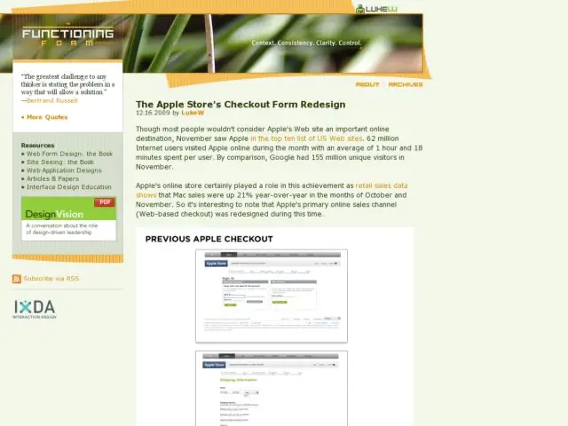
I finally made some time to read through Luke Wroblewski's excellent review of the changes in the Apple store's redesigned checkout form. According to Wroblewski, "...retail sales data shows that Mac sales were up 21% year-over-year in the months of October and November. So it's interesting to note that Apple's primary online sales channel (Web-based checkout) was redesigned during this time.
I wasn't surprised that the single page checkout form is an improvement over the paged version. What I was particularly interested in reading was Luke's observations about the problems with the move to put labels in inputs on so much of the form, and the improvements made with error messaging and breaking up secondary actions via tabbed sections.
I consider this a must read, and as always it's great to read whatever Luke continues to provide as an update to the form book. Read it on Functioning Form.
