CSS and Javascript experiments are fun to play around with. I tend to talk about them here because of the questions they raise about whether a technique is worth implementing or if it does more harm than help. Straight forward and familiar are the safe route. Sometimes experiments lead to better ways of doing things, other times they seem like they're gratuitous.
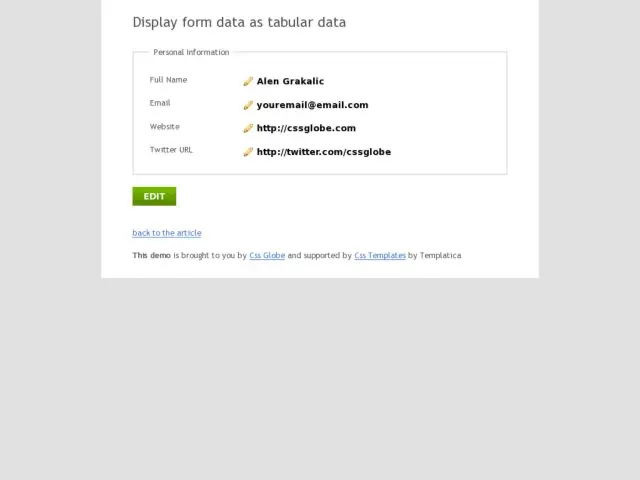
I came across an interesting, if problematic experiment to convert form fields into editable fields that are masked table cells until each input is in focus. I don't think this would be particularly familiar to a user if they're editing a form for the first time. However, it does provide a nice problem to deconstruct and review.
I'm sure there is a specific application they have in mind here, e.g. displaying a view of tabular data as a masked form to a user that has permission to edit it. But I think that could just be accomplished using javascript to transform individual fields and submit via AJAX. One of the problems with transforming the text to input and back to system text again is that the user might believe that the transition implies a submission, when nothing is submitted in this form, I presume, until the Edit button is clicked. If the case was that editing each input submitted the data, however, this feels like it could be an appropriate concept.
As far as the concept of masking input fields here, I think the issue I have has to do with familiarity, usability, and efficiency. But to make it more usable, the form could give the user a cue as to how to start using this form. The first input might be put in focus so you know that you're able to edit form fields. Clicking an edit icon to start seems inefficient, although tabbing is also possible.
Some tricks run the risk of turning a simple function into what might be perceived as a gimmick, or worse, might fail to perform its primary function of getting the user's data input. Form fields feel like a dangerous place for me to confuse.
