Sketch2Claude: Graph paper for a sketch-to-prototype workflow
I made graph paper for sketching and scanning interfaces back in 2008. These new sheets are a throwback to those original ones, but now something else is reading it.
It’s been years since I sold UI design graph paper sketch pads and later made them into freely downloadable PDFs. There were wireframe grids, a storyboard sheet, all of it divided into 24 columns because that’s what Blueprint CSS used at the time. The cyan versions were printed in non-photo blue, a color that drops out when you scan it, so you could sketch inside the grid, run the page through a scanner, and get back a clean drawing.
People printed a lot of that paper and I sold them through Amazon for a few years. Every now and then I get an email asking where the pads went and I heard that some animators and filmmakers used the storyboard pads.
Today I’m finding that I’m still sketching. In fact I pretty much sketch every project as the first step in designing or building. One idea that’s been bouncing around in my head is about how to make my sketch-to-build workflow a little smoother. So I broke out the old graphpaper idea and tried to re-imagine it as a source I could feed Claude Code.
The three sheets
I’ve redrawn the sheets. The design goal has changed. I don’t want the grid to disappear on scan anymore. It should be legible and I’m handing the page to Claude instead of scanning it. I ran through a few ideas in Claude to see if it would discern the edges of the sketch and it does so easily. It even knows how to ignore the metadata and can interpret callouts. Even though I don’t need it to be, I still created the artwork in cyan, because I just like it that way.
Each one is US Letter, drawn in the same pale cyan, with a header row for the screen name, the breakpoint you’re drawing, a version number, and the date. Registration squares sit in all four corners. These may be useful if scanning from iPhone Notes to fix keystone distortion. 12 columns run across the top with the numbers printed above them, and a row counter runs down the left edge in fours.
Portrait with Notes
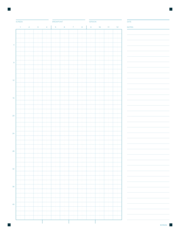
The full portrait sheet squeezes the grid narrower and runs it 43 rows deep, with a ruled notes column down the right. It’s useful for the kind of layout where you want to see a long page like a marketing landing page, or when you have to sketch the whole scrolling layout. This is the one I might use the most. The callouts and notes area are great for adding context or instructions in the handoff.
Portrait
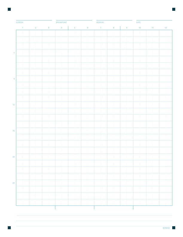
The portrait sheet has 12 columns, about 27 rows deep, three ruled lines at the bottom for callouts. This one is good for drawing a single screen at a mobile or tablet width, or a scrollable web page where you want the whole thing to fit on one page.
Landscape with Notes
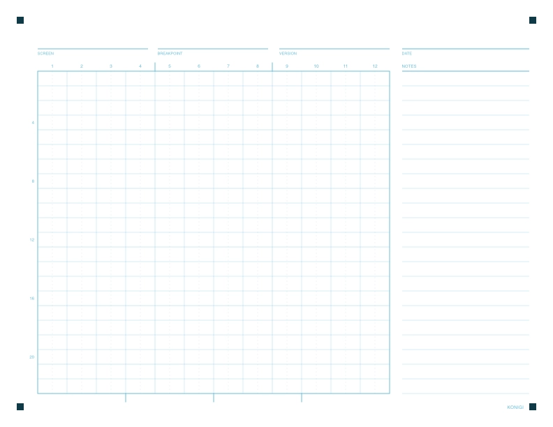
And the landscape sheet is the single screen, desktop layout. 12 columns, 22 rows, notes column on the right. It’s the closest to the original 2008 wireframe-with-notes page. Most useful for a single screen app sketch.
The workflow
- Sketch a screen.
- Scan it with your phone directly to a folder.
- Drop the image into Claude Code in the project you’re working in.
Tell Claude what it’s looking at. You don’t even have to explain much and you don’t need any special Claude skill. It will just figure out the layout from the grid, make good guesses at basic hierarchy and typography and write well formed CSS. I may work on some sketch2claude skills going forward as I experiment, but for a simple static html prototype to start, I was surprised I could just say, something as simple as “Make this landing page!”
What comes back is a static HTML and CSS file you can open in a browser. It’s a starting point, not the finished thing. It’s the drawing implemented in a real viewport, where you can see a few things, then sketch again, or keep going in code. But the thing that’s important for now is that it puts you back in the driver’s seat if you were starting from a prompt and not using any visual guidance from a wireframe or Figma file.
Shape shifting the ideation steps
In the past my flow was usually brief, sketch, wireframe, light spec, high-fidelity mockup/comps, build. I taught it that way to a lot of people.
The high-fidelity mockup is the step I now skip most often. Not always, and not on work where a team needs a single source of truth to argue against. But for my own products, and for a client conversation where the real question is whether the structure holds up, going from a sketch to something running in a browser beats a beautiful static screen that still can’t be clicked.
Sketching has always been the fastest way for me to think. What’s different now is that the sketch is executable. This easily makes the cheapest artifact in the process one of the most useful to me.
Print them, ignore the ones you don’t like, and go sketch something.
Download
All three sheets are on the graph paper page, free, as PDFs. Print at 100% with no scaling, borderless if your printer will do it. They’re free to use and share, but please don’t sell them.
- You don't have to give every decision over to AI. Sketching lets you focus on ideas at the right level of fidelity, so you're in control as the designer.
- Three printable sheets, free. A portrait 12-column screen grid, a taller portrait sheet for long scrolling pages, and a landscape sheet with a notes column for desktop layouts.
- The workflow: sketch, photograph, paste, prompt. Claude Code reads the column numbers and row counts off the page and returns a static HTML and CSS prototype you can open in a browser.
- 12 columns, not the 24 the old Konigi paper used. 12 is what every CSS grid convention already assumes and is easily divided in 1/3s and 1/4s.
- Sketching is the new wireframing and it gets more valuable once the sketch becomes executable. It's a new workflow for those designers and builders who find themselves wanting to skip wireframes and high-fidelity mockups.